Drawing: The Basics/Drawing and Rendering for Metal Jewelry Design
(I'm doubling up information here from two courses which both deal with the essentials of describing form with line and shading; Drawing the Basics and Drawing and Rendering for Metal Jewelry Designers. The former is a six class course, and the latter, which includes some content on the basics of technical drawing and drafting as well as rendering surfaces with paint, is about 14 weeks long. If you are in the shorter six week course and looking to review material you can scroll and sift through the content below to find material useful for your review. I am constantly editing these pages; adding or subtracting from them to make them more readable or pertinent. Please consider them a work in progress. Apologies for any errors, and I appreciate your patience if you discover any. In Drawing: The Basics and Drawing and Rendering for MJD you will spend one class life drawing and to preview or review you can go directly to page for A Survey of Life Drawing Method (which can be found under 'MORE' on the contents bar top of page) and sift through relevant material there. If you are in Drawing for Metal Jewelry Design there is a Part Two of Drawing for Metal Jewelry Design that deals with product design and technical drawing and rendering, also found top of page under 'MORE'.)
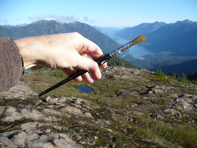
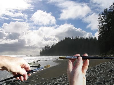
(Many of the images below can be clicked on to view a larger file size.)
Drawing for Metal Jewelry Design
Drawing can exist as a discrete art form in and of itself. But for painters, designers, architects, engineers, filmmakers...and metal jewelry workers, it can be a means to an end. It can be used produced to develop, to preconceive, to postulate ideas for a finished product. Much like a sculptor generates sketches on paper for his/her ideas, as metal jewelry designers you can, and will, find yourself sketching and drawing on paper in a process, a workflow, that culminates in a finished three dimensional product.
Learning to draw well will help you in your design process. But there's more (attention shoppers, this way for more bargains...). Drawing is often a foundation for many occupations. It's a starting place where you can establish a relationship between the eye, the mind and the hand. By continuing to draw observationally, for example, by attending life drawing sessions occasionally or regularly, you can continue to maintain and develop visual skills and eye hand coordination. As well you can keep a sketchbook for observational drawings and developing and storing rough design concepts and ideas.
(I'm doubling up information here from two courses which both deal with the essentials of describing form with line and shading; Drawing the Basics and Drawing and Rendering for Metal Jewelry Designers. The former is a six class course, and the latter, which includes some content on the basics of technical drawing and drafting as well as rendering surfaces with paint, is about 14 weeks long. If you are in the shorter six week course and looking to review material you can scroll and sift through the content below to find material useful for your review. I am constantly editing these pages; adding or subtracting from them to make them more readable or pertinent. Please consider them a work in progress. Apologies for any errors, and I appreciate your patience if you discover any. In Drawing: The Basics and Drawing and Rendering for MJD you will spend one class life drawing and to preview or review you can go directly to page for A Survey of Life Drawing Method (which can be found under 'MORE' on the contents bar top of page) and sift through relevant material there. If you are in Drawing for Metal Jewelry Design there is a Part Two of Drawing for Metal Jewelry Design that deals with product design and technical drawing and rendering, also found top of page under 'MORE'.)
(Many of the images below can be clicked on to view a larger file size.)
Drawing for Metal Jewelry Design
Drawing can exist as a discrete art form in and of itself. But for painters, designers, architects, engineers, filmmakers...and metal jewelry workers, it can be a means to an end. It can be used produced to develop, to preconceive, to postulate ideas for a finished product. Much like a sculptor generates sketches on paper for his/her ideas, as metal jewelry designers you can, and will, find yourself sketching and drawing on paper in a process, a workflow, that culminates in a finished three dimensional product.
Learning to draw well will help you in your design process. But there's more (attention shoppers, this way for more bargains...). Drawing is often a foundation for many occupations. It's a starting place where you can establish a relationship between the eye, the mind and the hand. By continuing to draw observationally, for example, by attending life drawing sessions occasionally or regularly, you can continue to maintain and develop visual skills and eye hand coordination. As well you can keep a sketchbook for observational drawings and developing and storing rough design concepts and ideas.
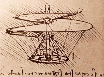
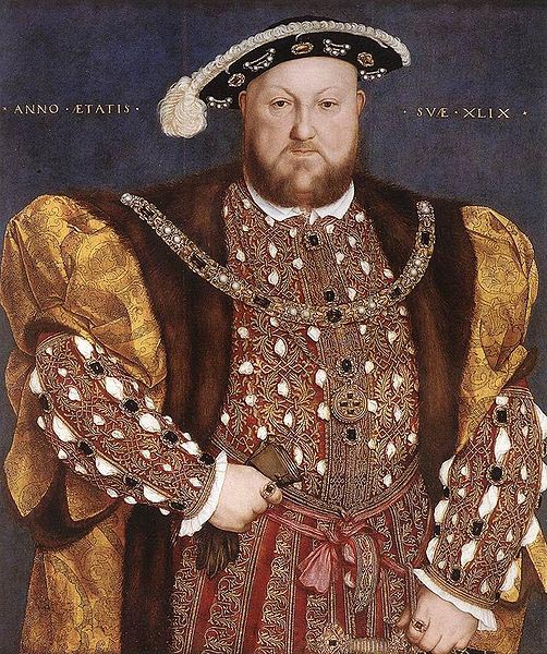
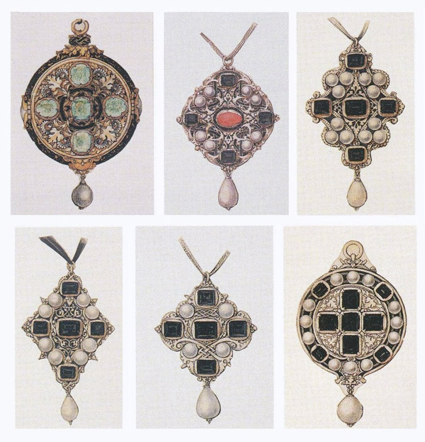
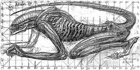
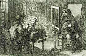
I have enormous amount of respect for and interest in occupations associated with the visual arts that I don't participate in, and I am envious and will take great vicarious pleasure in your creations in this jewelry program. Some of the greatest visual artists, fine artists, in history, worked in the field of metal jewelry design as well as pushing paint. This was particularly true of well known Renaissance artists like Benvenuto Cellini and Leonardo da Vinci. See the gallery of images below. Renaissance artists used their visual creativity and acquired skills and craftsmanship in various fields; painting, sculpture, product design, architecture as well as design and fabrication of jewelry. Drawing and design abilities are portable from one field to another. By developing a deep understanding of metal jewelry production skills and design concepts, you might might find yourself, in future, transporting them to some other occupation. For example, your understanding of mold making and casting acquired in this jewelry program could help you pick up employment in the film industry creating latex or plaster props for set design. In the slideshow below, see some examples of art by Renaissance artists who also designed jewelry. The gallery below includes a painting by Holbein of a bejewelled Henry XIV as well as lovely renderings of Tudor era jewelry design by the painter.

The exercises and projects in the Metal Jewelry Design Class class will start very broadly at first, and will over the semester gradually focus on the subject you hold dear; the design and manufacture of jewelry.
Our drawing program is divided into roughly 3 sections.
-In the first section we are going to study drawing as though we were art students. We will try and cover all the basic concepts of observational drawing using classic subject matter that includes the human figure.
-In the second section we will move into drawing objects and employing perspective, and look at product design and the role of drawing in it. A sculpture or a piece of jewelry is a product, and product drawing will be extremely informative as we might be able to deconstruct or reverse engineer objects to reveal the components and parts that inspired the whole.
-In our third and final section we will apply what we have learned about drawing to a design of what you hold dear; metal jewelry objects of art.
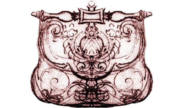
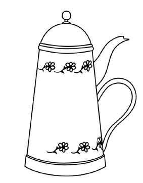
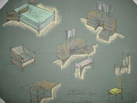
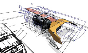
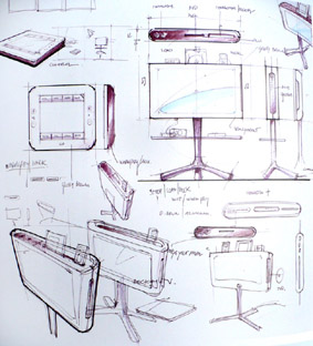
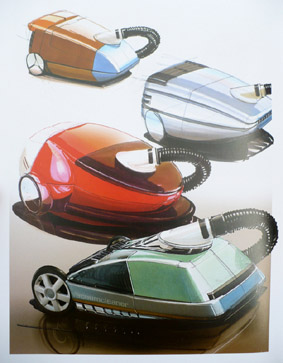
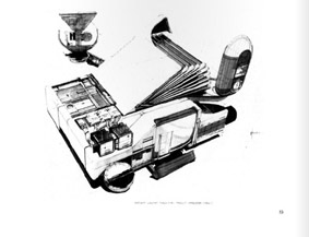
Starting with The Masochist's Teapot, below find a gallery of beautiful product design drawings and renderings that include architectural elements, machinery, consumer products, packaging and even props designed specifically for film. Be aware that being able to design and render objects and products in the real world is just part of the product design picture. Designers...teams of product designers...also work creating props and objects for film and television, animation and computer games. Jewelry design is essentially product design; as well as becoming jewelry designers you will arguably become product designers. (Images reproduced here were found online and are for educational/illustration purposes only and the small files are not intended to infringe on copyrights). Click on images to enlarge somewhat.
Our drawing program is divided into roughly 3 sections.
-In the first section we are going to study drawing as though we were art students. We will try and cover all the basic concepts of observational drawing using classic subject matter that includes the human figure.
-In the second section we will move into drawing objects and employing perspective, and look at product design and the role of drawing in it. A sculpture or a piece of jewelry is a product, and product drawing will be extremely informative as we might be able to deconstruct or reverse engineer objects to reveal the components and parts that inspired the whole.
-In our third and final section we will apply what we have learned about drawing to a design of what you hold dear; metal jewelry objects of art.
Starting with The Masochist's Teapot, below find a gallery of beautiful product design drawings and renderings that include architectural elements, machinery, consumer products, packaging and even props designed specifically for film. Be aware that being able to design and render objects and products in the real world is just part of the product design picture. Designers...teams of product designers...also work creating props and objects for film and television, animation and computer games. Jewelry design is essentially product design; as well as becoming jewelry designers you will arguably become product designers. (Images reproduced here were found online and are for educational/illustration purposes only and the small files are not intended to infringe on copyrights). Click on images to enlarge somewhat.


Observational drawing: The box
The concepts and exercises in both the Basic Drawing and Jewelry Design are superficially simple. But explaining them isn't (and making the concepts unconscious and inherent to your drawing process isn't easy either. This takes time and practice). I keep re-reading these pages and editing them down and they still appear like gibberish at times, especially when I've rambled on and digressed. As a student of drawing, you probably want put a bit of effort into reading and consciously understanding some of the simple concepts associated with basic drawing, but lots more effort into practicing them unconsciously through drawing in class and at home.
Don't sweat it. If you are having trouble understanding some of the basic concepts written here you can blame my attempt at explaining them. You can also just look at the pictures amongst the text, from which, I hope, a great deal can be suggested. You'll certainly do the exercises in class...that will help a lot; doing something is always more instructive than just reading about it. And if you're still having trouble with some aspect of what is presented during the course please question me in class when I'm orbiting the room and settling to have a look at what you're doing. A brief verbal explanation to a direct question and perhaps a thumbnail demo on a piece of paper should sort things out.
Despite the suggestion that this course is 'just' the basics, the stuff we'll consider is quite interesting. Just like a fraction of a moment after the Big Bang at the beginning of the Universe, the most weighty, juicy, intriguing and interesting concepts may well occur at this basic level. As time goes on and your, and my, visual universe expands, things get a little more...I don't know, diffuse, stretched out, disconnected. The further you go down the rabbit hole, as interesting as things get, they will probably lack the impact of when you first took the initial plunge in. Many who have spent a lifetime working in the visual arts one way or another, including myself, forget about the basics, putting them aside and taking them for granted. It has been a great pleasure for me to review the basics of drawing, re-experience that initial magic again, and I hope you find this material equally interesting.
Before we begin our drawing exercises, lets review some ways of working that will be useful.
Composing and Focusing
When we sit down in front of something to begin drawing, a huge problem for you (and me...), is being confronted with too much information. A big part of producing an interesting drawing is to be able to focus on your subject. You need to get rid of a lot of irrelevant stuff that surrounds it. A camera's viewfinder is a wonderful tool for 'cropping', or focusing in on your subject. You don't need a camera, however, to create one, you can use your hands to 'crop' down your point of view of the world, compose, and focus on what is relevant to you and fix it in your minds eye. Using an imaginary viewfinder in your minds eye will also help you to fill your page and not draw something tiny and hard to work on in the middle of a largely empty sheet of paper.

A Proper Drawing Position
Drawing at an easel provides the best drawing position: looking straight at the board with no possibility of distortion as a result of foreshortening of your drawing. If you are drawing at a table and have your board flat on the table, you will almost inevitably discover that, on finishing the drawing, the top will be too large in proportion to the bottom. This is a result of looking 'down' your drawing and 'foreshortening' it as you work it at a very low angle. Second choice to an easel is perhaps using two chairs to make a 'drawing horse'. Prop your board on one chair seat, and sit in another facing the board. Sitting at a table can work if you prop the board on your knees and lean it against the table. Position yourself to be able to look at your drawing and the subject just beyond with little movement of the head so that you can compare angles and proportions easily.
The image below attempts to illustrate the usual effect of a poor drawing position. You can see that the foreshortened drawing, above, looks fairly accurate when laying flatter, as on a table. However, when you stand the drawing up and look directly at it, as though on an easle, it's proportions are incorrect. Very often you end up drawing a cephalopodan looking figure.
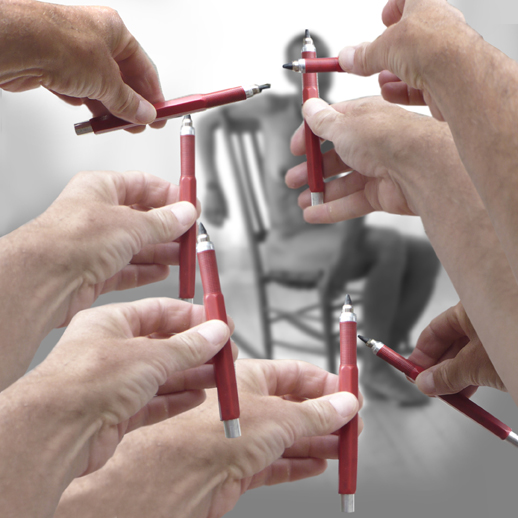
Eyeballing or Sighting
'Eyeballing', or 'sighting' is a useful technique for drawing accurately. The illustration below refers to drawing a figure, but eyeballing can, of course, be applied to drawing any subject matter.
'Eyeballing' allows you to measure angles and proportions.
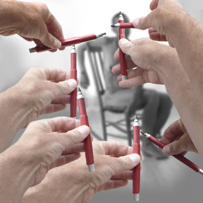
Measuring angles: if you hold your arm out dead straight with your drawing or painting tool in hand you can roughly measure the angle of any apparent line on your subject relative to other angles and also relative to the vertical and horizontal axis. Your measurements are approximate, relying on your observations and memory, as the term 'eyeballing' suggests.
Measuring proportion: again hold your arm out straight and use the tip of your pencil or brush to mark one end of part of the figure (the head, for instance), and then move your thumb down the pencil to indicate the other end. You now have a measurement to start with, sometimes called 'the basic unit'. In the example above, the height of the head would be an obvious measurement to take. Using the top of your pencil and your thumb for indication, you can now measure approximately how many head heights your figure is from top to bottom. In order to fairly accurately measure how many heads high your subject is you must not bend your elbows; you must always keep your hand and the pencil the same distance from your eyes.
In the image above, the two top right hands and crayon-holder are measuring the height and width of the model's head. All the others are measuring angles.
You can measure angles and proportions by eyeballing or sighting before you draw, or you can 'wing it' free freehand and then check your angles and proportions later.
The more comfortable you are with drawing, the less you'll eyeball angles and measurements. However, there are not a lot of artists who don't resort to it to double check angles or measurements even when free drawing. If something doesn't look quite right, you can confirm a correct judgment or discover an error. With enough time and concentration, it will be possible to come up with a fairly accurate drawing using eyeballing.
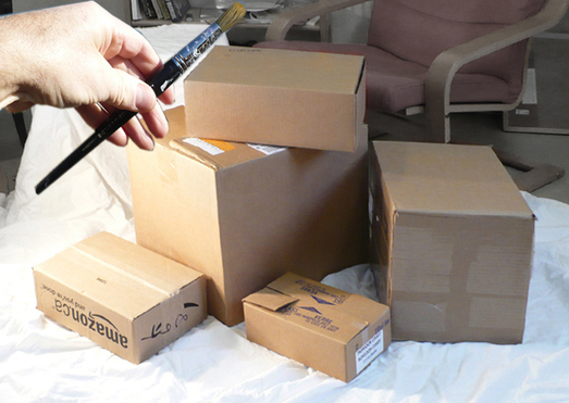
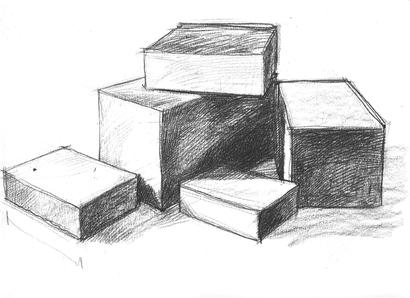
Exercise: Drawing Boxes
We're going to be drawing boxes in this first class; there is only a marginal difference between drawing and painting cardboard boxes and drawing and buildings, automobiles, or machinery. Or jewelry. The box is one of the most basic modules in the underlying architecture of objects in the world around us. There will be others to consider in later classes.
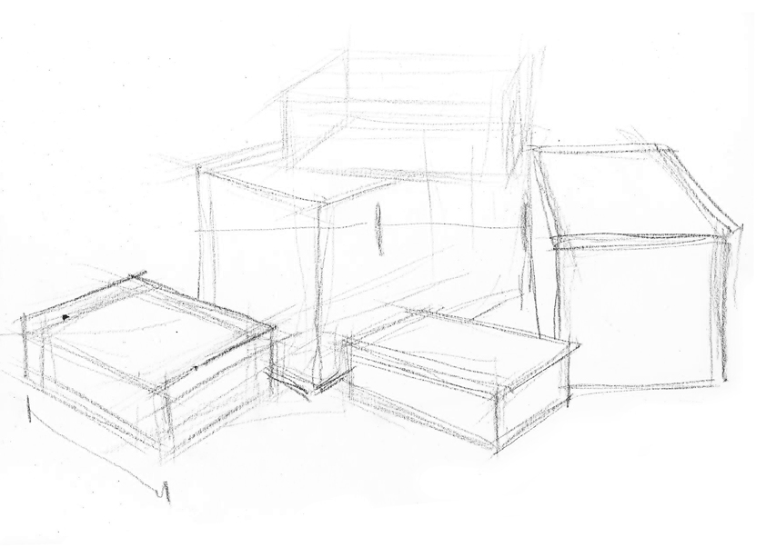
See the gallery of images below the following text to see the development of a drawing of boxes.
Start your drawing, below, working lightly, roughing in where you think the objects are, but ready to shift them around, gradually allowing your drawing to become darker as you become more confident of placement, angles and proportions. Notice below there is an indication of using the far left box length as the 'basic unit'. I am able to use that measurement to accurately estimate how wide the large middle box is and you can see how I left marks to estimate that it is two left box lengths wide. For the other boxes no measuring marks have been left. Marks have been left, however, from previous angle measurements, so you can see lightly drawn boxes within boxes as I struggle to place them in space. These very practical sketchy 'halo's' that surround working drawings and sketches can actually have great aesthetic appeal. Very often a rough drawing with evidence of the artists struggle with 'searching lines' to find an accurate rendering is far more appealing than a slick 'cleaned up' drawing.
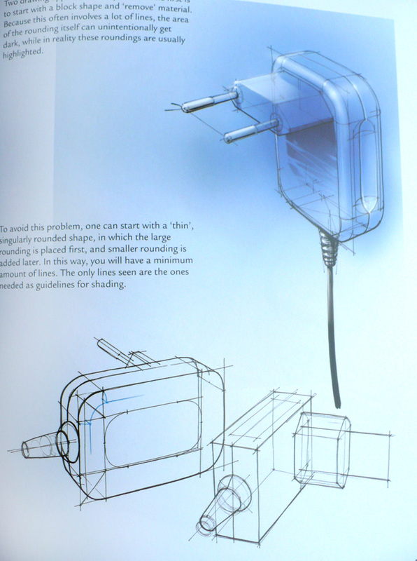
Also note how a purely line drawing can be 'transparent'. On some of the boxes, I've actually drawn lines on the other side of the box. This helps me to visualize the boxes as three dimensional objects. I can actually draw what I can't see by imagining what is there. This is similar to the 'wire frame' constructions used initially in the developing of objects on computers. It is a way of visualizing that is unique to line drawings. As soon as you 'turn on the lights', so to speak, and render in light and shade with a pencil or paint, you are creating a sense of surface that will cut your vision off from the object's far side and interior. The sense of surface created by shading is an exciting thing to explore in it's own right, but you'll find you can't have it both ways. You'll learn to appreciate the merits of both ways of seeing, however.
Once the line drawing proceeds to the point now where the placement and proportions of the boxes is considered complete, darkened and defined, you can consider some lighting. A primary light source may play across the surface of the boxes and strike some planes more directly than others making them brighter. Using the side of the crayon and looking carefully at the division between light and shade lay a mid to light tone over everything that you perceive or want to have in shade. Now you have a rough lighting scheme. Limit the number of dark tones you apply working from lighter to darker on the planes that receive less light. In these sketches, as well as the side of the crayon I'm also using the point to hatch and cross hatch, which creates a sense of embellished surface on objects. It also is a way of gradually building up subtle tone and gradations in increments. Finally I've added tone/shading behind the boxes. This might help to accentuate the areas of light on the boxes. It is an option for you but not necessary. Think about it.
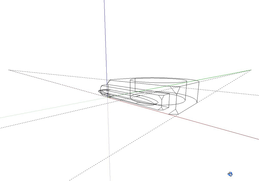
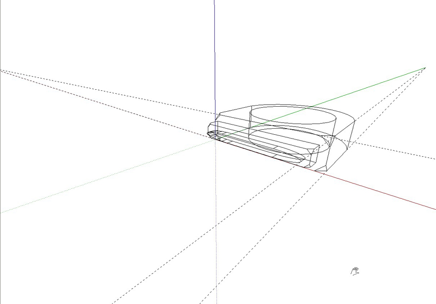
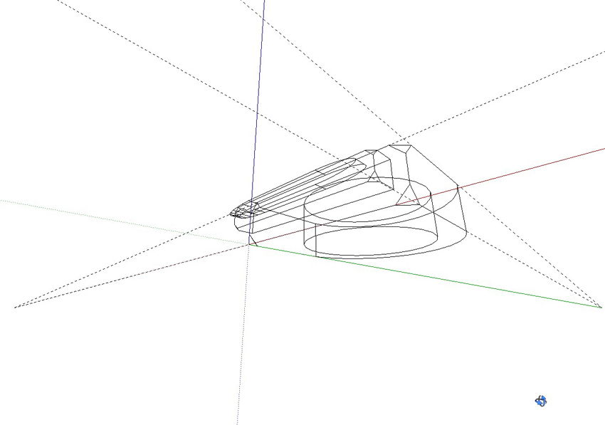
In the final 'drawing' in the gallery I've tried to duplicate the arrangement of the photograph and crayon drawings with SketchUp, even making an effort to adjust the lighting to match. I ran the model through a filter that makes it look very much like a drawing on paper...except that you can actually rotate the drawing like a sculpture. This is to remind you that at some point you might find it useful to explore a 3D digital program.
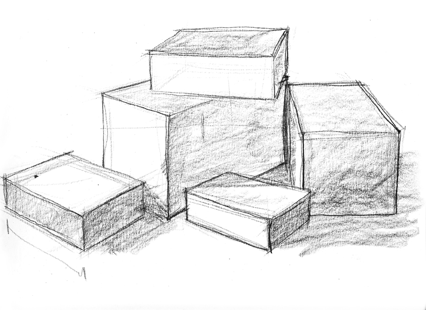
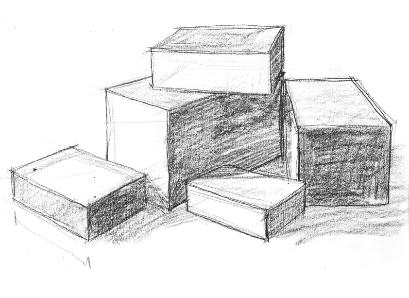
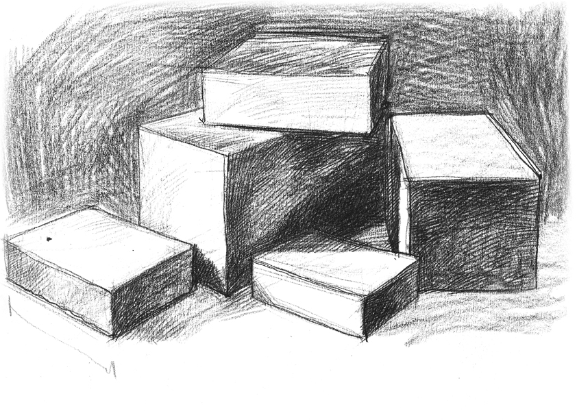

Before moving on, I'd like to make note of some interesting qualities of line drawing vs. shaded or rendered drawings. In the series of drawings above you can see how my sketch of boxes develops from being purely linear to shaded. As it becomes more rendered, the line work is lost. You can no longer see construction lines or imagined lines at the back of the boxes. The drawing becomes very surface oriented.
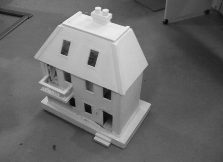
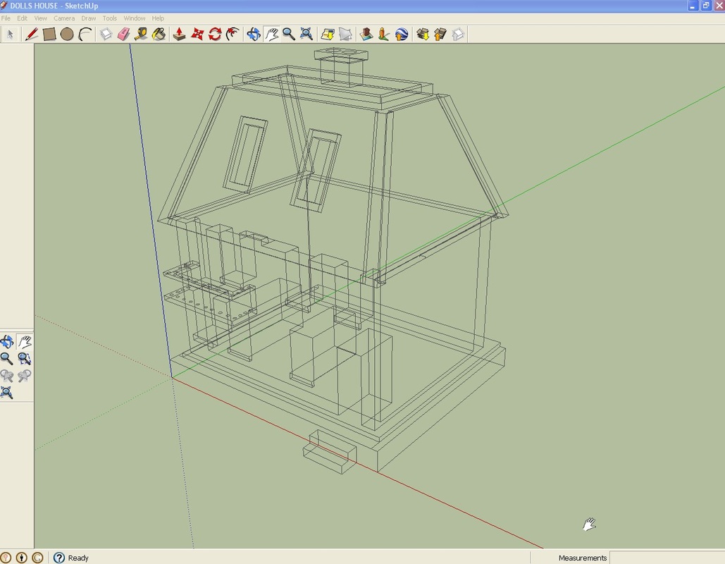
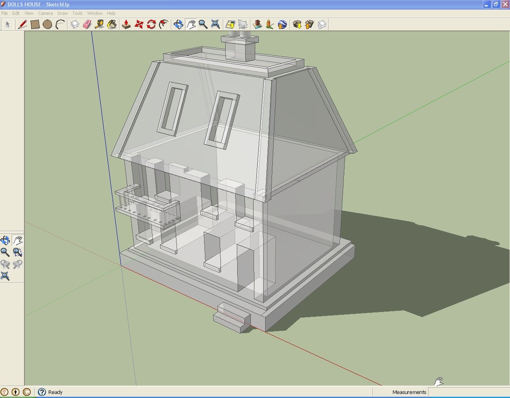
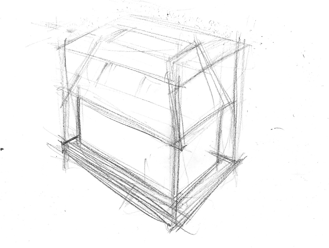
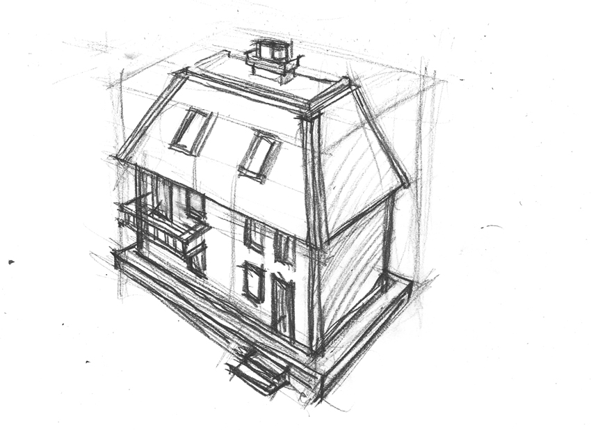
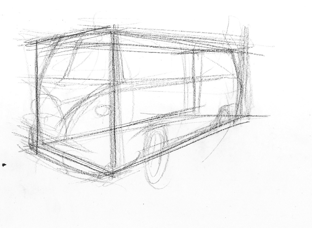
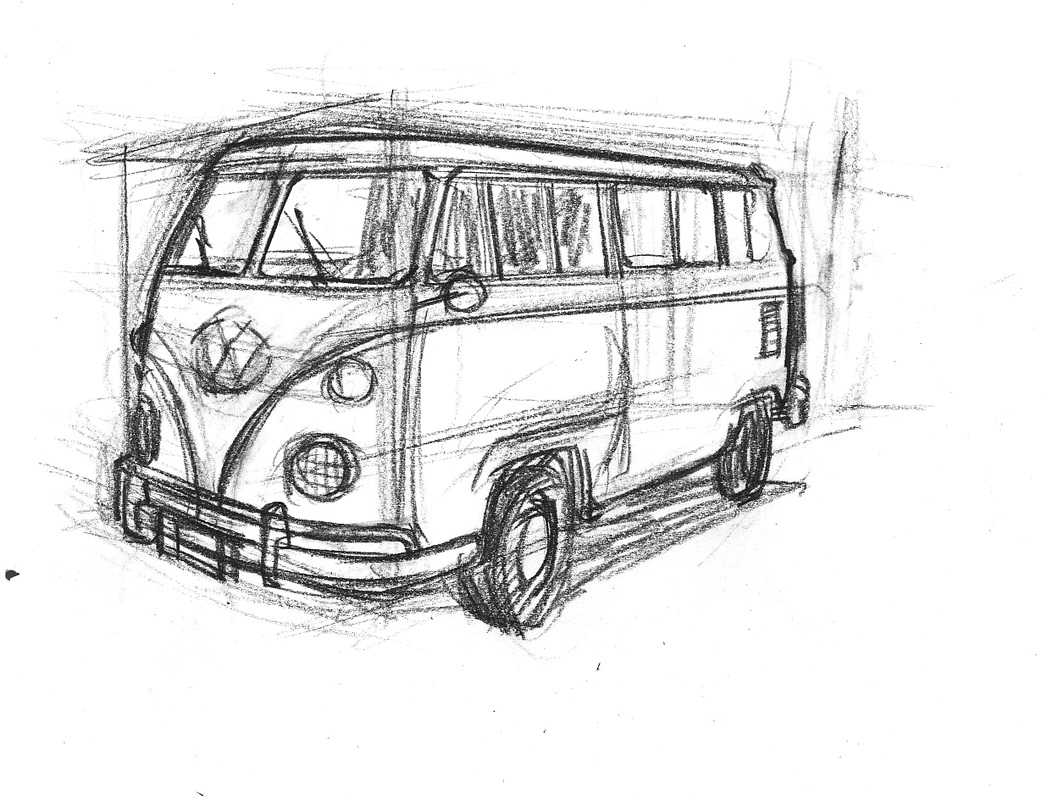
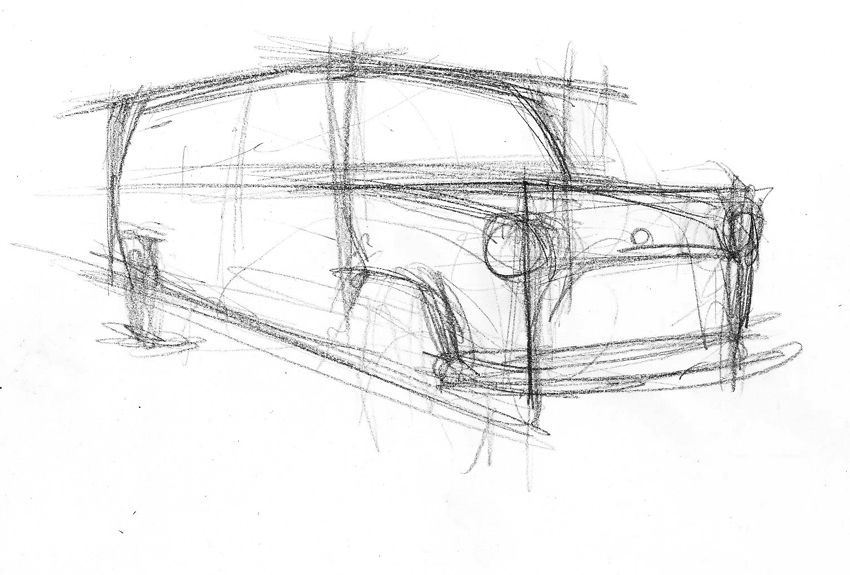
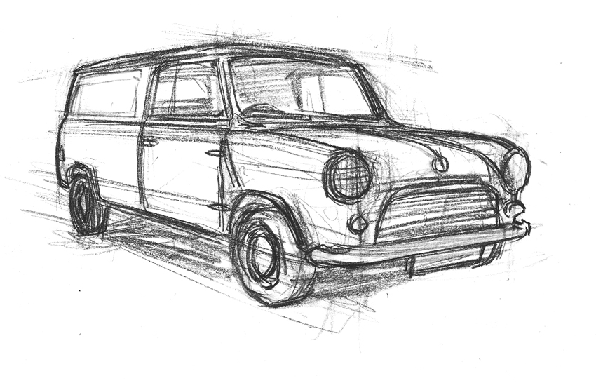
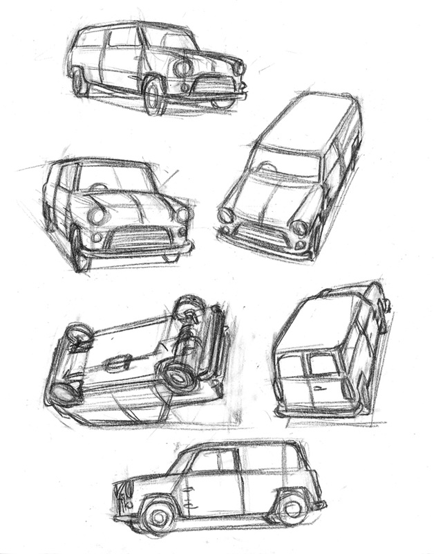
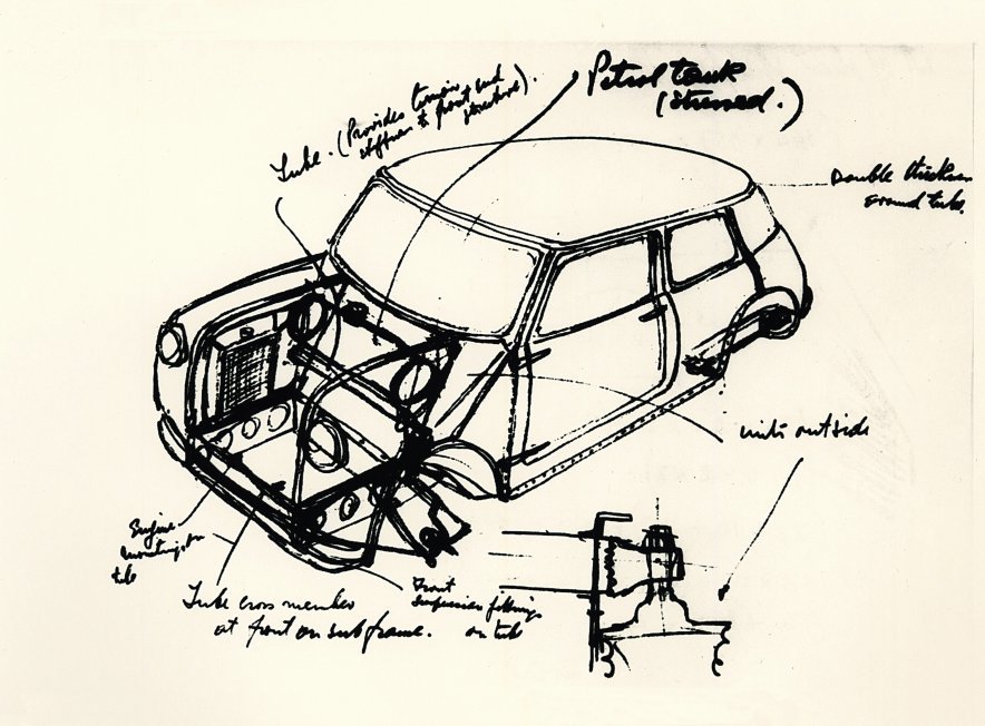
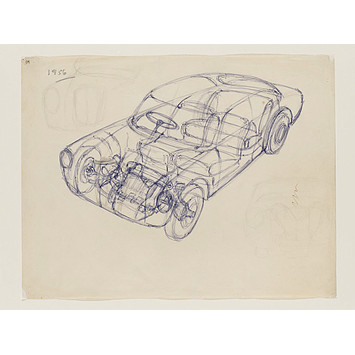
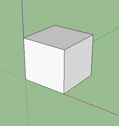
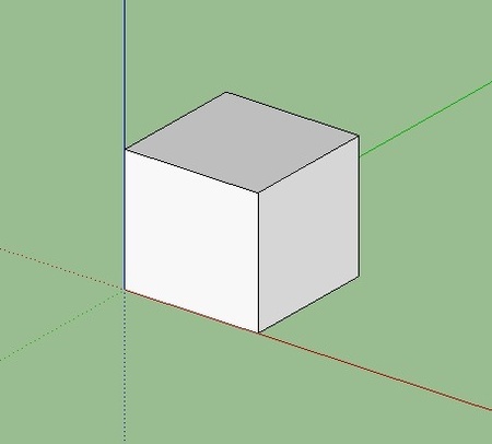
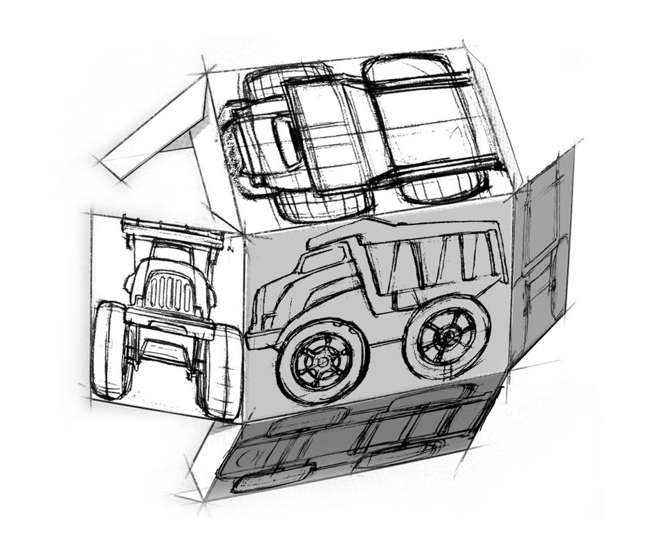
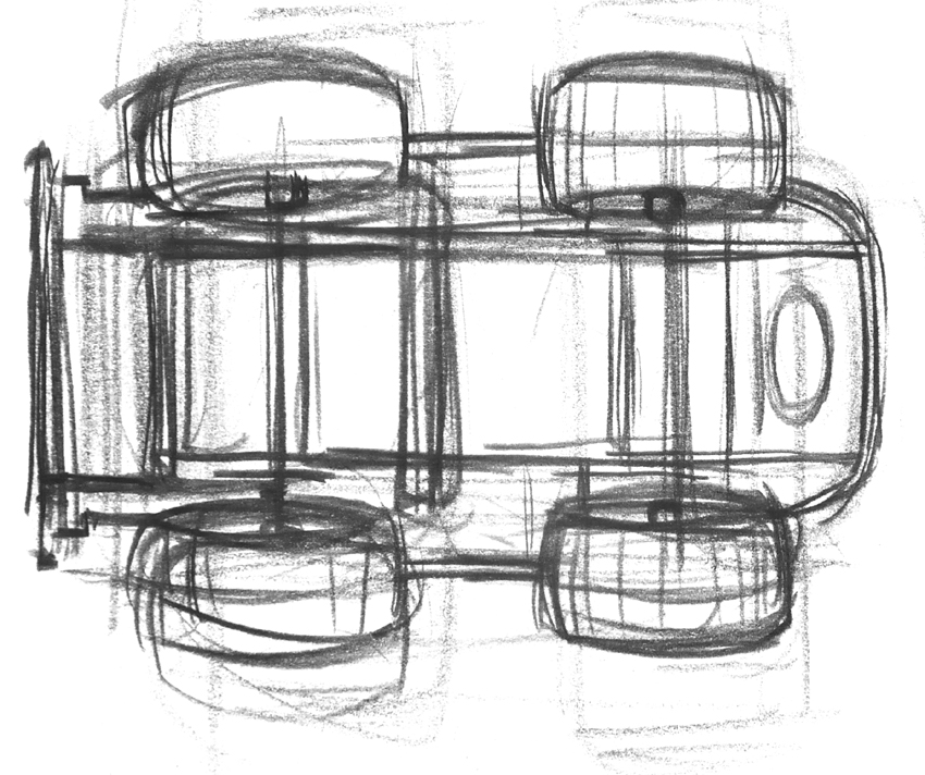
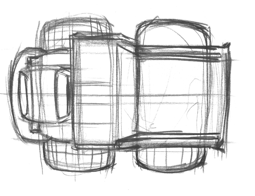
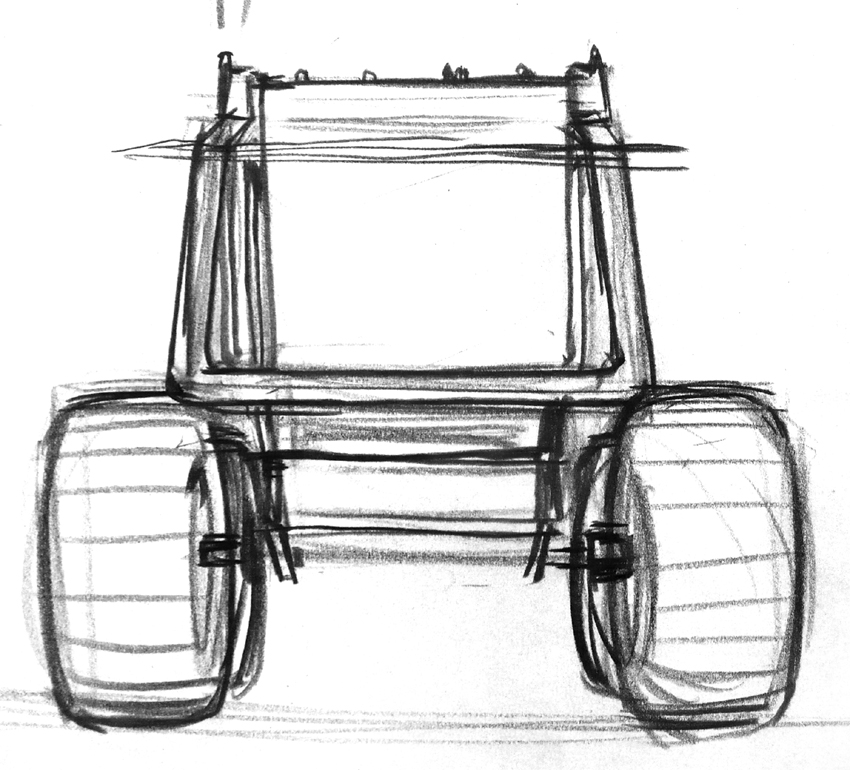
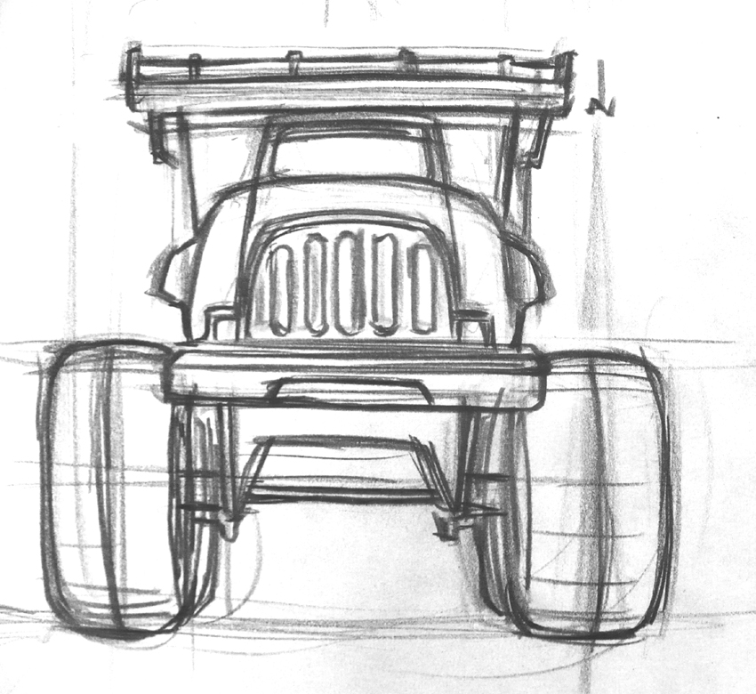
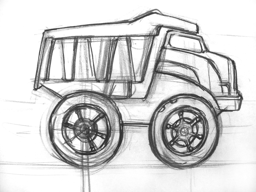
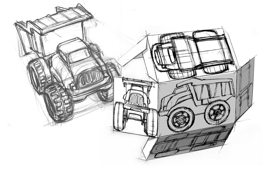
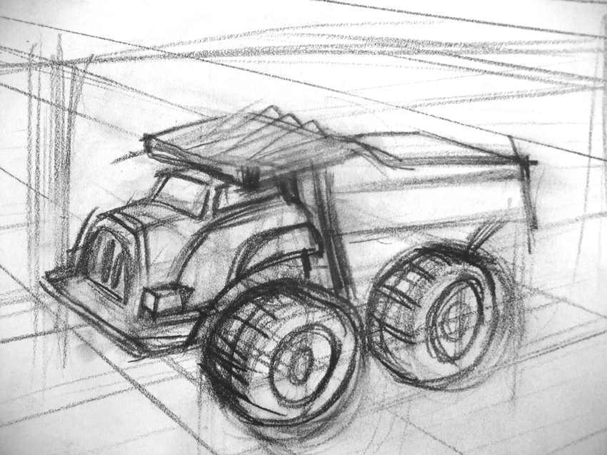
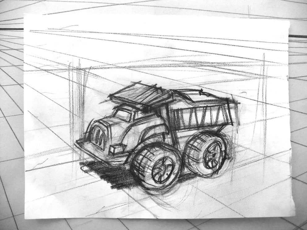
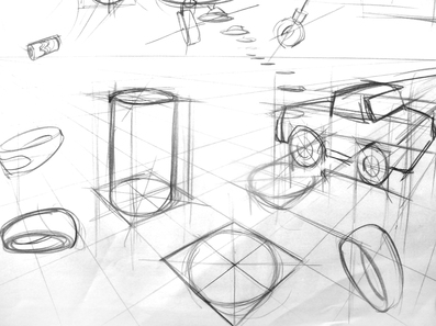
Below is a photo of a dolls house used as reference in a number of the gallery images that follow. In the first three SketchUp images of the gallery you can see how 'drawn' objects lose the x-ray vision qualities of line as they become shaded. Of course, a shaded drawing has it's merits, but for design purposes you will often find it valuable to work in just line so you can see the modules and components of your imagined product. There then follows a couple of images of a drawing I made of the same dolls house. Notice how there is a similarity to the SketchUp line drawing, and also how I'm using box modules to visual the subject. Following the dolls house drawing is a line drawing of a Volkswagen van. Notice that, although this a vehicle, I can still use the box to build the vehicle in. The box helps with visualizing the vehicle and also with maintaining correct perspective. The process is repeated with a Mini Estate vehicle. It is a 'two-box' design. Car engineers apparently speak about 'one box', 'two box' and 'three box' designs, hinting at the overarching design module used in their creation. Obviously the VW van is a one box design. The little mini wagon is a two box design; the passenger compartment and the engine compartment. A sedan would be a three box design; the engine compartment, the passenger compartment, and the trunk or luggage compartment. Like architecture and many other products, it's all about the box. You can see one of the illustrations below illustrates cars visualized as boxes, and another shows the mini rotated in a number of positions. This is easy to do if you draw a box in perspective and then transfer the proportions and details of your subject to a vision of it within the confines of the box. Of course, there are other modules as well that can be used to underlay and construct form, such as circles and ovoids, cones, cylinders. I've also included a couple of lovely drawings by Alec Issigonis, the brilliant car designer who came up with the concept of the original Mini, which, with it's genius front wheel drive transverse engine that allowed for enormous space in the passenger compartment by reducing the size of the engine compartment and eliminating having a drive shaft run through the passenger compartment. You can see on the final Issigonis drawing, that the transparency of line allows the artist/engineer/designer to visual interior structures such as the engine block and passenger seating. This can be achieved as a result of the transparency of line. Next is a meticulous Renaissance drawing of a goblet by Paolo Uccello. It looks surprisingly like the wire frame rendering of computer imagery.
Below is a photo of a dolls house used as reference in a number of the gallery images that follow. In the first three SketchUp images of the gallery you can see how 'drawn' objects lose the x-ray vision qualities of line as they become shaded. Of course, a shaded drawing has it's merits, but for design purposes you will often find it valuable to work in just line so you can see the modules and components of your imagined product. There then follows a couple of images of a drawing I made of the same dolls house. Notice how there is a similarity to the SketchUp line drawing, and also how I'm using box modules to visual the subject. Following the dolls house drawing is a line drawing of a Volkswagen van. Notice that, although this a vehicle, I can still use the box to build the vehicle in. The box helps with visualizing the vehicle and also with maintaining correct perspective. The process is repeated with a Mini Estate vehicle. It is a 'two-box' design. Car engineers apparently speak about 'one box', 'two box' and 'three box' designs, hinting at the overarching design module used in their creation. Obviously the VW van is a one box design. The little mini wagon is a two box design; the passenger compartment and the engine compartment. A sedan would be a three box design; the engine compartment, the passenger compartment, and the trunk or luggage compartment. Like architecture and many other products, it's all about the box. You can see one of the illustrations below illustrates cars visualized as boxes, and another shows the mini rotated in a number of positions. This is easy to do if you draw a box in perspective and then transfer the proportions and details of your subject to a vision of it within the confines of the box. Of course, there are other modules as well that can be used to underlay and construct form, such as circles and ovoids, cones, cylinders. I've also included a couple of lovely drawings by Alec Issigonis, the brilliant car designer who came up with the concept of the original Mini, which, with it's genius front wheel drive transverse engine that allowed for enormous space in the passenger compartment by reducing the size of the engine compartment and eliminating having a drive shaft run through the passenger compartment. You can see on the final Issigonis drawing, that the transparency of line allows the artist/engineer/designer to visual interior structures such as the engine block and passenger seating. This can be achieved as a result of the transparency of line. Next is a meticulous Renaissance drawing of a goblet by Paolo Uccello. It looks surprisingly like the wire frame rendering of computer imagery.


Perspective
You can draw very accurately by eyeballing and measuring angles and proportions. However, no basic drawing course would be complete without some coverage of perspective and perspective grids.
Don't feel obliged to completely and meticulously understand all that I've written here! Just having a feel for it will be sufficient for most purposes. If you want to come back and read this again later, you can do so, or, if your interest in perspective persists, you can go further afield online or in books published specifically dealing with the subject.
Perspective is apparently created geometrically as a form of 'projection'. Projection is a very apt description because it is what is happening when I use the 'projector' in the classroom. There are various types of perspective 'projections' mentioned below, from one point, two point, three point, and parallel projections. There are many complex 'projections' used to unfold the topography of the earth's sphere onto a flat surface with varying degrees of usefulness. There are many types of projections used in film with different aspect ratios, and also distortions designed to lay on curved screens, such as IMAX, OMNIMAX or the projection used in planetariums. There is an underlying mathematics to them all of which I am, alas, oblivious, and fortunately for me, and for you, in this course I only need to present perspective informally and very basically.
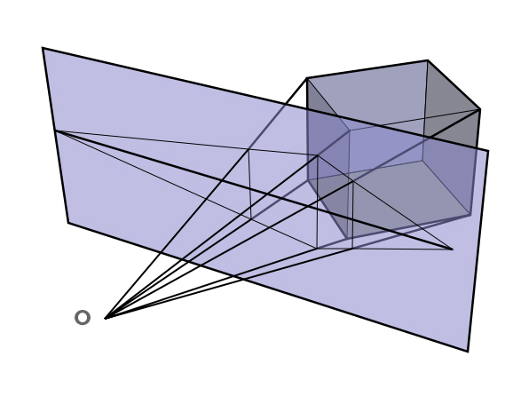
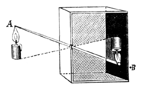
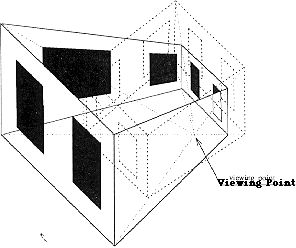
Below is a diagram from Wikipedia that beautifully illustrates a 'projection' of two point perspective of a 3d cube onto a 2d surface or plane. As well as representing a 3d object on a 2d surface, 'projecting' also has the useful quality of scaling down a large object to a manageable size. Hence we can perceive something enormous like a mountain through a camera, on our retina, or in a painting. Projections can project a small image to make it large, as with my classroom projector, or works like looking down the wrong end of a telescope making a large object small.
The iris in our eye works similarly to a pin hole camera that 'projects' a scaled down and upside down version of the world on our retinas. The projection is thrown upside down on the back of our retinas because if you extend the projection lines (in the diagram below) leftward from the object, through the 2D plane and converging at the circle representing our eye, you'll notice that by extending those projection lines beyond the convergence point (the iris) they flip around. Projection lines that previously were on top are now below the projection lines that were below and are now on top.
Another useful way of attempting to describe the effect of projection lines converging from the world into your eye or a camera is 'visual cone'. Fuzzy and fading to black at the edges, from an optical point of view what you might be seeing out in the world is basically a cone of vision that hurtling off into infinity. When looking into space, this visual cone is also a view into the past; because of the finite value of the speed of light, the further you look into space the further you look into the past. Astronomers are currently looking so far back down the visual cone that they can see a time not long after the birth of the universe. However they can't see beyond an opaque barrier of dense microwave radiation from the dissipating incomprehensible energy of the big bang.
You can draw very accurately by eyeballing and measuring angles and proportions. However, no basic drawing course would be complete without some coverage of perspective and perspective grids.
Don't feel obliged to completely and meticulously understand all that I've written here! Just having a feel for it will be sufficient for most purposes. If you want to come back and read this again later, you can do so, or, if your interest in perspective persists, you can go further afield online or in books published specifically dealing with the subject.
Perspective is apparently created geometrically as a form of 'projection'. Projection is a very apt description because it is what is happening when I use the 'projector' in the classroom. There are various types of perspective 'projections' mentioned below, from one point, two point, three point, and parallel projections. There are many complex 'projections' used to unfold the topography of the earth's sphere onto a flat surface with varying degrees of usefulness. There are many types of projections used in film with different aspect ratios, and also distortions designed to lay on curved screens, such as IMAX, OMNIMAX or the projection used in planetariums. There is an underlying mathematics to them all of which I am, alas, oblivious, and fortunately for me, and for you, in this course I only need to present perspective informally and very basically.
Below is a diagram from Wikipedia that beautifully illustrates a 'projection' of two point perspective of a 3d cube onto a 2d surface or plane. As well as representing a 3d object on a 2d surface, 'projecting' also has the useful quality of scaling down a large object to a manageable size. Hence we can perceive something enormous like a mountain through a camera, on our retina, or in a painting. Projections can project a small image to make it large, as with my classroom projector, or works like looking down the wrong end of a telescope making a large object small.
The iris in our eye works similarly to a pin hole camera that 'projects' a scaled down and upside down version of the world on our retinas. The projection is thrown upside down on the back of our retinas because if you extend the projection lines (in the diagram below) leftward from the object, through the 2D plane and converging at the circle representing our eye, you'll notice that by extending those projection lines beyond the convergence point (the iris) they flip around. Projection lines that previously were on top are now below the projection lines that were below and are now on top.
Another useful way of attempting to describe the effect of projection lines converging from the world into your eye or a camera is 'visual cone'. Fuzzy and fading to black at the edges, from an optical point of view what you might be seeing out in the world is basically a cone of vision that hurtling off into infinity. When looking into space, this visual cone is also a view into the past; because of the finite value of the speed of light, the further you look into space the further you look into the past. Astronomers are currently looking so far back down the visual cone that they can see a time not long after the birth of the universe. However they can't see beyond an opaque barrier of dense microwave radiation from the dissipating incomprehensible energy of the big bang.
Above: Wikipedia image.
It has probably been overlooked by art historians just how much technology many painters on the historical record developed and applied on their creations. David Hockney has written an excellent book on the subject called 'Secret Knowledge: Rediscovering the lost techniques of the old masters'. As well there is an excellent documentary film out called 'Tim's Vermeer' about an 'inventor' who not only reproduces a Vermeer painting but actually reproduces the whole room that Vermeer used to paint from and attempts to duplicate the technology that Vermeer almost certainly used to assist in making his beautiful work. There is a link to the Hockney book on Amazon HERE. And here's a link to the movie 'Tim's Vermeer' HERE.
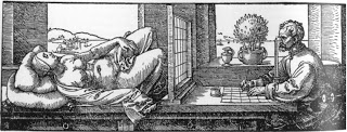
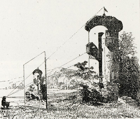
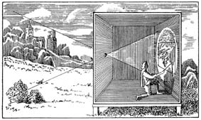
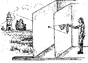
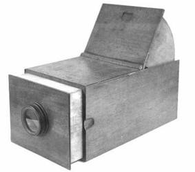
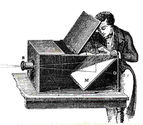
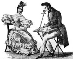
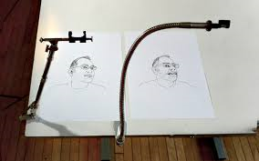
Below is a gallery illustrating the projections devices, like the camera obscura, used to create accurate representations. Top row we start with the use of a grid to help project an image. Next, we have whole rooms used as pin-hole cameras, which project an image upside down. Mirrors and lens around the aperture can orient the image correctly, and sharpen definition, as in a SLR film camera. Devices like the camera-obscura, second row far right, made the creation of small drawings more practical; similar to tracing with tracing paper. The final images show the use of the camera lucida and some examples of the simple prismatic devise that creates ghost or double imaging of your subject to appear on the paper you are working on, allowing you to trace somewhat effectively. There is evidence to suggest Jean Auguste Dominique Ingres used the device for his portraiture, as many of the small preparatory drawings he produced look traced in parts. I've seen his drawings in drawing cabinets, and although it was a long time ago I seem to recall them look a bit contrived. I have purchased a NeoLucida (see final image), a contemporary version of the old camera lucida, and although it is an interesting device for demonstrating projection devices it is supremely limiting for anyone who can actually draw. Ingres would have been trained to draw well. So why might he have used it? I can only speculate that he would have used it for the same reason artists today, myself included, don't hesitate to use light tables, tracing, photo copy enlargements, SketchUp 3D programs, 'Edit/Transform' tools in Photoshop, and 'Lucy' projectors. To save time. Time is money, and productivity is money. Even if you can draw well, these technologies can quickly correct errors. A camera lucida would have made short work of the task of making an accurate likeness of a person for Ingres, and his portrait work would probably have been his bread and butter and something he had to 'crank out' to make a living from. Click on images to enlarge somewhat.
It has probably been overlooked by art historians just how much technology many painters on the historical record developed and applied on their creations. David Hockney has written an excellent book on the subject called 'Secret Knowledge: Rediscovering the lost techniques of the old masters'. As well there is an excellent documentary film out called 'Tim's Vermeer' about an 'inventor' who not only reproduces a Vermeer painting but actually reproduces the whole room that Vermeer used to paint from and attempts to duplicate the technology that Vermeer almost certainly used to assist in making his beautiful work. There is a link to the Hockney book on Amazon HERE. And here's a link to the movie 'Tim's Vermeer' HERE.
Below is a gallery illustrating the projections devices, like the camera obscura, used to create accurate representations. Top row we start with the use of a grid to help project an image. Next, we have whole rooms used as pin-hole cameras, which project an image upside down. Mirrors and lens around the aperture can orient the image correctly, and sharpen definition, as in a SLR film camera. Devices like the camera-obscura, second row far right, made the creation of small drawings more practical; similar to tracing with tracing paper. The final images show the use of the camera lucida and some examples of the simple prismatic devise that creates ghost or double imaging of your subject to appear on the paper you are working on, allowing you to trace somewhat effectively. There is evidence to suggest Jean Auguste Dominique Ingres used the device for his portraiture, as many of the small preparatory drawings he produced look traced in parts. I've seen his drawings in drawing cabinets, and although it was a long time ago I seem to recall them look a bit contrived. I have purchased a NeoLucida (see final image), a contemporary version of the old camera lucida, and although it is an interesting device for demonstrating projection devices it is supremely limiting for anyone who can actually draw. Ingres would have been trained to draw well. So why might he have used it? I can only speculate that he would have used it for the same reason artists today, myself included, don't hesitate to use light tables, tracing, photo copy enlargements, SketchUp 3D programs, 'Edit/Transform' tools in Photoshop, and 'Lucy' projectors. To save time. Time is money, and productivity is money. Even if you can draw well, these technologies can quickly correct errors. A camera lucida would have made short work of the task of making an accurate likeness of a person for Ingres, and his portrait work would probably have been his bread and butter and something he had to 'crank out' to make a living from. Click on images to enlarge somewhat.
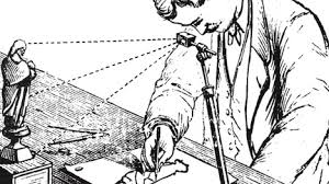


While on the subject of using projectors to obtain proportionally accurate imagery, it's worth pointing out that our 'eyeballing', or 'sighting', is a semi mechanical way of working that is similar to projection. We are basically imagining a transparent surface, like a sheet of glass, at arms length, upon which a smaller version of our subject is projected, and are then taking measurements from that imagined plane and projection and transferring them to our paper.
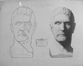
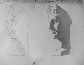
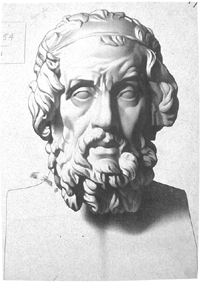
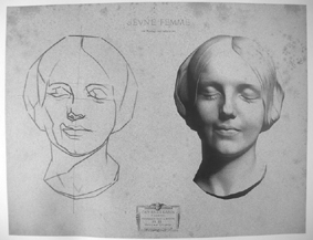
In recent decades there has been an 'art renewal' movement to bring back traditional drawing (and painting) methods from very early in the 20th Century and the 19th Century, methods used in the so called 'academic' ateliers and schools. These fairly rote and inflexible traditional art educations involved meticulous copying of drawings and plaster casts. Charles Barque was one of the primary artists who developed a widely distributed drawing program based on a technique called 'sight sizing' from plaster casts and portfolios of lithographs of mainly classical sculpture. The sight sizing technique is really a variation of our more casual 'eyeballing'. Using it, your subject, usually a drawing or sculpture or model, is placed beside your paper and from a prescribed distance, using string and plum line, the observer meticulously takes measurements from the subject and plots them on the paper. As a result of working from a distance there is little distortion caused by forced perspective. This method is intriguing, but it's barque might be worse than it's bite.
Take a look at the slide show below and you can see some of the results of this interesting, but extremely tedious, way of drawing accurately. Personally I'd probably string myself up with the plumb line before I finished to escape the boredom of the method!
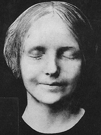
(Interestingly, as a result of my interest in plaster casts and death masks, when looking at the finished drawings of busts, I recognized one of them. The plaster cast was of a unknown Parisian woman who drowned in the Seine that had a mask made of her. You will see a photo of her or her death mask at the end of the slideshow. Below is a quote from Wikipedia regarding the mask and the person. As you will read below, her anonymous face became an archetype of a drowning victim.
"One mask, known as L'Inconnue de la Seine, recorded the face of an unidentified young woman who, around the age of sixteen, according to one man's story, had been found drowned in the Seine River at Paris, France around the late 1880s. A morgue worker made a cast of her face, saying "Her beauty was breathtaking, and showed few signs of distress at the time of passing. So bewitching that I knew beauty as such must be preserved." The cast was also compared to Mona Lisa, and other famous paintings and sculptures. In the following years, copies of the mask became a fashionable fixture in Parisian Bohemian society.
The face of Resusci Anne, the world’s first CPR training mannequin, introduced in 1960, was modeled after L'Inconnue de la Seine".
The last image is a photograph of the original corps, and just prior to it is a drawing from a plaster cast.)
In recent decades there has been an 'art renewal' movement to bring back traditional drawing (and painting) methods from very early in the 20th Century and the 19th Century, methods used in the so called 'academic' ateliers and schools. These fairly rote and inflexible traditional art educations involved meticulous copying of drawings and plaster casts. Charles Barque was one of the primary artists who developed a widely distributed drawing program based on a technique called 'sight sizing' from plaster casts and portfolios of lithographs of mainly classical sculpture. The sight sizing technique is really a variation of our more casual 'eyeballing'. Using it, your subject, usually a drawing or sculpture or model, is placed beside your paper and from a prescribed distance, using string and plum line, the observer meticulously takes measurements from the subject and plots them on the paper. As a result of working from a distance there is little distortion caused by forced perspective. This method is intriguing, but it's barque might be worse than it's bite.
Take a look at the slide show below and you can see some of the results of this interesting, but extremely tedious, way of drawing accurately. Personally I'd probably string myself up with the plumb line before I finished to escape the boredom of the method!
(Interestingly, as a result of my interest in plaster casts and death masks, when looking at the finished drawings of busts, I recognized one of them. The plaster cast was of a unknown Parisian woman who drowned in the Seine that had a mask made of her. You will see a photo of her or her death mask at the end of the slideshow. Below is a quote from Wikipedia regarding the mask and the person. As you will read below, her anonymous face became an archetype of a drowning victim.
"One mask, known as L'Inconnue de la Seine, recorded the face of an unidentified young woman who, around the age of sixteen, according to one man's story, had been found drowned in the Seine River at Paris, France around the late 1880s. A morgue worker made a cast of her face, saying "Her beauty was breathtaking, and showed few signs of distress at the time of passing. So bewitching that I knew beauty as such must be preserved." The cast was also compared to Mona Lisa, and other famous paintings and sculptures. In the following years, copies of the mask became a fashionable fixture in Parisian Bohemian society.
The face of Resusci Anne, the world’s first CPR training mannequin, introduced in 1960, was modeled after L'Inconnue de la Seine".
The last image is a photograph of the original corps, and just prior to it is a drawing from a plaster cast.)

Another quick aside on describing the world in an accurate drawing. This involves creating a grid with which to look through and see the world. It's is very similar to projecting perspective. Many plein air artists make little frames with grids of wire or fishing line criss-crossing through their center, with which they can hold in a fixed position and view a subject and, sketching the grid on their paper, break down and measure their drawing process with greater accuracy. By drawing a similar grid at a larger and appropriate ratio to match the size on their paper or canvas they can more easily transfer the visual information seen through the observational grid. In a way, it is very similar conceptually to what we are doing with eyeballing and sight-sizing. Under slightly different circumstances it can also be a way of creating a large drawing from a small drawing, of 'scaling it up'. You can draw a grid through a small drawing, redrawing a larger grid in the same ratios on a larger piece of paper or canvas, and then use the grid to assist with accurately enlarging the drawing. For example, if your grid squares are one inch and you scale them up to one foot in your new grid, your new drawing will be...much bigger. Think of having a small reference photograph that you want to transfer to a larger canvas. This is the method that you might use for the process.
Lets get back to perspective itself! Accurate perspective in a drawing creates an approximate representation of three dimensions on the flat two dimensional surface of your paper. The most obvious aspects of perspective are that objects get smaller the further they recede from our eye or from the surface of a two dimensional picture plane, and that individual objects are foreshortened. That is, an individual object will become smaller or shrink the further away it is. The foreshortening of an object is often a big stumbling block when artists try to render an accurate drawing.
When observational drawing, as we have seen, we can measure the angles and proportions of what we see and relay them to our paper with great accuracy. However, when drawing from our imagination or without reference we can use perspective grids, which are imaginary lines radiating from a vanishing point on the horizon. These imaginary lines are parallel to each other, but appear to merge at the edge of infinity on the horizon. They are often drawn and carefully constructed in elaborately rendered drawings for realistic painting.
When observational drawing, as we have seen, we can measure the angles and proportions of what we see and relay them to our paper with great accuracy. However, when drawing from our imagination or without reference we can use perspective grids, which are imaginary lines radiating from a vanishing point on the horizon. These imaginary lines are parallel to each other, but appear to merge at the edge of infinity on the horizon. They are often drawn and carefully constructed in elaborately rendered drawings for realistic painting.
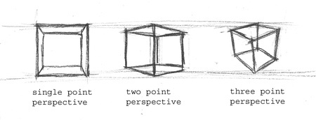
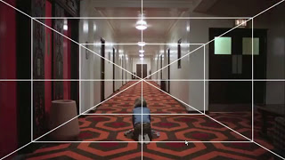
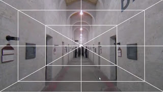
Single point perspective has just one vanishing point. One point perspective has us imagining only lines radiating from one point on the horizon, and we can only correctly place objects directly in the middle of our line of vision to the vanishing point. One point perspective is often limited in it's usefulness because we can't correctly rotate objects and see them in an aspect showing two sides. Nevertheless, taking note of one point perspective provides some understanding how perspective in general works and can actually be useful drawing in some situations such as rendering the middle of the inside of a room, an elevator shaft, or in between rails on a railway. Film directors like Stanley Kubrick used the symmetry of single point perspective to great effect in his movies. The occasional shot or sequence was underlain with a one point perspective structure that might draw attention to it at a subconscious level and sharpen the viewers attention to it. You can view an interesting video compilation of single point perspective scenes from the movies of Stanley Kubrick HERE.
Two Point Perspective solves the problem of placing objects off-center on the horizontal. By creating two vanishing points we can accurately draw both edges of a cube of the box.
Three point perspective. By adding a third vanishing point you can solve the problem of describing an object that is off-center on the vertical, as when you are significantly above or below your box.
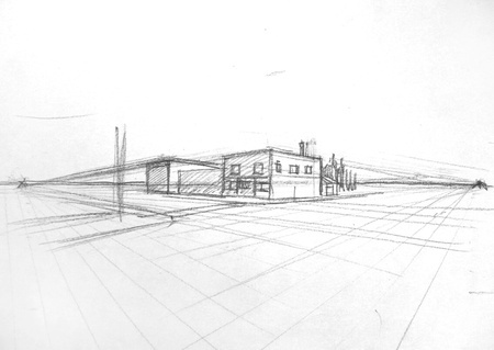
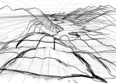
As valuable as building a perspective grid is, it can be unwieldy. Below is a sketch of a street corner, and you can see that if I just wanted to draw the building close up I would have to build a perspective grid on a much larger piece of paper. If you make yourself a very large perspective grid on a very large piece of paper, using a window or a light table you would be able to place a smaller piece of paper on the grid and make convincing drawings of an object in close up. For drawing and painting on location, measuring angles and proportions is still extremely valuable.
Two Point Perspective solves the problem of placing objects off-center on the horizontal. By creating two vanishing points we can accurately draw both edges of a cube of the box.
Three point perspective. By adding a third vanishing point you can solve the problem of describing an object that is off-center on the vertical, as when you are significantly above or below your box.
As valuable as building a perspective grid is, it can be unwieldy. Below is a sketch of a street corner, and you can see that if I just wanted to draw the building close up I would have to build a perspective grid on a much larger piece of paper. If you make yourself a very large perspective grid on a very large piece of paper, using a window or a light table you would be able to place a smaller piece of paper on the grid and make convincing drawings of an object in close up. For drawing and painting on location, measuring angles and proportions is still extremely valuable.
Parallel Perspective: Below are two representations of a cube pulled from SketchUp which show a two point perspective, left, and a parallel projection on right. In reality, the two lines that define opposite edges of the cube are parallel, but in the two point perspective the parallel horizontally oriented lines will all merge together at their respective vanishing points to create the illusion of depth and foreshortening as we actually perceive things. Notice that the vertical lines don't. In three point perspective they would. In single point perspective, only two sides of a cube will merge on the horizon.
In a parallel projection of perspective, we actually render an object on a two dimensional surface with the opposite edges still parallel. As a result the object has an odd appearance, often appearing wider at the back than at the front. In fact, if we saw all the world like this it would be a world that is even odder than the world we have, one so cluttered with objects there would be no horizon in sight. However, parallel projections are very useful for rendering individual objects, like a house, a car, a consumer product, a widget, or...a piece of jewelry. This is because you can measure one part against another with accuracy. For example, in the parallel projection the height of the cube front and back would be exactly the same.
In a parallel projection of perspective, we actually render an object on a two dimensional surface with the opposite edges still parallel. As a result the object has an odd appearance, often appearing wider at the back than at the front. In fact, if we saw all the world like this it would be a world that is even odder than the world we have, one so cluttered with objects there would be no horizon in sight. However, parallel projections are very useful for rendering individual objects, like a house, a car, a consumer product, a widget, or...a piece of jewelry. This is because you can measure one part against another with accuracy. For example, in the parallel projection the height of the cube front and back would be exactly the same.
As an aside, parallel perspective projections are often used in architectural rendering, in early video gaming objects, and you can also see it used in early attempts at perspective during the medieval period prior to the Renaissance.
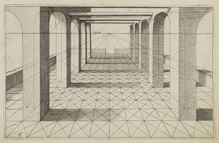
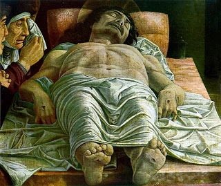
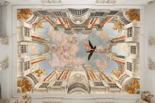
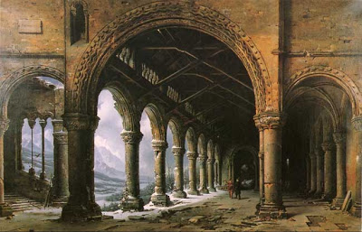
Below is a gallery that in the top row shows early, misunderstood, attempts at creating perspective on the left to an image by Giotto who almost 'gets it'. Second row shows examples of single point perspective from the Renaissance, including an image of the dead Christ by Uccello which...probably doesn't quite work. Feet and hands seem out of proportion to the head, as in a parallel projection. We then have a single point perspective used in a Baroque ceiling, and in Stanley Kubrick films. Fourth row down we see one point perspective employed by scenic painting by artist and chemist Louis Daguerre who invented the Daguerreotype and is credited with photographing the first human figure. Mid fourth row is a Rococo ceiling with no architecture but in which you can see the artist has paid attention to perspective nevertheless. Fourth row far right and fifth row there are a couple of photos and rough sketches of landscape showing how, even when observational drawing something as complex and organic as a landscape, one can imagine a perspective grid actually being draped over the landscape to help you understand exactly what you are observing and trying to describe. You can also see how valuable measuring angles and proportions can be in even landscape painting or drawing.
Below is a gallery that in the top row shows early, misunderstood, attempts at creating perspective on the left to an image by Giotto who almost 'gets it'. Second row shows examples of single point perspective from the Renaissance, including an image of the dead Christ by Uccello which...probably doesn't quite work. Feet and hands seem out of proportion to the head, as in a parallel projection. We then have a single point perspective used in a Baroque ceiling, and in Stanley Kubrick films. Fourth row down we see one point perspective employed by scenic painting by artist and chemist Louis Daguerre who invented the Daguerreotype and is credited with photographing the first human figure. Mid fourth row is a Rococo ceiling with no architecture but in which you can see the artist has paid attention to perspective nevertheless. Fourth row far right and fifth row there are a couple of photos and rough sketches of landscape showing how, even when observational drawing something as complex and organic as a landscape, one can imagine a perspective grid actually being draped over the landscape to help you understand exactly what you are observing and trying to describe. You can also see how valuable measuring angles and proportions can be in even landscape painting or drawing.


Although it appears that perspective was not really understood until the Renaissance, there must have been some understanding and consideration of it's effects prior to that time. I recall during art history studies reading of how the Byzantine Emperor in Constantinople had a palace built where his throne was at one end of a Basilica-like hall and the entrance was at the other. The elongated rectangular box, or basilica, that was the hall was actually smaller at the Emperor's end which of course had the effect of making the Emperor appear to his audience as larger than life. This is known as 'forced perspective'. Even gardeners can do this. By reducing the size of a pathway as it moves into the garden the garden itself can appear larger than in reality.
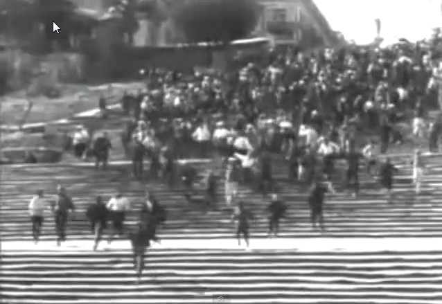
There are many examples of forced perspective with the use of models on sets in filmmaking, and even on location. The famous 'Potemkin Steps' or 'Odessa Steps' in the Black Sea port of Odessa are built similarly. These are the steps up from the harbour used in Sergei Eisenstein's great early 20th century silent film 'Battleship Potemkin'. As they rise up they get smaller at the top making them appear longer than they really are. When viewed straight on as below, the single point perspective is forced making them appear even more formidable than they actually are.
There are many examples of forced perspective with the use of models on sets in filmmaking, and even on location. The famous 'Potemkin Steps' or 'Odessa Steps' in the Black Sea port of Odessa are built similarly. These are the steps up from the harbour used in Sergei Eisenstein's great early 20th century silent film 'Battleship Potemkin'. As they rise up they get smaller at the top making them appear longer than they really are. When viewed straight on as below, the single point perspective is forced making them appear even more formidable than they actually are.
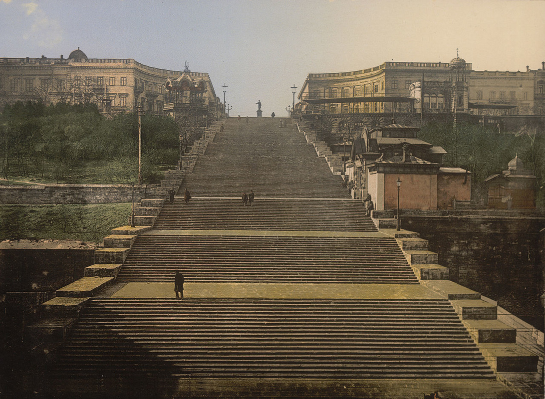
Below is a screen grab from Eisenstein's Odessa Steps sequence in his famous silent film Battleship Potemkin. He probably chose the steps because of their forced perspective, which made them, and the Czars troops engaging in the massacre, seem more intimidating. You can view a clip of the sequence on YouTube HERE. This sequence, including the part with the baby carriage with the baby aboard slowly and painfully picking up speed, has often been spoofed or referenced in later live action films, such as 'The Untouchables' and 'Brazil'. As well, Picasso referenced the screaming figure with the child in his Guernica mural, and Francis Bacon, the British figurative painter frequently referenced the film for his gaping screaming maws.
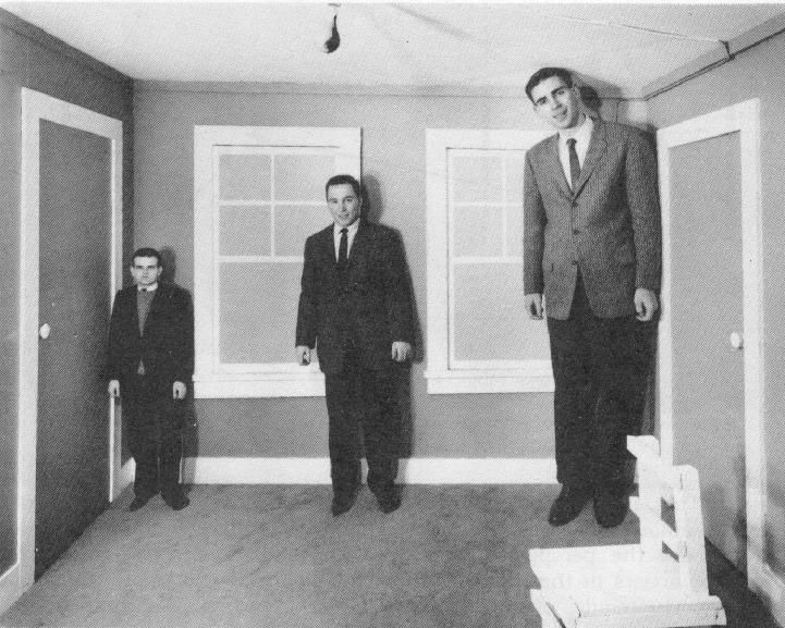
Another example of distorting perspective is the sort of thing you find in the so called 'Ames Room', which is built to distort perspective even more elaborately than simply forcing it.
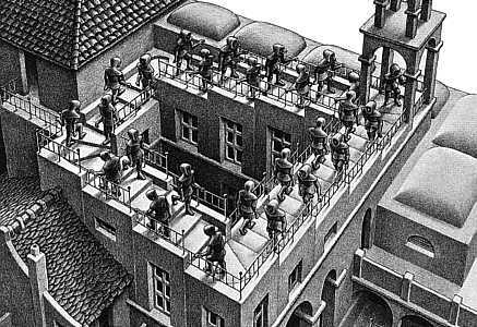
And finally, here's one more example of twisting linear perspective by actually twisting reality, the so-called Penrose Staircase or 'Escher Stairs'. There is a well circulated faked video of people supposedly negotiating an actual example of Penrose Escher Stairs, and you can find a video with some footage and an interview with one of the myth builders HERE. And below you can see the Dutch artist M.C. Escher's drawing or intaglio print of the Penrose Staircase.
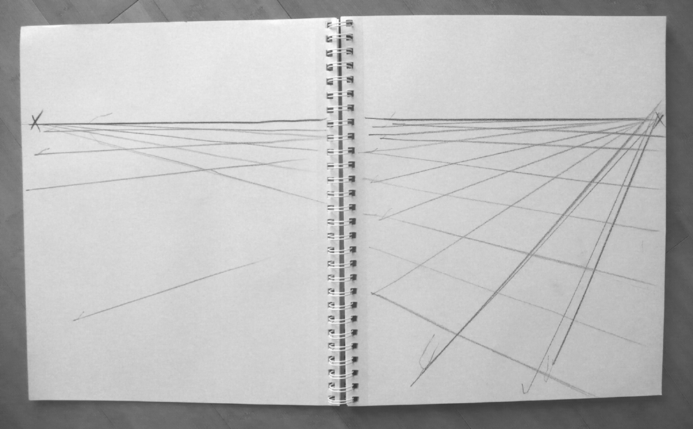
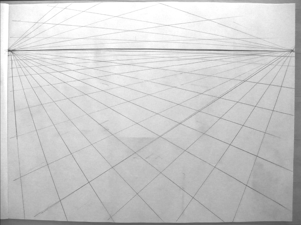
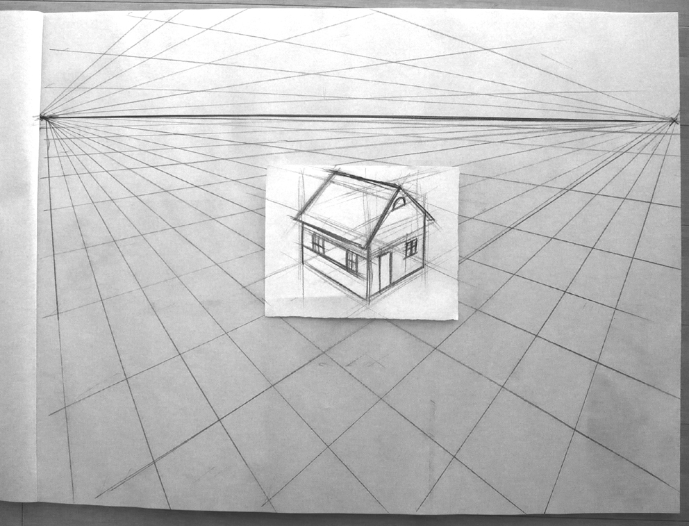
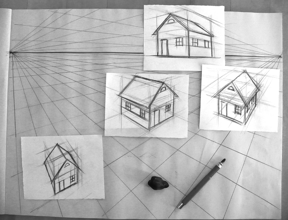
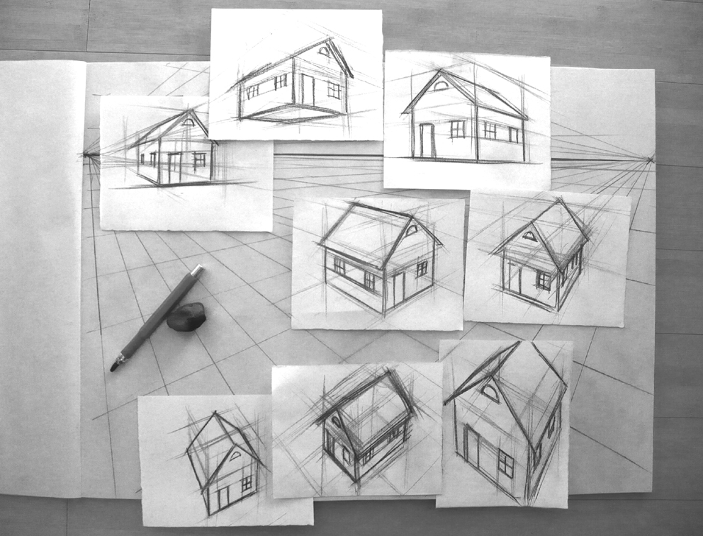
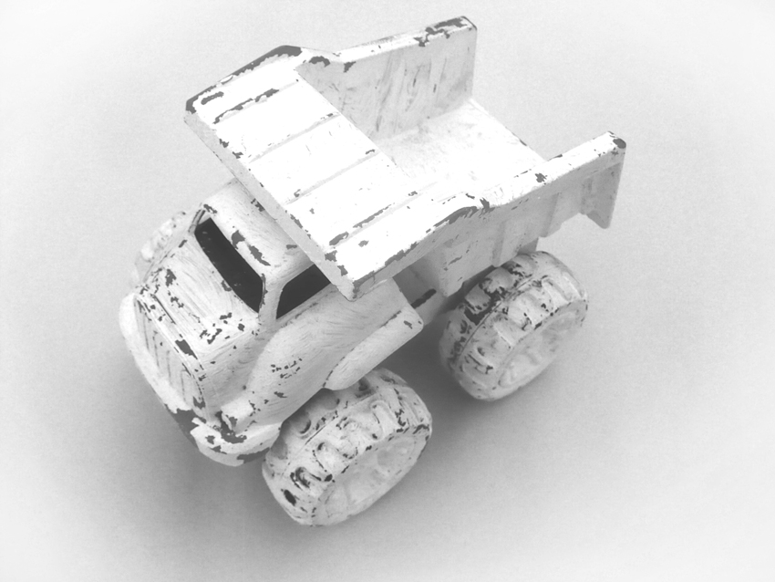
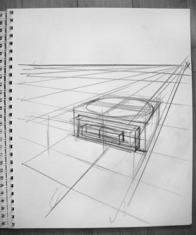
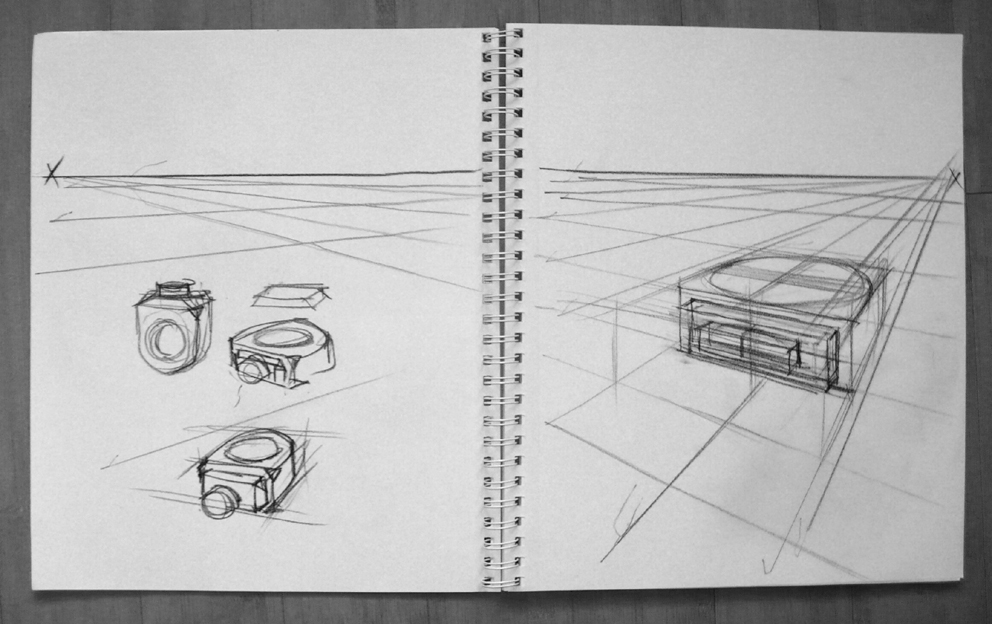
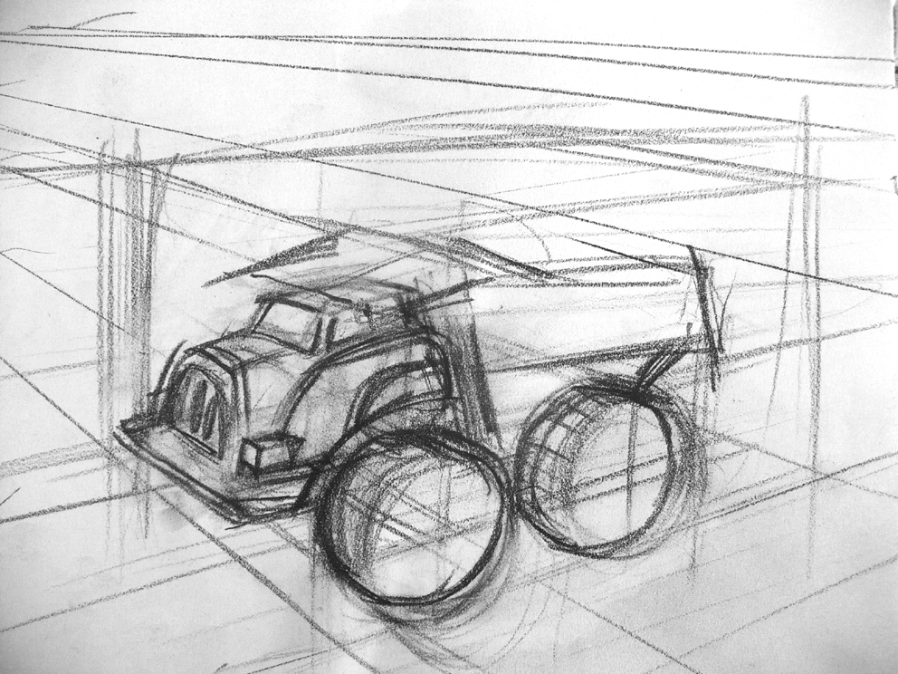
Back to the real world of linear perspective! So here's a suite of images illustrating just how you can build an object or scenario on a perspective grid. We'll be doing a fair bit of this in class. Top row you can see how you can expand your grid by establishing the vanishing points across two pages of a sketch pad. Using a perspective grid you can see below how you can draw, for example, a simple house from any aspect by locating in an appropriate spot on a perspective grid. We'll be looking at drawing the various aspects of an object straight on, the truck, for example, and see how we can then use the information to redraw the object on model from any 3/4 point of view using a perspective grid. The final images show how similar to a perspective grid drawing a simple SketchUp 3D rendered object looks when reduced to a line format and rotated. The example has a high convergence 'lens'.


It's worth considering that use of perspective can be highly expressive, as we saw in it's application by filmmaker Stanley Kubrick. Consider how comic book artists regularly use forced perspective or unusual points of view to create drama. Here is an online compilation, presumably made by a film buff or film instructor, of shots from Quentin Tarantino films that show points of view...perspective...from below, used to great effect. Click HERE.
To view a compelling series of clips assembled from work by filmmaker Wes Anderson that show how perspective and point of view from above are used, click HERE. Anderson, in these shots, has used perspective in terms of point-of-view, but has tended to flatten elements out, to actually diminish the effect of converging lines and perspective. The images in the sequence appear collage-like.
And here is some footage similarly assembled to illustrate many dramatic points of view from the television series Breaking Bad. Click HERE.
Finally, here is a clip that might show you how valuable an understanding and use of perspective would be to anyone working in the movie industry, and particularly in digital special effects when considering how contemporary film making collages/composits elements such as live action footage, photographs, matte paintings, and digital 3D models together. This is a very enjoyable clip to watch, see it HERE.
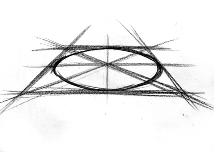
Drawing Cylinders; Containers and Drinking vessels
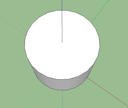
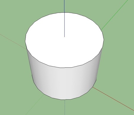
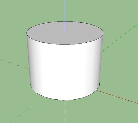
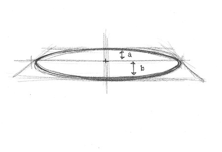
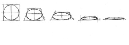
Still life is one of the classic art genres, and still life with glasses, cups and containers present the problem of accurately drawing the foreshortened circle we see on the top of cylinder shaped objects viewed from their sides. This is called an ellipse by artists. The gallery below starts with 2 technical schematics of just what an ellipse actually is in terms of geometry care of Wikipedia. Apparently a plane intersecting a cone is where you encounter an actual ellipse, and the two dimensional oval with all the unintelligible markings on it represents the area intersected by the plane removed from the cone. You'll notice that the the shape is symmetrical on an axis from 12 o'clock down to 6 o'clock, as well as form 9 to 3. This ellipse would work on a cylinder drawn in parallel projection, but this doesn't quite work for our purposes because it doesn't show foreshortening; it fails to express the converging lines of linear perspective. When we draw observed ellipses we'll have to try and factor in foreshortening as well. Below is a series of cylinders taken from SketchUp with two point perspective showing how as we tilt a cylinder, or raise it toward the horizon, the observed ellipse on top becomes more and more compressed. The sketches that follow at the bottoms show how we can try to factor in or estimate the effects of foreshortening on the ellipse by making distance 'a' somewhat smaller than distance 'b'. Apparently complex stuff when trying to explain it with words, but I hope that by hands on demonstration and practice in class and at home you will very quickly come to terms with these concepts.


Below are a series of drawings that try to express what we have to keep in mind and account for while describing ellipses. Notice how the distance 'a' is actually a bit shorter than the distance 'b'. This can be observed in reality. This is the effect of foreshortening. In a circle viewed straight on there is no difference between 'a' and 'b'. But as we lower the plane on which the circle is described the circle becomes elliptical until the plane forms a horizon at which point the ellipse becomes just a line. As we lower the circle and it becomes more and more foreshortened, the distance 'b' remains larger than distance 'a'.
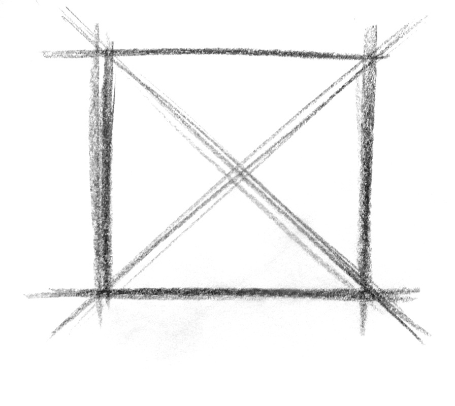
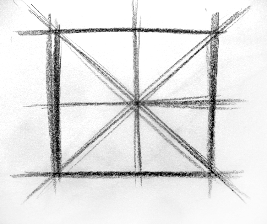
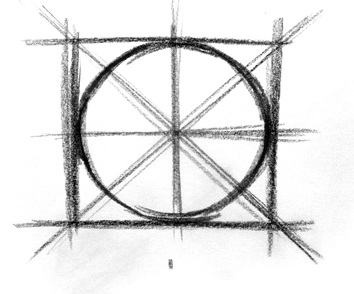
Before showing you how to describe an accurate looking ellipse, lets create a fairly accurate looking circle; see below. A way of drawing a good circle is to make a good square first (left). If you link the opposite corners of the square you'll find the centre of the circle (middle left). You can then draw a couple of extra cross hairs, which, if kept parallel to the edges of the square divide the square equally (middle right). Now you can describe four tangents that just kiss the edges of the square; little arcs that you can freehand as though your wrist were the point of a compass (right). Finally, you can finish describing the circle and make some visually assisted adjustments depending on the degree of accuracy required (bottom).


Ok. Now we want to describe an ellipse. We can do this similarly (below). Make, find on a perspective grid what appears to be a fairly correct foreshortened square (left), Link the corners with a line just as we did with the circle (middle left). Now we know the exact centre of the foreshortened square. If we create the cross hairs from the centre, keeping our lines parallel to the edges or converging correctly to the same vanishing point as the edges, you will notice that the near section of the square is somewhat wider than the far section, similar to the comparison between the 'a' and 'b' distances previously observed (middle right). Now we can draw the four little tangents similar to how we made them in the square (right). To finish up, we can complete describing a fairly accurate ellipse by linking the tangents with an appropriate arc (bottom). You will still need to do a bit of eyeballing to get a really polished ellipse, but the square and construction lines we have created will have been a great help.

In class we'll build perspective grids and mess around creating ellipses. These ellipses can be ever so useful in rendering. You can use them for the opening of vessels in a still life scenario, or for wheels on vehicles. Or flying saucers from and alien invasion force emerging over the horizon.
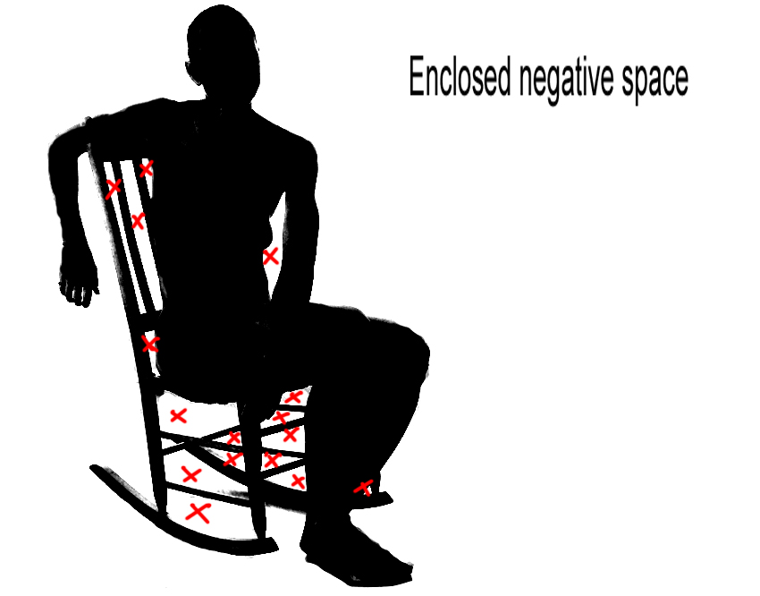
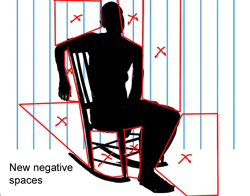
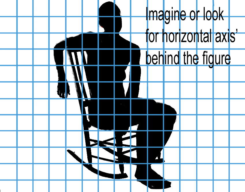
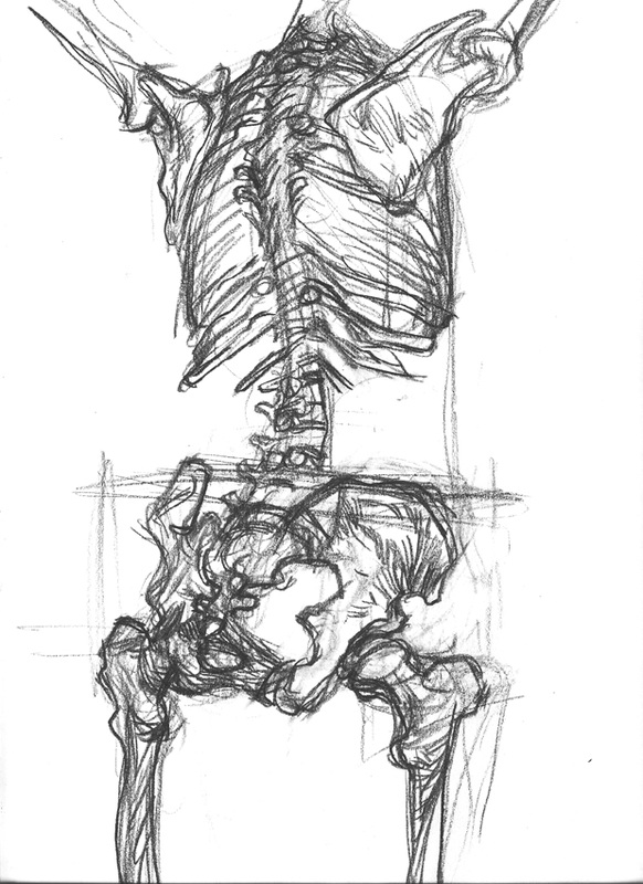
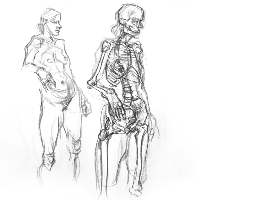
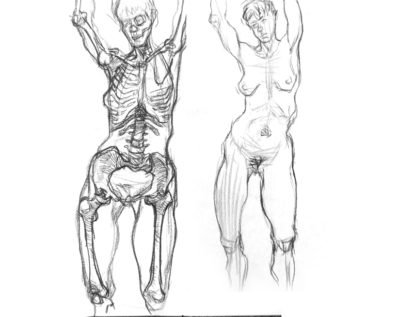
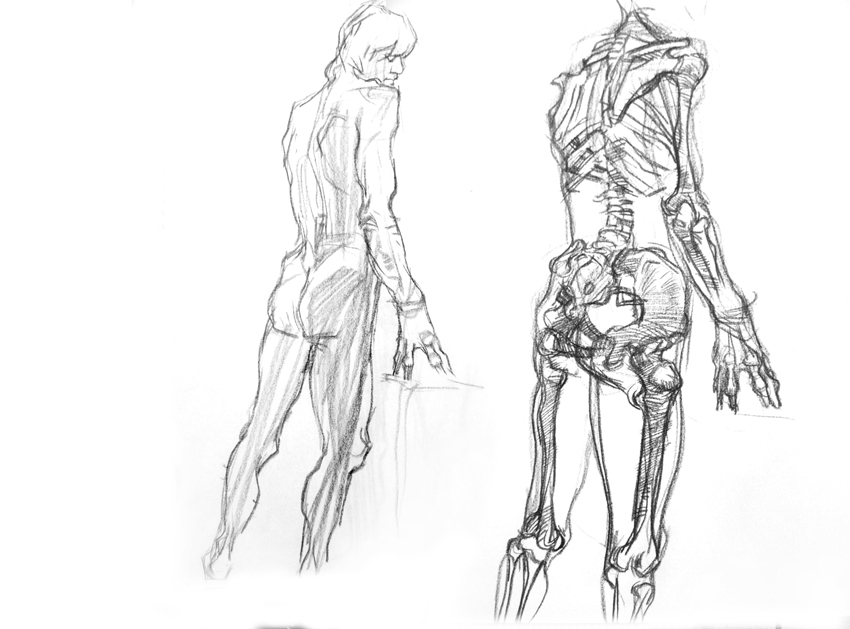
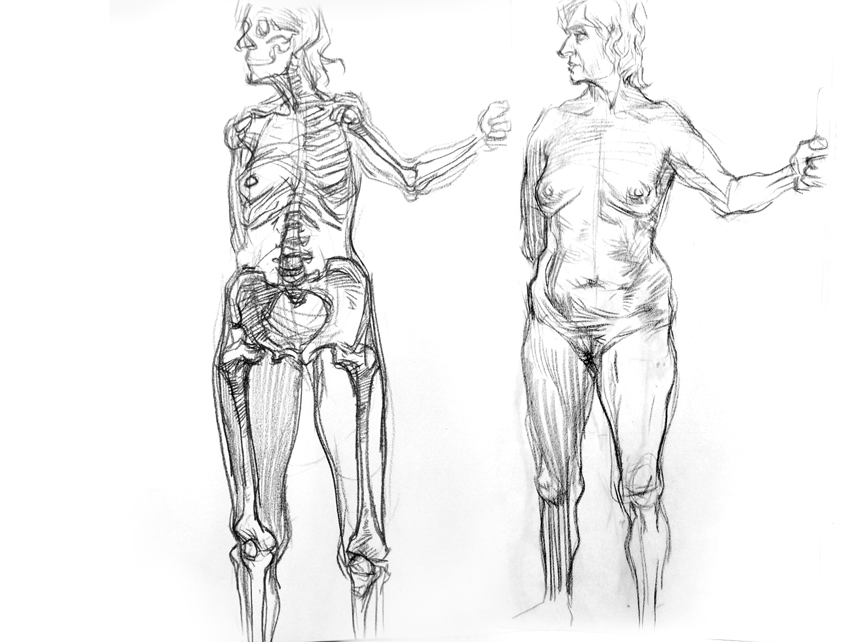
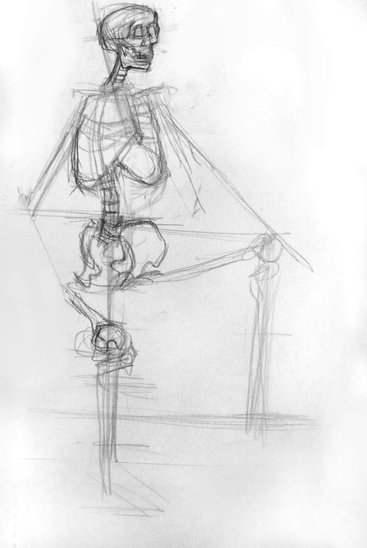
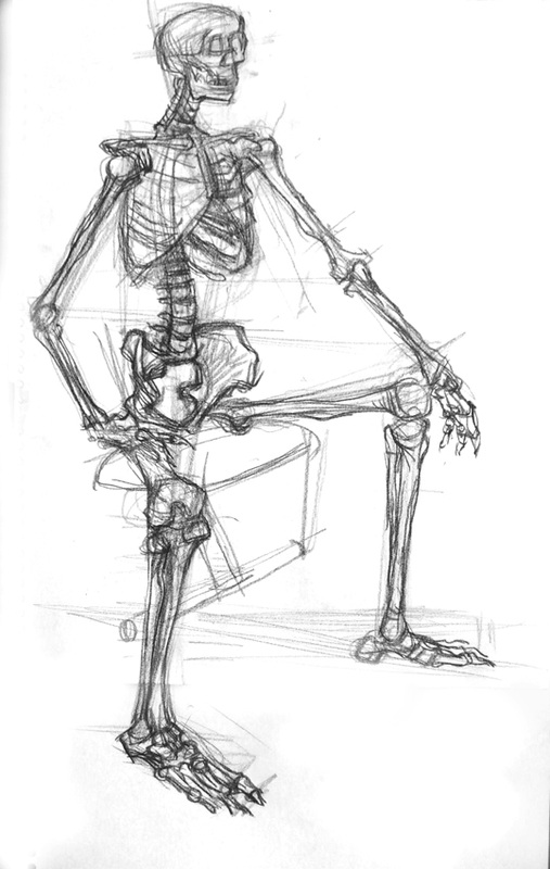
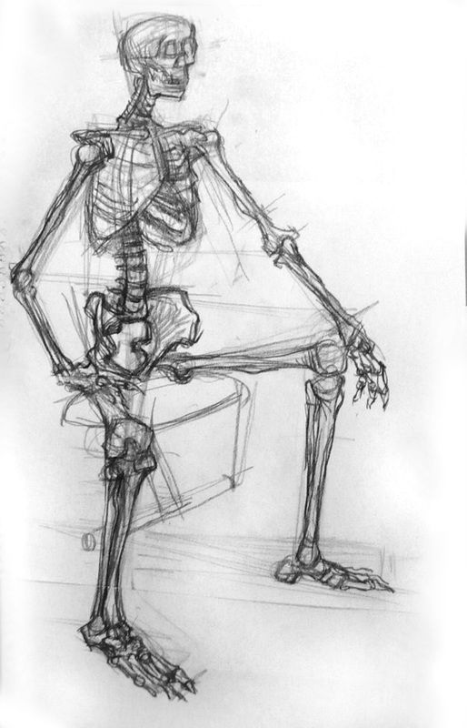
Negative and Positive Space and Drawing the Skeleton.
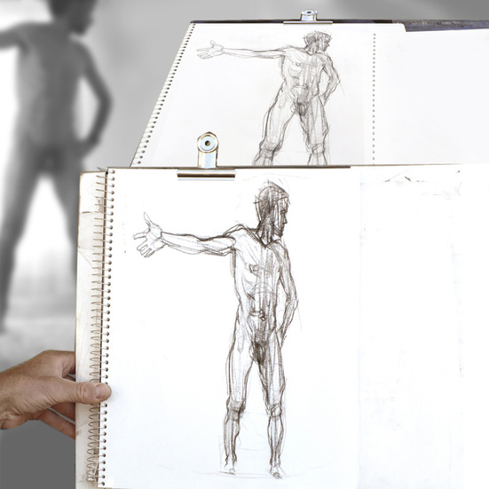
We will draw the skeleton before working from a nude model. Drawing the skeleton will give us some more practice measuring angles before we take the plunge to drawing the complexities of the full figure, and give us some clues to what is under the skin the in the same way that drawing the nude gives us clues to the structures under a figures clothing. Drawing the skeleton will also give us a chance to consider negative and positive space for constructing an accurate drawing. You're probably already aware of this simple concept which can help you see shapes outside of the 'positive' shape of the subject itself. Review the images below; start with the photo of the subject below left and then look at the positive shape in black. The white is the negative space. When observational drawing look behind your subject for vertical and horizontal axis's, like windows, door jams, corners of rooms; these can help you to establish a grid of sorts in your mind's eye to create negative spaces which can help you define the positive space of your subject more accurately. The gallery below will suggest ways of using negative space both real and fabricated to help you construct your drawing or double-check the accuracy of a drawing that you have free handed. Remember you can still start your drawing by measuring angles and proportions. You can measure the angles and proportions of the negative spaces as well positive spaces. Also look where vectors that you might have made in constructing your drawing project off into space or overlap other parts of the figure. As you check and double-check your angles and proportions, you can also compare how one part of the subject or another line up vertically. For example, the shoulder might be plum with the heel...


When you are measuring angles and proportions and developing your drawing of the skeleton, be careful not to become too distracted by detail. It is not essential to count the number of ribs in the rib cage. It is far more important to look at the ribcage as a whole, as a shape, almost like a wireframe object. In fact, you should be looking at the significant structures and modules that make up the skeleton, not the discrete parts that will risk confusing you if you set about describing them too soon. You should be counting the number of ribs when you are in the final stages of rendering the ribcage.
All through this course, but especially in this drawing session, we are going to concern ourselves primarily with exploring through a 'working drawing' rather than fretting about a finished product. Ironically, if we concentrate on the work in progress and not the finished product our final drawing will probably be all the more interesting and powerful. Drawing as exploring.
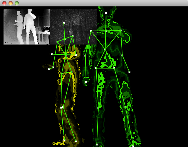
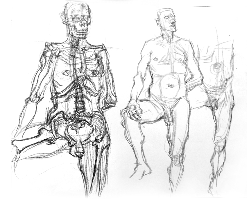
Below are three images with skeletal forms. Leonardo da Vinci spent an enormous amount of time cataloguing the skeletal and muscular structures of the human body as meticulous ink medical illustrations. Later, the anatomist Benard Albinus made highly detailed etchings that gradually layered muscules onto the skeleton, attempting to describe the way muscularture slips and folds and pleates into itself. If you continue drawing the figure, you will find that you will unconsciously begin to understand how this works, not in a full medical sense, but in a more casual but practical way. A final image shows vectors generated by a computer visioning program of some sort. It seems that, in order to make a machine understand what it is seeing, vectors need to be percieved amongst the confusing masses of form. Understanding the skeleton and it's placement can provide ready made vectors to help you describe a figure. The most basic of these you already know of course. The stick man.

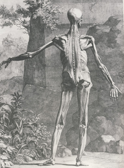
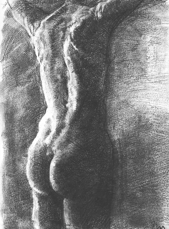
You can see by looking at the three drawings below, how useful it is to explore the skeleton. You can see how the skeleton manifests itself on the surface of the figure even in the drawing rendered with light and shade on the far right; you can clearly see the shoulder blade. In both the skeletal drawings, I've tried to just describe overall shapes, rather than get distracted by the clutter of individual bones. The drawings also illustrate the contrary properties of line and rendering of light and shade. Line is transparent and you can see through to other linear structures. A rendering is opaque. Each approach to describe form has it's merits.

Sometimes it is worthwhile to draw from life with a skeleton on hand and attempt to place the skeleton within the figure. The more you practice this the more aware you will become of skeletal landmarks manifesting themselves on the surface of your subject. Eventually you will be able to 'see' inner structures, that is, imagine them, from acquired knowledge. This ability seems parallel, somehow, to a machines ability to image. Imaging/Imagining. Not quite the same thing but somehow related.

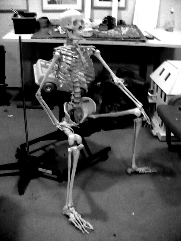
Below you can see a photo of the skeleton subject; and then rough indications of shapes, angles, proportions. You can see plumb lines that suggest how I have tried to line parts of the figure up with other parts. The larger and final image shows a the 'finished' drawing, which is necessarily rough due to time constraints and could best be described as a 'working drawing'. Personally, I find the aesthetic of working drawings more satisfying that those of tight finished drawings. I recall traditional 2D animators carefully studying rough animation of colleagues, and appreciating all the evidence of the struggle to describe form...moving form...that is, of course, lost in the final clean drawings and the 'inked (Xeroxed) and painted work that would go to camera. Yes, the head really is that small on Budget-Bucky plastic skeleton I bought from Candent Medical Supplies! Still, it was a bargain for the price.
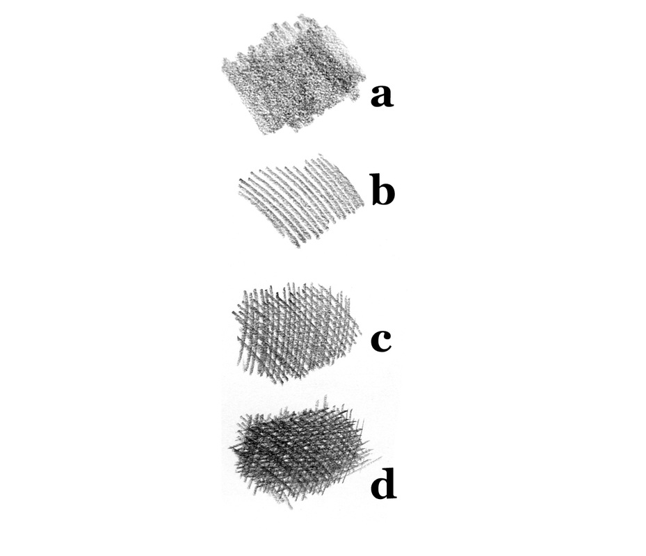
Shading and Rendering: Light and Shade Describing Form
Line drawing is very different from shaded or rendered drawing. Lines are 'transparent' and we can 'see through' them to the other side. As soon as we turn on the light (and shade) we create a sense of surface that is less penetrable. Most of our drawing in this class has used line only, but now we will devote a class to creating a sense of surface with light and shadow.
Once we have constructed our first drawing with line, we're going to do some simple shading on it. Here's a metaphor to help with the idea of light playing over form.
Look at the three images below. Lets imagine we are in a very very dimly lit room. We have a flat sheet of stiff black paper in front of us, Bristol board perhaps. Here's the sheet of black paper below us on a table which looks like the image on the far left. We see nothing but black
We then take the sheet of black paper, and we scrunch it up into a ball, creasing it mightily, and then we more or less flatten it out again. Of course, we can't make it flat. We can't see it very well, but feeling it in the dim room, we can tell that it now has relief, it has creases, parts coming towards us, parts receding, parts facing one way, parts facing the other and everything in between. If we could see it clearly, it might actually look like topography, a mountainous landscape viewed from high above. But, as you can see below, in the middle image, the room is so dimly lit and we can only vaguely get a hint of the topography by using our eyes.
We need a way of revealing, or imaging the topography, the relief, of the paper to make it visible. Lets imagine we have a can of white spray paint. We take it and spray it, left to right, at a low angle almost parallel to the bumpy surface of the paper. We spray in long sweeps along the bristol board the surface is revealed, even in the dim light of the room we are in. Hopefully we are wearing a mask when we do this. Any plane, or fascet of the topography that catches the spraypaint more directly catches more paint and is therefore lighter. Planes that catch the light, ooops, I mean spraypaint, less directly receive less of it and are therefore darker. Planes completely hidden from the spray of paint, in the shadow of extreme relief, in the lee of the mountains, so to speak, receive no light...I mean paint... at all and are left pure black. If that spraypaint were photons behaving like particles (and not waves) it would be behaving in very much the same way as light striking form.


Below you can see a few examples form being described by light and shade. Top left is on a topographic map. The light appears to be striking the surface of the topography from around 11 o'clock and describes landforms very effectively. Top middle is a rendered drawing of the body, which is, of course, topography of sorts. The remaining examples are from film, specifically the Ridley Scott movie Bladerunner. I'll venture an opinion that the traditional European oil painting tradition which has an extremely theatrical quality with carefully nuanced theatrical lighting schemes has merged almost seamlessly with the cinematic tradition. Cinematographers study lighting schemes found in art, as well as having a strong understanding of perspective applied through the use of various lens. As visual artists interested in studying drawing and painting it would serve us well not just to study drawing and painting but also film. An enormous amount can be learned about painting from film, and many of the best filmmakers began their study of things visual by studying drawing and painting. I was once doing a demo and explaining that I show a lot of screen grabs from film to my students, for example, from Ridley Scott films like Bladerunner, and that filmmakers had a lot of the same skills as painters. An older person in the group put up his hand and said that he agreed, that he had in fact been at Hartlepool College of Art in the UK with R. Scott and that he was, in his opinion, the best painter and most talented artist of the class.
|
Below are some images showing a comparison between film and traditional oil painting. Bottom left is a painting by Jean Raoux (died 1734) and the middle and right images are from Jane Campion's visually stunning movie Brightstar. The laws of lighting are universal, so it would not be surprising if the art director or cinematographer had never seen the paintings of Jean Raoux. However, it would not be surprising if they had either, as the similarities are astonishing. What is certain is that both Raoux and the filmmakers worked very hard to establish lavish and nuanced lighting schemes for their interior imagery. I rarely watch a film or television series without wanting to pause a film and take in all of the effort that went into communicating visually by playing light and shade on form. This is exactly what we will be doing in this class.
As we look at the pictures below this would also be a good time to introduce the idea of reflected light. Notice how, in both the painting and the middle photographic image, the face is not illuminated directly, but rather indirectly. In fact, in the figure on the far left of the painting it is the back of the neck that is illuminated directly. The face is lit by light bouncing off the surface of the book and re-illuminating the face. The face is being lit by a secondary light source. The back is being lit by the primary light source. In class I will illustrate the effect by holding up my arm to the projector so that one side is illuminated directly, but you will also see that the shade side of my arm is re-illuminated by bounced light from the screen. We mustn't allow ourselves to be confused into thinking that the bounced light is direct light. One of the wonderful effects of primary and bounced light sources is that it allows us to describe volume effectively. You have a brightly lit side and a dark 'core' and then a less intensely lit area. You can see the effect of this in the figure on the far left of the painting. |
|


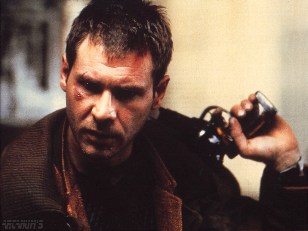

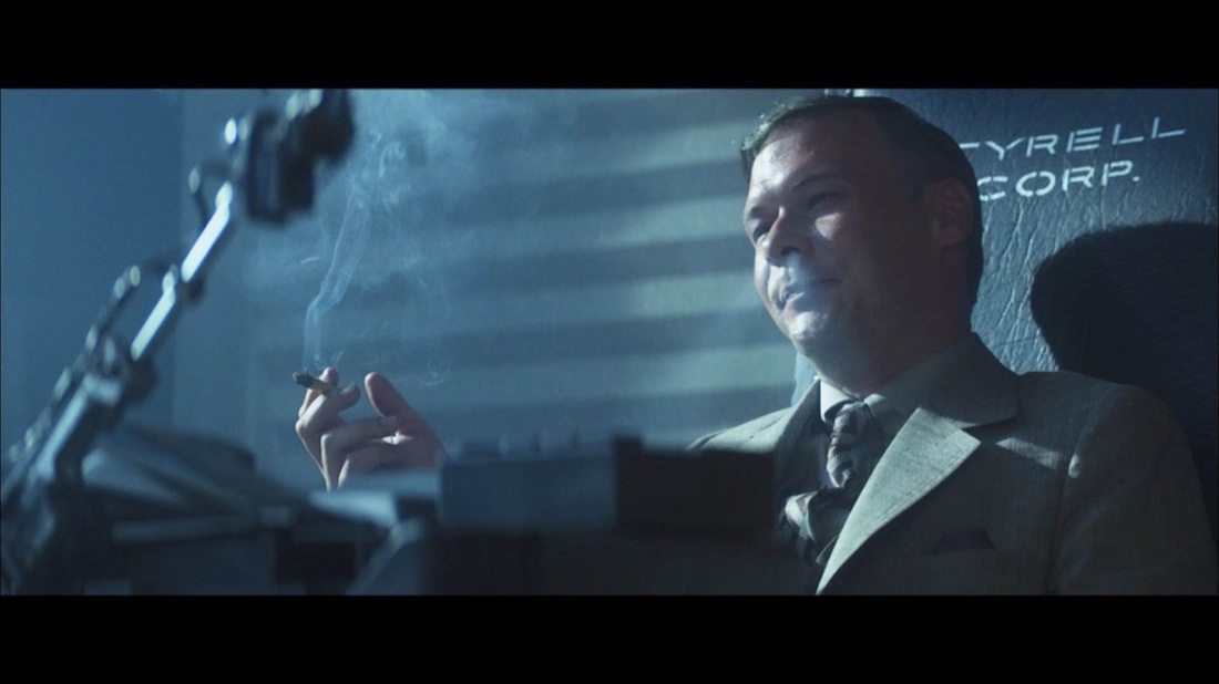


We are going to be drawing, so we will have the luxury of not being confused by local colour as we study the effect of light and shade on form. One of the biggest early challenges for a developing artist is learning how to discriminate between the effect of light and shade on form and the effects of local colour within lighting schemes. I try to address understanding this issue in a separate course in which we use watercolour to describe the effects of light and shade on form monochromatically, in a grisaille under painting, and apply local colour in transparent glazes after would. For now, we just concentrate on light and shade, and the colourless plaster casts allow us to truly concentrate on it's effects.
Getting back to primary and secondary lighting, take a look at the close ups below of some of the plaster casts we'll be working on to describe light and shade on form in class. You can clearly see the dark core in the centre of the two faces created by the intense primary light source striking one side and the less intense secondary bounced light source striking the shade side. In the hand plaster cast, you can see the dark core on the fingers. The illuminated side of the fingers bounces light on the shade side of other fingers. On the thumb, which is completely in shade an object out of field illuminates the shade side and then a tertiary light source is created...very faint, by bounced light bouncing off the index finger! Watch for sort of thing very carefully when drawing.
Getting back to primary and secondary lighting, take a look at the close ups below of some of the plaster casts we'll be working on to describe light and shade on form in class. You can clearly see the dark core in the centre of the two faces created by the intense primary light source striking one side and the less intense secondary bounced light source striking the shade side. In the hand plaster cast, you can see the dark core on the fingers. The illuminated side of the fingers bounces light on the shade side of other fingers. On the thumb, which is completely in shade an object out of field illuminates the shade side and then a tertiary light source is created...very faint, by bounced light bouncing off the index finger! Watch for sort of thing very carefully when drawing.
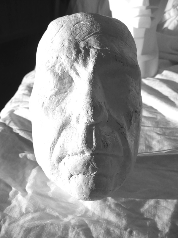
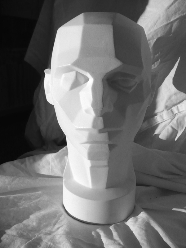
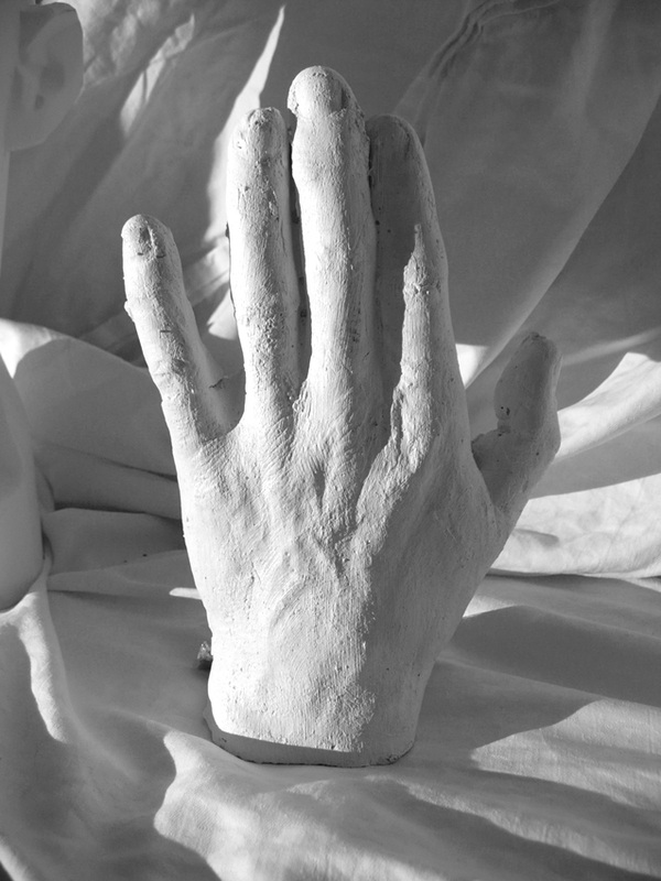
An Aside on Relief
In class we are going to be illuminating our subject by raking light across it. This is an effective way to describe form. Another way is to describe form by relief modelling. Below top left we see a drawing of the back in a hatching technique. In this drawing, it is as if our eyes are in the vicinity of the light source. As the surfaces, or planes, on our subject turn away from our eyes they become darker, that is, more shaded. The CGI model of the head illustrates this even more clearly. It's the same sort of 'lighting' we see in the ultrasound of the fetus top right. You can see clearly that the planes that face you are lightest. This type of light is usually the default lighting scheme in 3D computer modelling programs; bottom left you can see a modelled figure lit in relief. It's called relief after 'relief sculpture', that is sculpture not fully in the round, bottom middle example. Bottom right is a sculpture in the round. Relief sculpture can describe form very effectively, even though not in the round, when lit directly as in relief modelling...when the planes darken as they turn away from the viewer.
In class we are going to be illuminating our subject by raking light across it. This is an effective way to describe form. Another way is to describe form by relief modelling. Below top left we see a drawing of the back in a hatching technique. In this drawing, it is as if our eyes are in the vicinity of the light source. As the surfaces, or planes, on our subject turn away from our eyes they become darker, that is, more shaded. The CGI model of the head illustrates this even more clearly. It's the same sort of 'lighting' we see in the ultrasound of the fetus top right. You can see clearly that the planes that face you are lightest. This type of light is usually the default lighting scheme in 3D computer modelling programs; bottom left you can see a modelled figure lit in relief. It's called relief after 'relief sculpture', that is sculpture not fully in the round, bottom middle example. Bottom right is a sculpture in the round. Relief sculpture can describe form very effectively, even though not in the round, when lit directly as in relief modelling...when the planes darken as they turn away from the viewer.


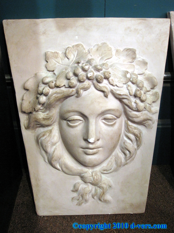
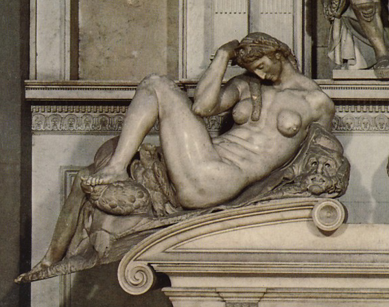
Below are a couple of images of a plaster cast of a torso we'll be using. They illustrate how careful consideration of lighting can reveal form and make an interesting image. On the left, the plaster cast is lit in relief without a focused, that is with a soft light source. You have a sense of the topography, but that sense is quite weak. However, when we use a focused light source that rakes across the topography, as in the photo on the right, the back the anatomy and structure of the back is quite shockingly revealed.
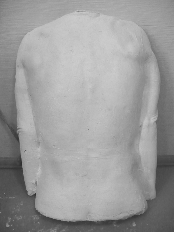
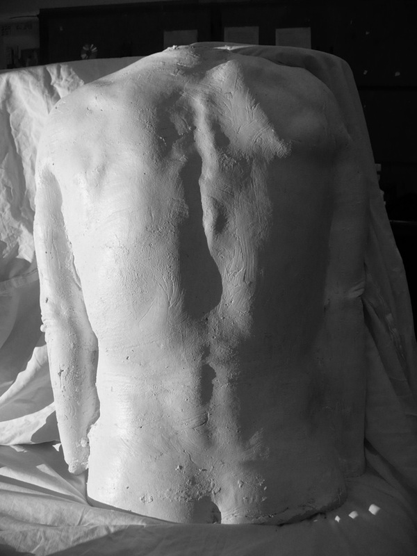
When you're drawing in class from the casts, you will have to work very hard to decide what is in light and shade. You will have to look carefully and actually make creative decisions about whether or not something is lit or not. The plaster casts, with no local colour, help this effort. But working from model you can easily be thrown by local colour, for example, the 'whites' of the eyes. It's only rarely the eyes are in light. Most light comes from above, and the eyeball is sunk under the brow and also under the lids. A common mistake of amateurs is to leave the whites of the eyes brightly lit creating an unnerving zombie effect. Go back and look at those Bladerunner screen grabs above, and see how the eyes are lit. In class we'll look closely at each other and see if in fact our eyeballs are lit; and we'll look at the 'value', in grey, of the whites of the eye. We will find the eyes aren't so white as we think.
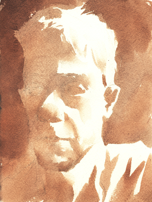
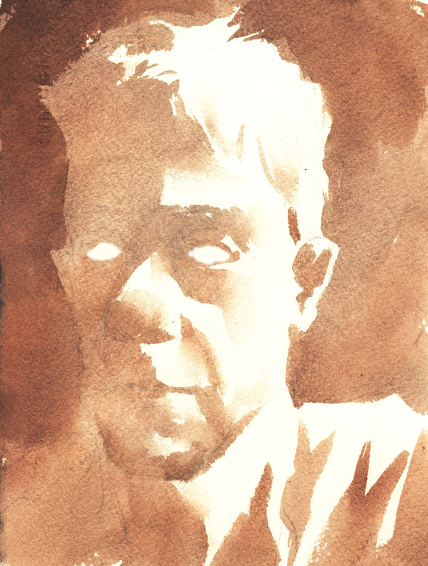
And now for something completely different. Look closely at the images below. There is virtually no sense of light and shade on any of the three images directly below. On the left we have a painting by Gustav Klimt, followed by a colour reproduction of a watercolour drawing/painting by Egon Schiele. Klimt's painting flat, graphic and poster-like. Schiele's painting is the same; there is some apparent colour modulation but when we translate the painting into pure value, or black and white, we can see it reads flat. Both these artists studied under a long tradition of painting, the same tradition of 'realism' that emphasised nuanced lighting. These artists were essentially rebelling against that tradition, pushing back at it, lavishing flat graphic poster-like qualities on their paintings that emphasised colour and texture. Schiele's pieces obviously want to emphasise the drawn aspects of his image. To render the figure in light and shade would subtract from his drawing prowess. Klimt's paintings, with their decorative graphic poster-like qualities to this day make them hot sellers as posters at art galleries and museums. There is a wide spectrum of application modulated light and shade vs. flat and graphic that you as an artist can modulate and choose to locate your image. You can choose to locate yourself and your imagery anywhere on that spectrum.
The bottom three paintings are by Lucien Freud. Freud often lights his subjects directly producing a harsh and disconcerting effect. Since there is little description of form with light and shade he exaggerates the local colour of his subjects. If you were to look closely at the faces and hands on Klimt's figures you would observe the same treatment. Both artists, but most notably Freud, in exaggerating the local colour of pale complexions, make their subjects look bruised, bloodshot, damaged. They look profoundly mortal. Take a look at yourself closely in a mirror under fluorescent ambient light. All those 'sickly' colours are there, especially amongst paler complexions during the winter months. The lighting treatment is very similar to the flooding, penetrating light of a flash camera. You can almost always tell a portrait painted from a flash photo reference, in the hands of an inexperienced artist it will usually appear very weak. If you are drawing and shading a portrait, think about your lighting when you pose the figure for the drawing or take photo reference. Think about the psychological effects of chiaroscuro and having light rake across your subjects face. Place sideways in a window for effect. If you want to use relief lighting, have them face the window. The Freud painting on the far right is starting to have some relief modelling become evident.
The bottom three paintings are by Lucien Freud. Freud often lights his subjects directly producing a harsh and disconcerting effect. Since there is little description of form with light and shade he exaggerates the local colour of his subjects. If you were to look closely at the faces and hands on Klimt's figures you would observe the same treatment. Both artists, but most notably Freud, in exaggerating the local colour of pale complexions, make their subjects look bruised, bloodshot, damaged. They look profoundly mortal. Take a look at yourself closely in a mirror under fluorescent ambient light. All those 'sickly' colours are there, especially amongst paler complexions during the winter months. The lighting treatment is very similar to the flooding, penetrating light of a flash camera. You can almost always tell a portrait painted from a flash photo reference, in the hands of an inexperienced artist it will usually appear very weak. If you are drawing and shading a portrait, think about your lighting when you pose the figure for the drawing or take photo reference. Think about the psychological effects of chiaroscuro and having light rake across your subjects face. Place sideways in a window for effect. If you want to use relief lighting, have them face the window. The Freud painting on the far right is starting to have some relief modelling become evident.
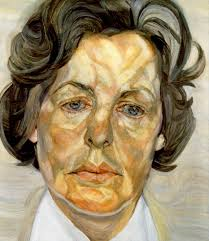
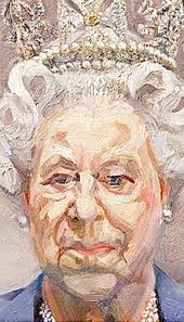
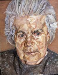
As a final aside, we can also see examples of these opposite lighting effects on the screen...television particularly. In film making or television with a reasonable budget, great effort is lavished on the lighting, which usually (but not always) models forms by having light and shade describe form in a way very similar to the 'traditional' painting model. This involves a lot of work. When television began filming (video) television sit-coms regularly there simply wasn't the time to establish complex lighting schemes. The solution was to 'flatten out' the lighting and carefully design the backgrounds and character colours (or values, as this was initially done in black and white) consistently throughout an episode. No effort for lighting was required from shot/scene to scene and the shows could be cranked out quickly. They discovered that without moody dark shadows the flatter lighting actually added to the levity of the production. Today, filmmakers might actually choose to use flat lighting to create levity, versus using dark moody lighting as in Bladerunner and other 'noir' films that use chiaroscuro and light and shadow extensively.
Below you can see an example of a still from a comedy sit-com (Friends) and a detective series (A Touch of Frost) each employing 'appropriate' lighting schemes. Of course, you will always find exceptions to this generalization. It's also worth noting that satire, and other darkly humorous productions, will often use very dramatic lighting; the third image on the right shows a still from Dr. Strangelove.
Below you can see an example of a still from a comedy sit-com (Friends) and a detective series (A Touch of Frost) each employing 'appropriate' lighting schemes. Of course, you will always find exceptions to this generalization. It's also worth noting that satire, and other darkly humorous productions, will often use very dramatic lighting; the third image on the right shows a still from Dr. Strangelove.

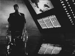
One reason for my deep personal interest in light and shade on form is a result of working for many years in animation as a background painter and art director. My job was to create a stage upon which interacting figures and narrative could take place. That place should, through lighting and colour, reflect the mood of the scene in which it is being used. We had to work in many different styles from production to production, and that included flat and graphic, reminiscent perhaps of the lighting treatment in sit-coms, in which there was little use for theatrical lighting. But much of the 'classic' background styling utilized nuanced modulated lighting schemes that set the stage for a drama. If you look at the backgrounds below, I think it will be clear where the action is taking place, even on the one bottom right in which the lighting scheme is fairly simple and graphic.
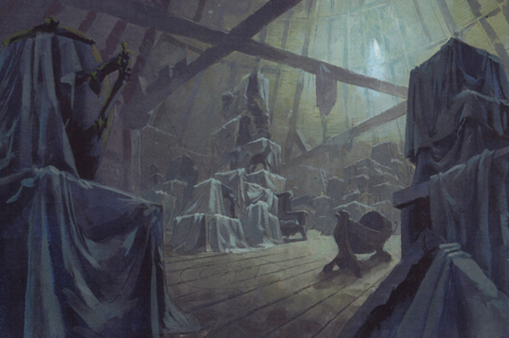


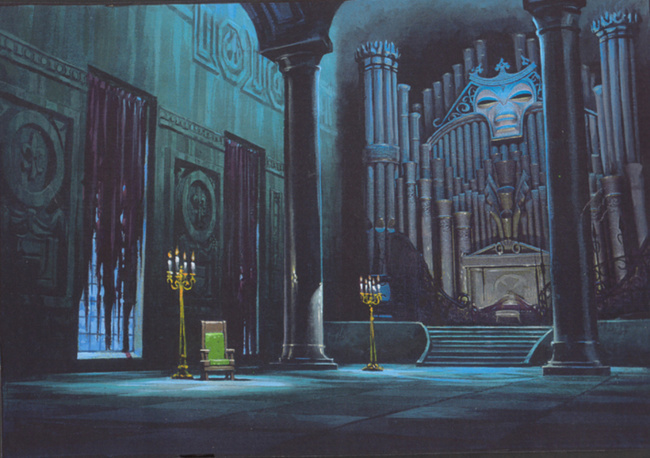


Below, take a look at some lighting comparisons between live action film, classic illustration, stage theatre, and classic European oil painting. Click on the N.C. Wyeth painting middle to make a comparison of the face between Harrison Ford in Bladerunner. Notice how the whites of the eyes do not catch any of the light falling from above. Compare these two to the young Rembrandt portrait, and how optically soft the eyes are, like soft watercolour blotches. On the second row below far left is a self portrait of Rembrandt in later life. Again, notice how soft the eyes are, and how the whites of the eyes, though visible, don't leap out at the viewer. Beside this portrait is a close of Rembrandt from Peter Greenaway's movie 'The Night Watch'. There can be little doubt that Greenaway and his cinematographer made a close study of the chiaroscuro light schemes found in the painters work. Greenaway often makes movies from stage plays, and his work has a very staged, theatrical feel to the lighting and often sparse sets. He lets the theatrical lighting do the work. It always amazes me how, at the theatre, you can be transmitted to the pool of light on stage, with it's sparse but carefully and lavishly lit set pieces. The next two images are photos of stage productions. Compare these to the image third row down centre which a scene from Barry Lyndon. The film employed special lenses that could capture candle light and expose sumptuous chiaroscuro lighting schemes reminiscent of theatrical oil paintings. The final four paintings in this sequence show some of these classical paintings that show great similarity to the film and theatre sets above them. There is work by David, Boilly, and Caravaggio.


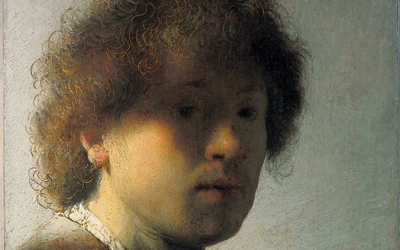
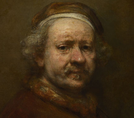
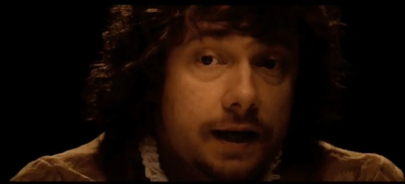
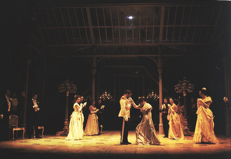

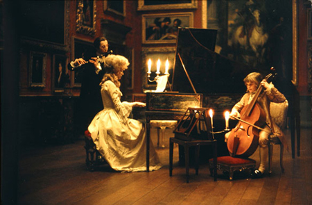

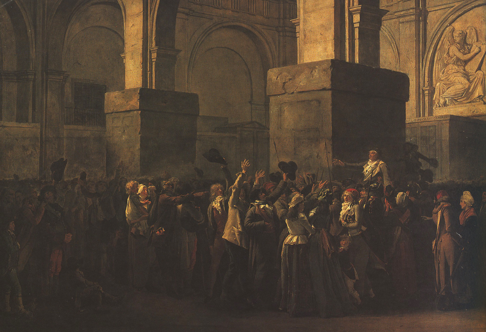
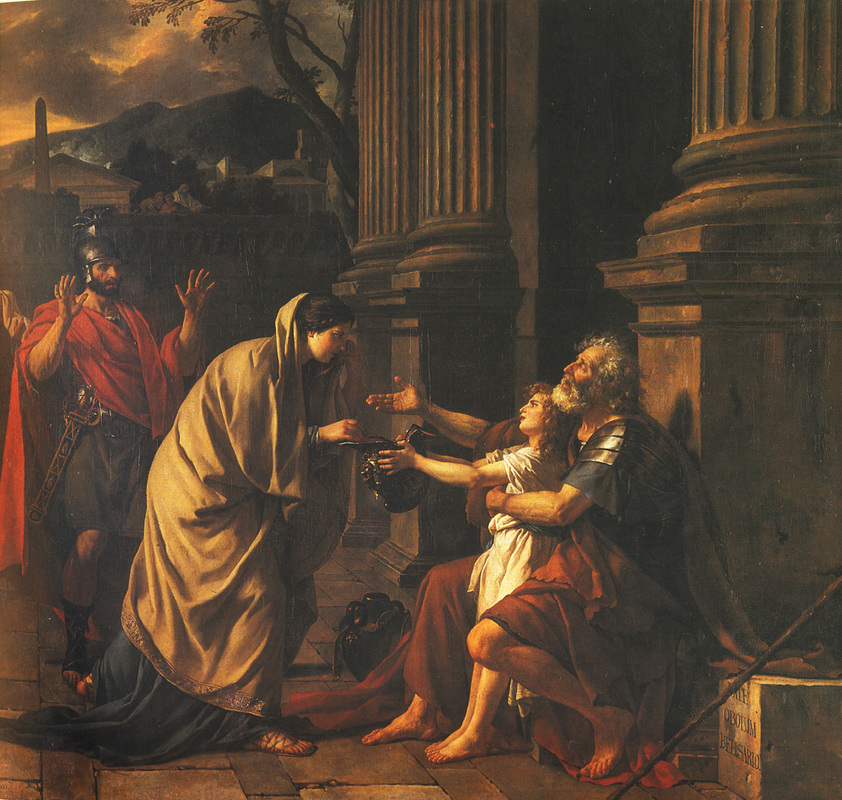

As a landscape painter, I have often looked to 19th Century Romantic landscapes for their strong sense of theatrical lighting. In them, the landscape is often divided into clearly allocated areas of light and shade. Foreground dark, middle ground light, background dark...this progression might continue deep into the picture frame, all the while with lights getting darker and darks getting lighter in order to create a sense of aerial perspective. Below are three landscapes I painted with a strong theatrical 19th Century style lighting schemes.
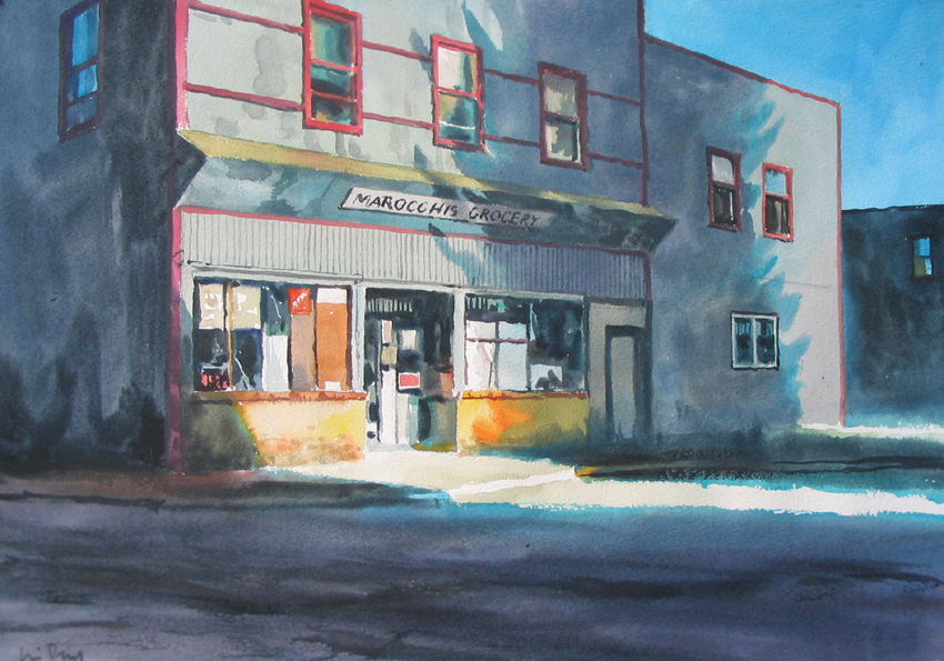


Below you can see, more or less, how our plaster casts will be arranged in class with light raking across them. Look closely, and you can see the bounced light on the shaded surface opposite to the surfaces catching the light directly.
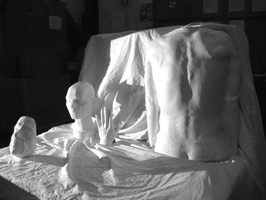
In our study of light and shade on form, once you've drawn your subjects on the page lightly with line, I'd like you make a 'value' scale on the side of page showing choices from white, the highest value, and black, your lowest or darkest value. Put a reasonable number of values in between. Your task will be to select a mid to light value an then shade everything that is darker than that value. You will be dividing your subject clearly into light and shade. You might later go back into the light and add some very light shaded value. But primarily, once you have finished the task of dividing your drawing into light and shade, you will be concentrating on darkening the darks.
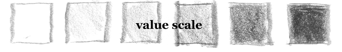
Here's the procedure applied to a very simple object; a ball. On the left you can see I took a mid to light value and covered everything that I didn't want to be in light. In the second finished image I've now added darks and a value slightly darker than pure white to areas initially described as light. Notice how, on the ball, you can clearly see light reflected from an unseen object out of scene. Now, you don't always need to employ this bounced light. If you imagine the ball as a head, a portrait, you will often see the shadow side fade to black, so to speak, particularly when the background is lighter than the planes furthest from the light. An interesting silhouette occurs when you choose to do this. But for this exercise we will look closely for bounced light to describe. Sometimes artists will actually add the bounced light even when not observable. The choice is yours. Something to note also is the happy coincidence of the high contrast between the dark core and the lit side of the ball. The area of the dark/light contrast is also the part of the ball closest to your eye. The contrast makes that part of the ball surge forward in the picture plane. If this image were of a human face, think of how useful it will be to increase the contrast on the nose, for example, to make it pull away from the face. The reduction of contrast in a lit object as it moves away from you is a very real phenomenon observable in, for example, the landscape around us. This will be dealt with in painting courses, but not extensively in this course. However, be aware that if you are rendering, in light and shade, two objects in space and one is nearer and the other further, you can reduce the contrast between light and dark on the further object to make it recede into the picture plane.
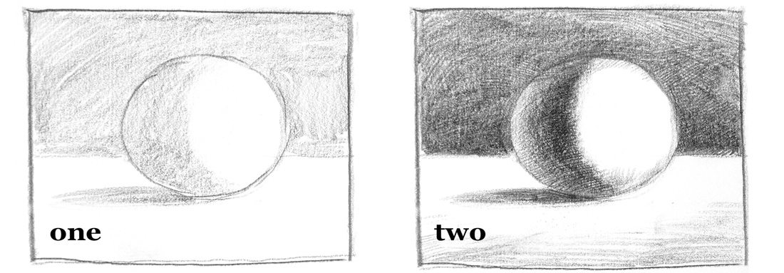
One last pointer. If you look at the finished drawing of the ball above, you can see a lot of cross hatching. I started shading the ball with the side of my crayon but eventually, when I had shaded a few values, I wanted to modulate the shading more subtly. So I began cross hatching on top of the side shading. You can shade purely with cross hatching, for example if your are drawing with an ink pen. Or shade just with the side of the crayon if you are using conte crayon. But you can also sharpen your crayon and lay on cross hatching textures as well. The hatching often creates a lovely, though arbitrary, sense of surface to your subject.