Painting the Figure in Watercolour
This studio course will briefly cover some useful basic drawing concepts and then apply them to watercolour painting from a nude figure. Working from a life model in watercolour is an exellent way to be introduced to painting in general, as the medium demands that we take great effort to understand the effect of light and shade on form seperate from local colour. Initially working monochromatically to describe light and shade on form, glazes of the local colour will then be applied to create a convincing representation of the figure. As well as this considered approach to developing a watercolour figure painting, time will be set aside to work alla prima for spontaneous quick studies to explore the possibilities of the watercolour medium. There will be ongoing painting demonstrations alongside you as you work, and brief slideshows to illustrate concepts during model breaks.
This studio course will briefly cover some useful basic drawing concepts and then apply them to watercolour painting from a nude figure. Working from a life model in watercolour is an exellent way to be introduced to painting in general, as the medium demands that we take great effort to understand the effect of light and shade on form seperate from local colour. Initially working monochromatically to describe light and shade on form, glazes of the local colour will then be applied to create a convincing representation of the figure. As well as this considered approach to developing a watercolour figure painting, time will be set aside to work alla prima for spontaneous quick studies to explore the possibilities of the watercolour medium. There will be ongoing painting demonstrations alongside you as you work, and brief slideshows to illustrate concepts during model breaks.
This course begins with the assumption that you have some experience and competence with drawing. Working with line, you will know how to measure angles and proportions and construct an accurate representation of your subject. You will also have spent some time rendering and modelling light and shade on form and have some understanding of how light describes form.
If you're not comfortable with these concepts, or would like to review them, hover your curser over 'MORE' on the title bar at the top of this page and click on 'Drawing: The Basics/Drawing and Rendering for Metal Jewelry Designers.
At the beginning of this course, we will quickly review in class some of the concepts covered in 'Drawing: The Basics', and pay particular attention to considering how light and shadow describes form. We'll also review the concept of light and shade here on this page below.
Shading and Rendering: Light and Shade Describing Form
Once we have constructed our drawing with line, we're going to try and ignore local colour and apply monochromatic watercolour washes to suggest a strong sense of light and shade. Here's a metaphor to help with the idea of light playing over form.
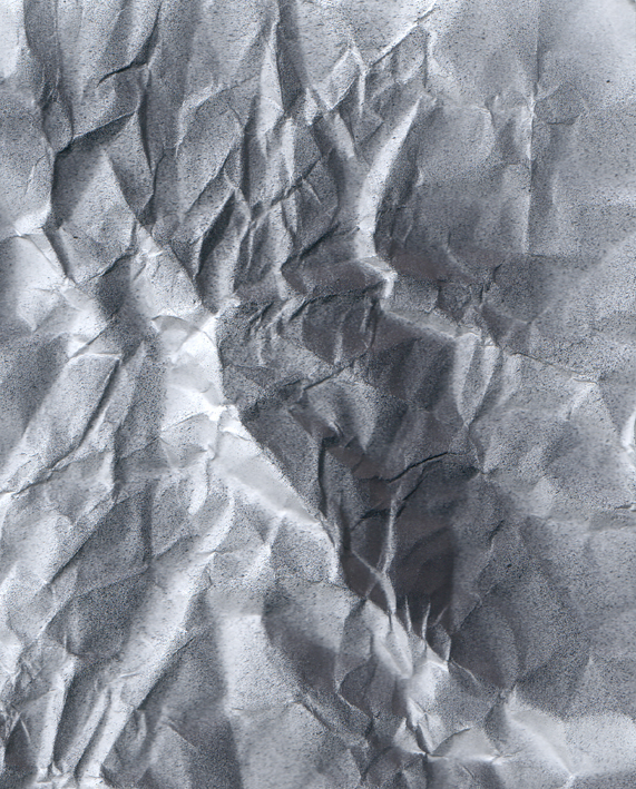
Look at the three images below. Lets imagine we are in a very very dimly lit room. We have a flat sheet of stiff black paper in front of us, Bristol board perhaps. There's the sheet of black paper below us on a table which looks like the image on the far left. We see nothing but black.
We then take the sheet of black paper, and we scrunch it up into a ball, creasing it mightily, and then we more or less flatten it out again. Of course, we can't make it flat. We can't see it very well, but feeling it in the dim room, we can tell that it now has relief, it has creases, parts coming towards us, parts receding, parts facing one way, parts facing the other and everything in between. If we could see it clearly, it might actually look like topography, a mountainous landscape viewed from high above. But, as you can see below, in the middle image, the room is so dimly lit and we can only vaguely get a hint of the topography by using our eyes.
We need a way of revealing, or imaging the topography, the relief, of the paper to make it visible. Lets imagine we have a can of white spray paint. We take it and spray it, left to right, at a low angle almost parallel to the bumpy surface of the paper. We spray in long sweeps along the bristol board the surface is revealed, even in the dim light of the room we are in. Hopefully we are wearing a mask when we do this. Any plane, or fascet of the topography that catches the spraypaint more directly catches more paint and is therefore lighter. Planes that catch the spraypaint, less directly receive less of it and are therefore darker. Planes completely hidden from the spray of paint, in the shadow of extreme relief, in the lee of the mountains, so to speak, receive no light...I mean paint... at all and are left pure black. If that spraypaint were photons behaving like particles (and not waves) it would be behaving in very much the same way as light striking form.
Light behaves very much this way, except that it can also actually bounce back onto the shaded side form, something we'll consider shortly.
If you're not comfortable with these concepts, or would like to review them, hover your curser over 'MORE' on the title bar at the top of this page and click on 'Drawing: The Basics/Drawing and Rendering for Metal Jewelry Designers.
At the beginning of this course, we will quickly review in class some of the concepts covered in 'Drawing: The Basics', and pay particular attention to considering how light and shadow describes form. We'll also review the concept of light and shade here on this page below.
Shading and Rendering: Light and Shade Describing Form
Once we have constructed our drawing with line, we're going to try and ignore local colour and apply monochromatic watercolour washes to suggest a strong sense of light and shade. Here's a metaphor to help with the idea of light playing over form.
Look at the three images below. Lets imagine we are in a very very dimly lit room. We have a flat sheet of stiff black paper in front of us, Bristol board perhaps. There's the sheet of black paper below us on a table which looks like the image on the far left. We see nothing but black.
We then take the sheet of black paper, and we scrunch it up into a ball, creasing it mightily, and then we more or less flatten it out again. Of course, we can't make it flat. We can't see it very well, but feeling it in the dim room, we can tell that it now has relief, it has creases, parts coming towards us, parts receding, parts facing one way, parts facing the other and everything in between. If we could see it clearly, it might actually look like topography, a mountainous landscape viewed from high above. But, as you can see below, in the middle image, the room is so dimly lit and we can only vaguely get a hint of the topography by using our eyes.
We need a way of revealing, or imaging the topography, the relief, of the paper to make it visible. Lets imagine we have a can of white spray paint. We take it and spray it, left to right, at a low angle almost parallel to the bumpy surface of the paper. We spray in long sweeps along the bristol board the surface is revealed, even in the dim light of the room we are in. Hopefully we are wearing a mask when we do this. Any plane, or fascet of the topography that catches the spraypaint more directly catches more paint and is therefore lighter. Planes that catch the spraypaint, less directly receive less of it and are therefore darker. Planes completely hidden from the spray of paint, in the shadow of extreme relief, in the lee of the mountains, so to speak, receive no light...I mean paint... at all and are left pure black. If that spraypaint were photons behaving like particles (and not waves) it would be behaving in very much the same way as light striking form.
Light behaves very much this way, except that it can also actually bounce back onto the shaded side form, something we'll consider shortly.


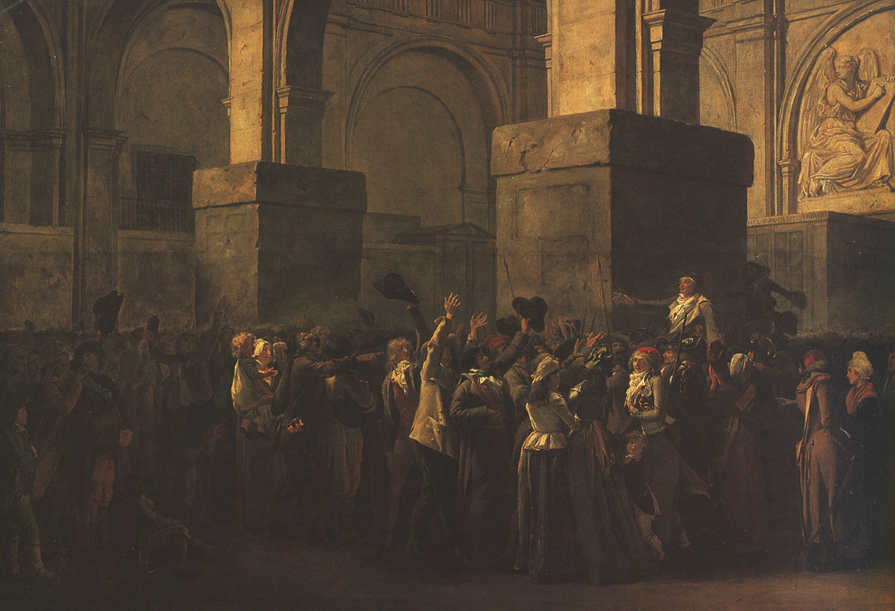
Below are some examples of the use of light and shade to describe and reveal form in drawing, painting, theatre, television and film, a little visual essay of sorts that I hope will lead you to consider light and shade as a possible way to describe form.
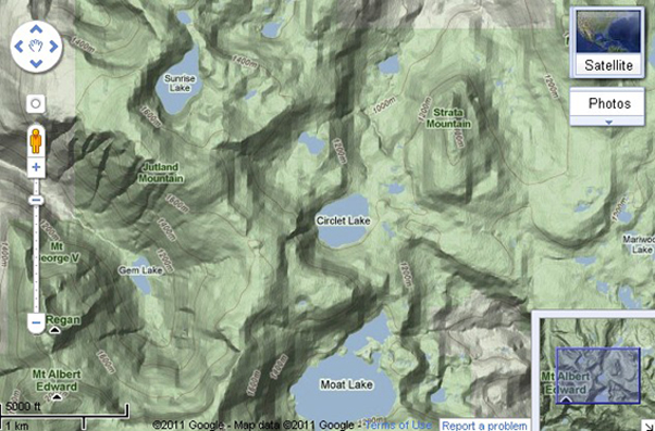
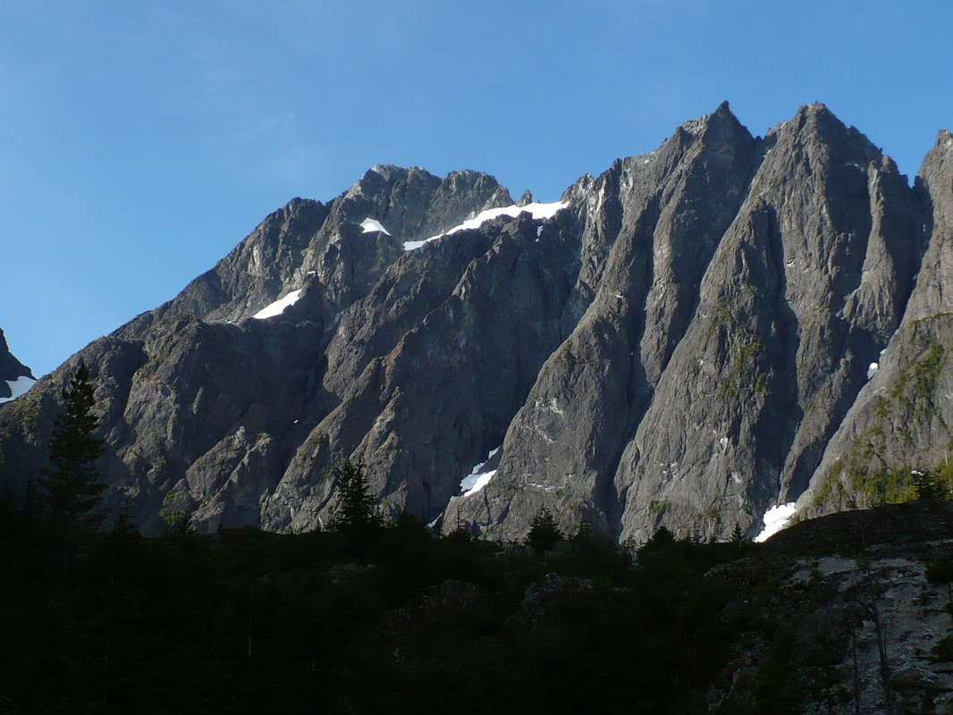
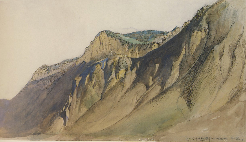
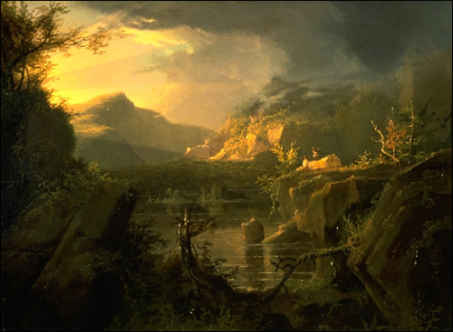
Top row. We have a modelled topographic map. You can see how the light source, at about 11:00, reveals topography. We have a photograph of Mt. Colonel Foster in Strathcona Park with it's topography revealed in early morning light. As the sun moves across and climbs higher in the sky the mountain may not look nearly as dramatic. A beautiful watercolour by John Ruskin uses similar lighting to reveal form.
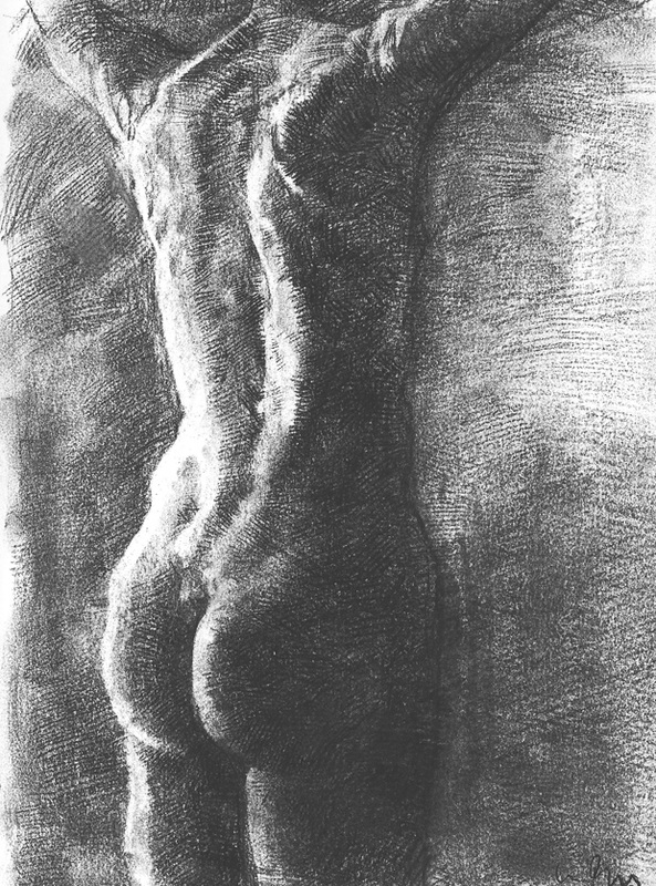
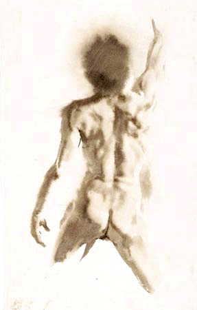
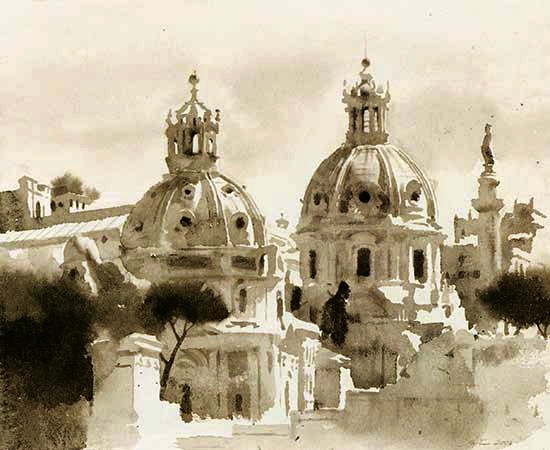
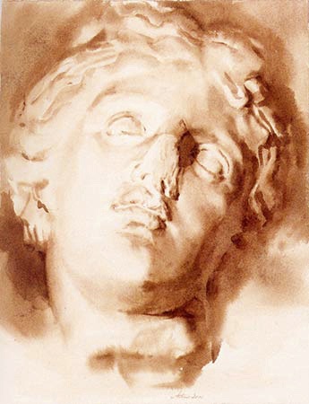
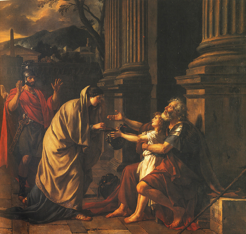
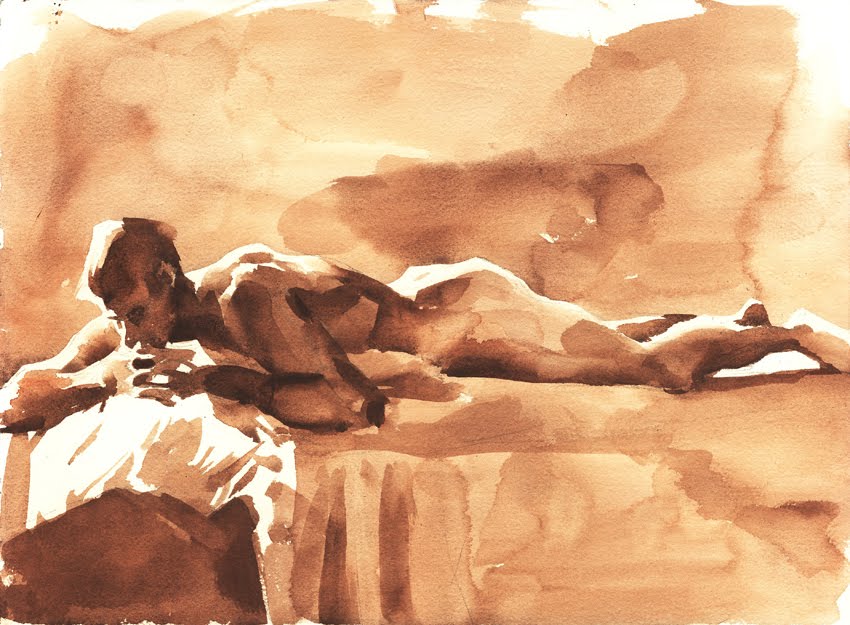
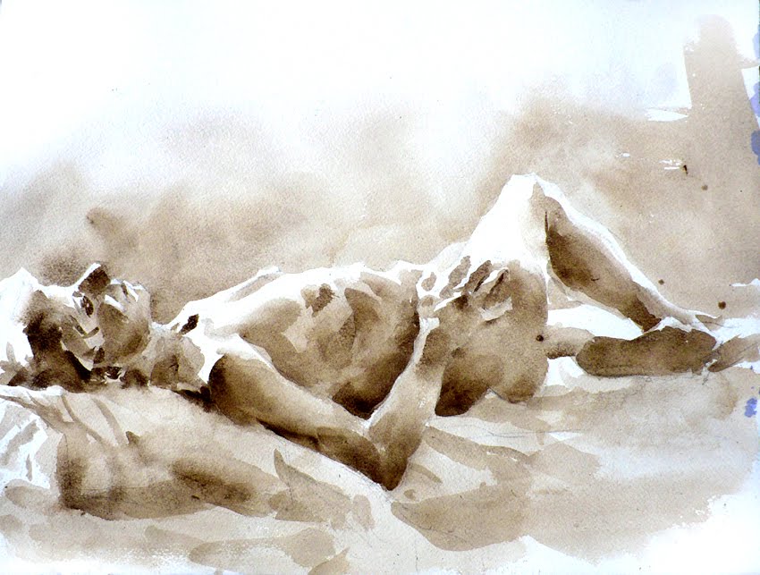
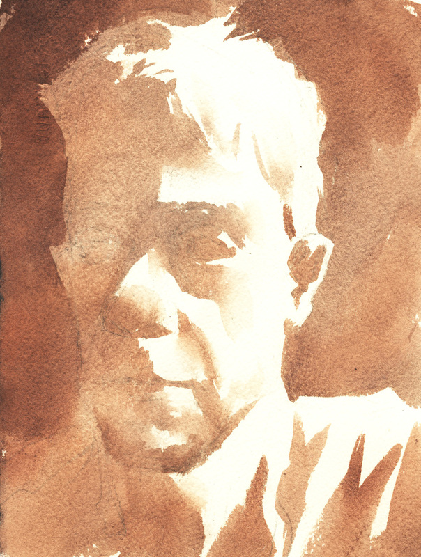
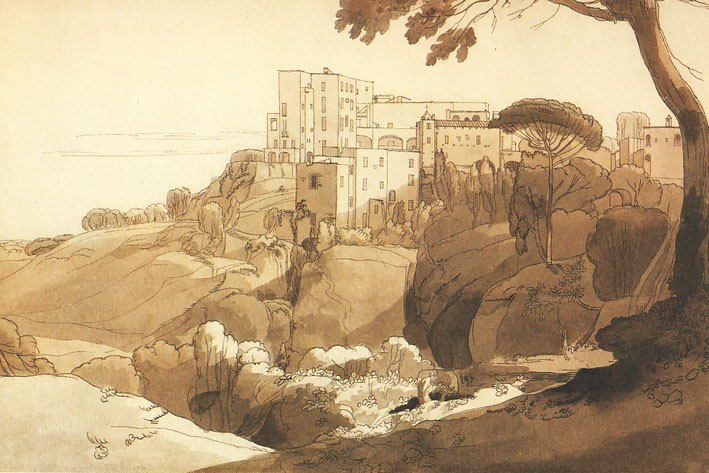
Second row. The landscape is topography, and the human form, which we will be painting from, is also topography. First up is a charcoal drawing modelling a human back. We aren't modelling with drawing materials in this class, but rather paint. Mid row is a beautiful sepia toned watercolour by American artist Wendy Artin. If you google and look at Artin's work you'll see she is quite capable of using local colour effectively, but for a large part of her work she chooses to work monochromatically with her paint, avoid local colour, and concentrate on the effect of light and shade on form. At the end of the row, you can see how Artin applies the same approach to architecture.
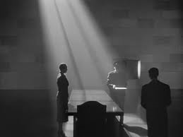
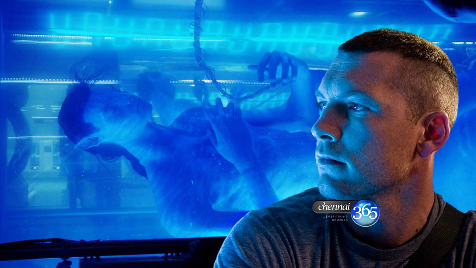
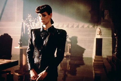
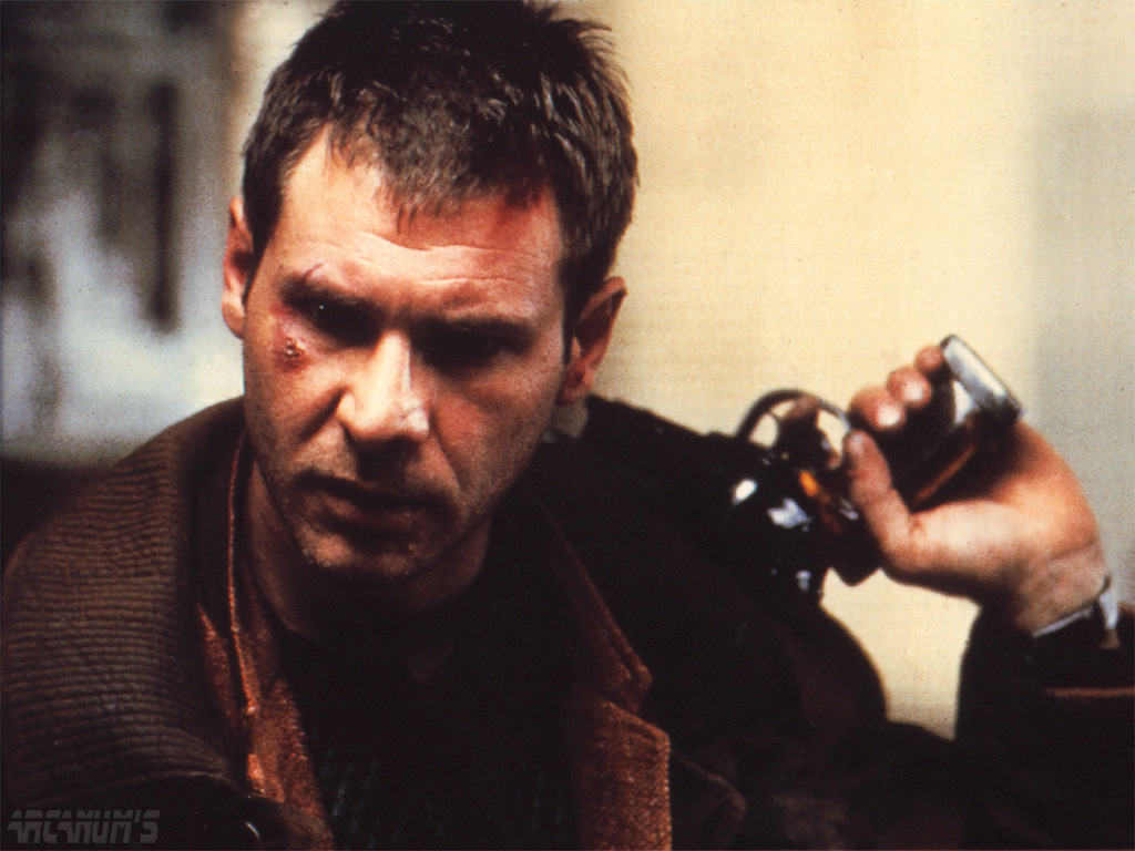
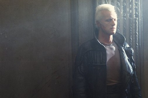
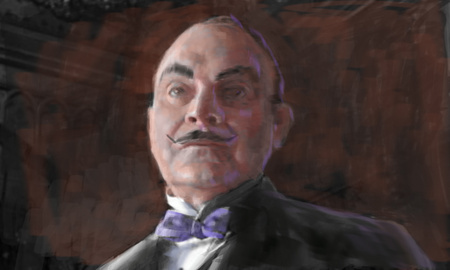
Third row. Some samples form film of how light and shade is used to describe form, three examples from the movie Bladerunner. You can learn an enormous amount about painting and light by looking at the accomplishments of film directors and cinematographers.
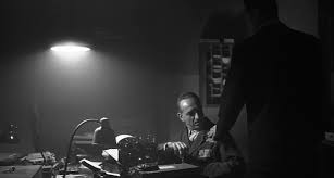
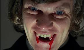
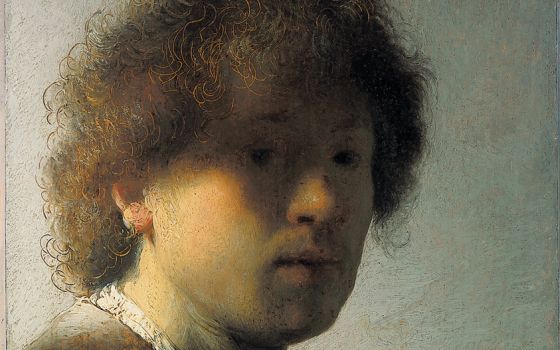
Row four. Particularly dramatic lighting on the face, from A Clockwork Orange, a theatrical production, and in a self portrait by Rembrandt.
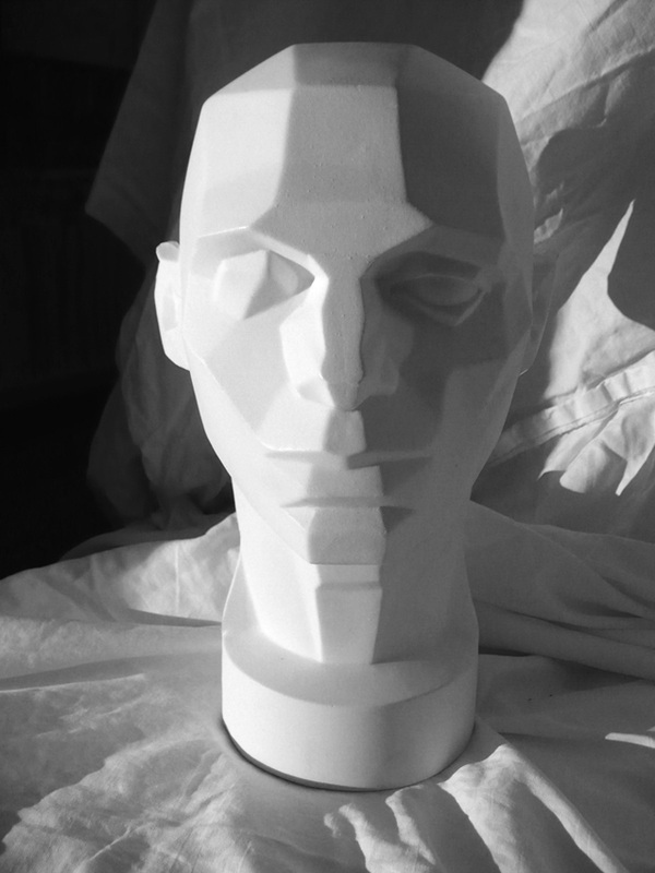
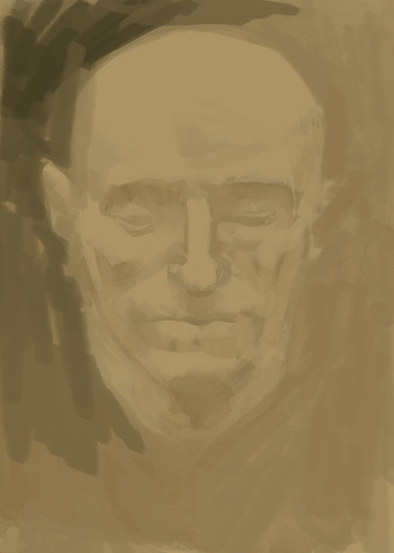
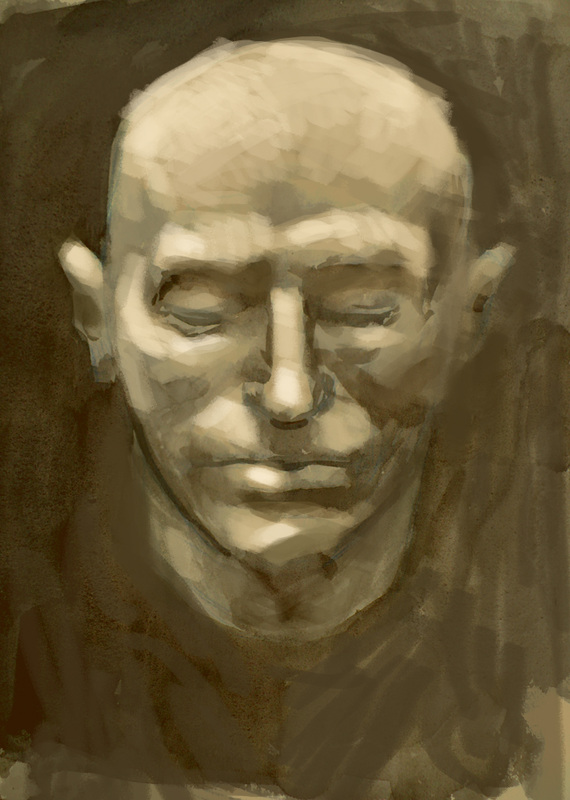
Row five. Light describes form on a 'planes of the head' cast, on a plaster cast death mask, and on another beautiful monochromatic watercolour by Wendy Artin.
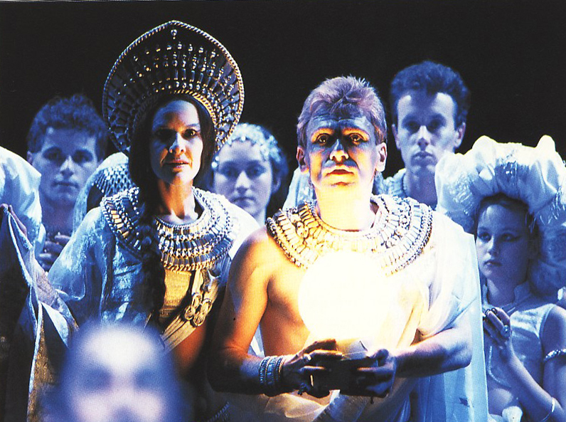
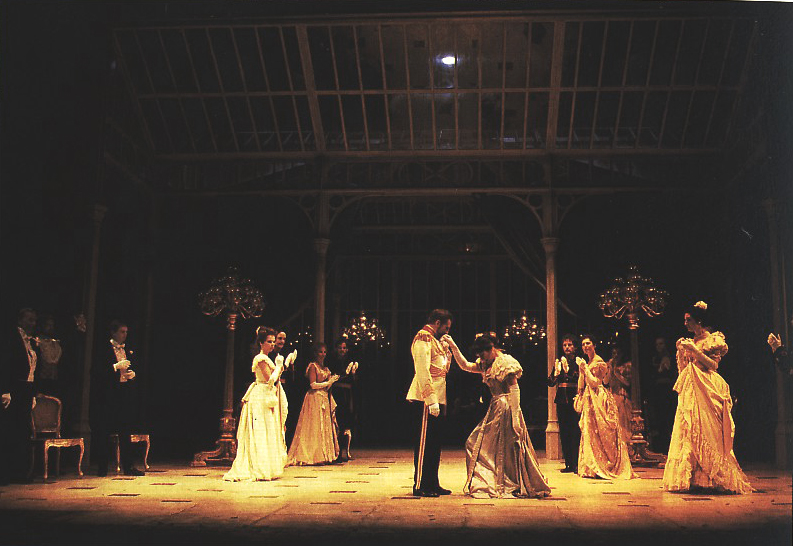
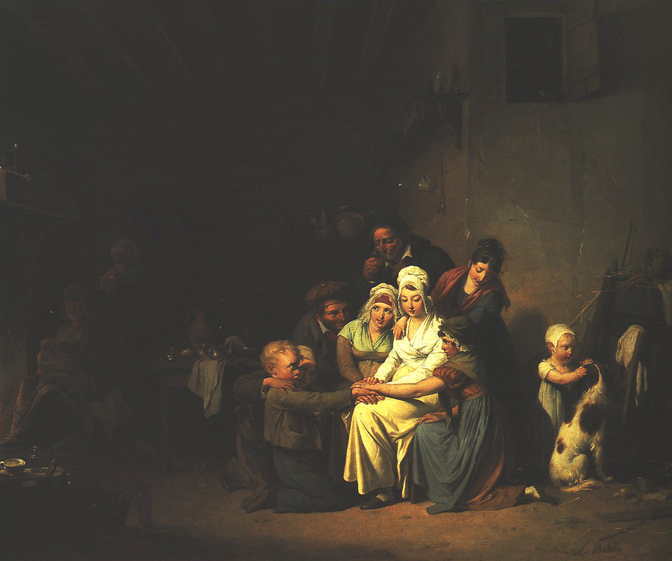
Row six and seven. Theatrical lighting on stage, in movies, in traditional oil paintings, and finally, in an animation background that I produced in the course of a days work. I have a personal interest in lighting, and theatrical lighting in art and film, because as a background painter and art director it was my job to create an empty stage upon which characters could interact and narratives unfold. In the final image of the background painting, it should be clear where the action should take place.
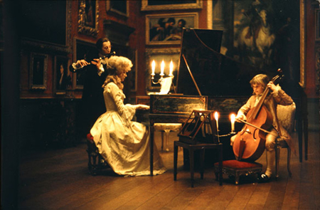
It's worth mentioning 'chiaroscuro' in relation to describing form with light and shade. These final pictures of theatrical backgrounds and the animation background employ chiaroscuro, strong contrast of light and dark, to reveal form. Areas or figures are lit and emerge from smoky dark backgrounds. It is as though the images are lit with candle light. In fact, the movie still is from Barry Lyndon, a movie in which the director, Stanley Kubrick, employed special lenses which allowed the capture of low light and allowed to in fact film in candlelight.
Top row. We have a modelled topographic map. You can see how the light source, at about 11:00, reveals topography. We have a photograph of Mt. Colonel Foster in Strathcona Park with it's topography revealed in early morning light. As the sun moves across and climbs higher in the sky the mountain may not look nearly as dramatic. A beautiful watercolour by John Ruskin uses similar lighting to reveal form.
Second row. The landscape is topography, and the human form, which we will be painting from, is also topography. First up is a charcoal drawing modelling a human back. We aren't modelling with drawing materials in this class, but rather paint. Mid row is a beautiful sepia toned watercolour by American artist Wendy Artin. If you google and look at Artin's work you'll see she is quite capable of using local colour effectively, but for a large part of her work she chooses to work monochromatically with her paint, avoid local colour, and concentrate on the effect of light and shade on form. At the end of the row, you can see how Artin applies the same approach to architecture.
Third row. Some samples form film of how light and shade is used to describe form, three examples from the movie Bladerunner. You can learn an enormous amount about painting and light by looking at the accomplishments of film directors and cinematographers.
Row four. Particularly dramatic lighting on the face, from A Clockwork Orange, a theatrical production, and in a self portrait by Rembrandt.
Row five. Light describes form on a 'planes of the head' cast, on a plaster cast death mask, and on another beautiful monochromatic watercolour by Wendy Artin.
Row six and seven. Theatrical lighting on stage, in movies, in traditional oil paintings, and finally, in an animation background that I produced in the course of a days work. I have a personal interest in lighting, and theatrical lighting in art and film, because as a background painter and art director it was my job to create an empty stage upon which characters could interact and narratives unfold. In the final image of the background painting, it should be clear where the action should take place.
It's worth mentioning 'chiaroscuro' in relation to describing form with light and shade. These final pictures of theatrical backgrounds and the animation background employ chiaroscuro, strong contrast of light and dark, to reveal form. Areas or figures are lit and emerge from smoky dark backgrounds. It is as though the images are lit with candle light. In fact, the movie still is from Barry Lyndon, a movie in which the director, Stanley Kubrick, employed special lenses which allowed the capture of low light and allowed to in fact film in candlelight.


Now that we've had a look at what a useful and expressive tool light and shade can be, we had better start to take a closer look in order to be able to employ what we've learned to our painting. What we need to be able to do, in our mind's eye, is to separate the effect of light and shade on form from the effect of local colour.
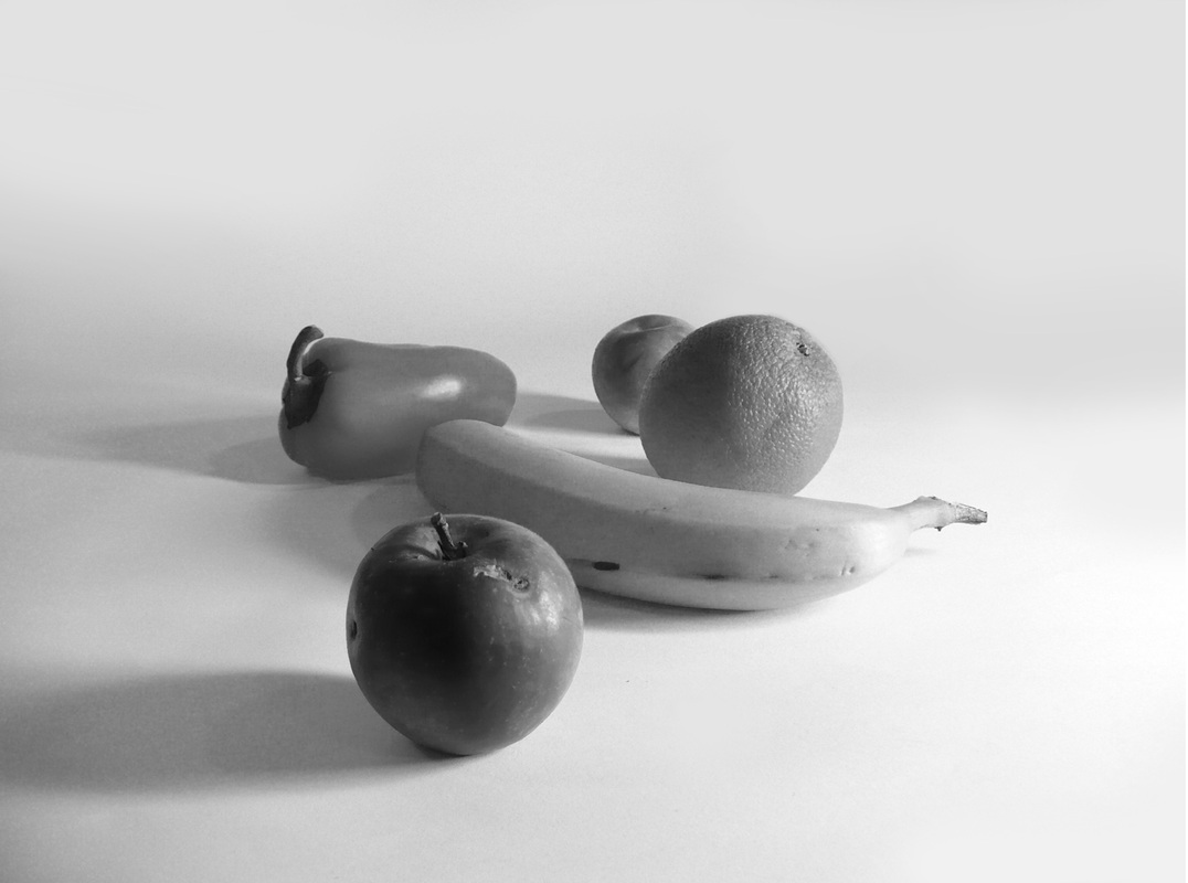
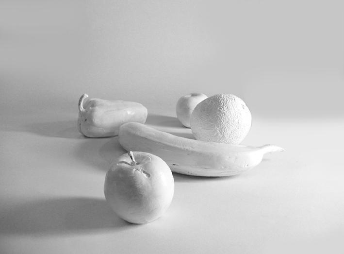
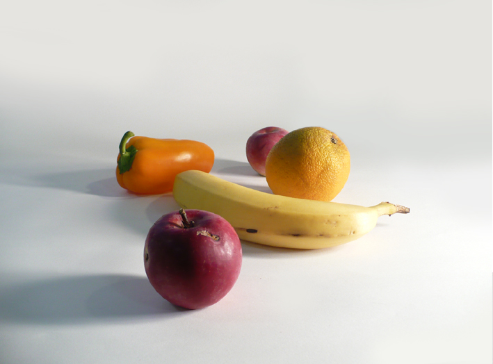
On the left is a photo of fruit in which light and shade is combined with local colour. If I look carefully, I can see the effect of light and shade. I can see light bouncing off the ground plane and re-illuminating the shaded side of objects. I can see the light is illuminating one side of the apple and orange, and casting shade on the other. But this observation is obfuscated by the presence of local colour. The colour has value, and therefore darkens the value of lit areas reducing the effect of illumination.
If I de-saturate the photograph, as in the middle photo, I eliminate local colour, but simply replace it with local value, that is, the colour is translated into a value between black and white. You can see clearly in the middle photo just how much value the local colour of the orange and apple by comparing the illuminated side to the background which is much closer to white. Desaturation alone doesn't seem to solve the problem of seeing the light and shade on form.
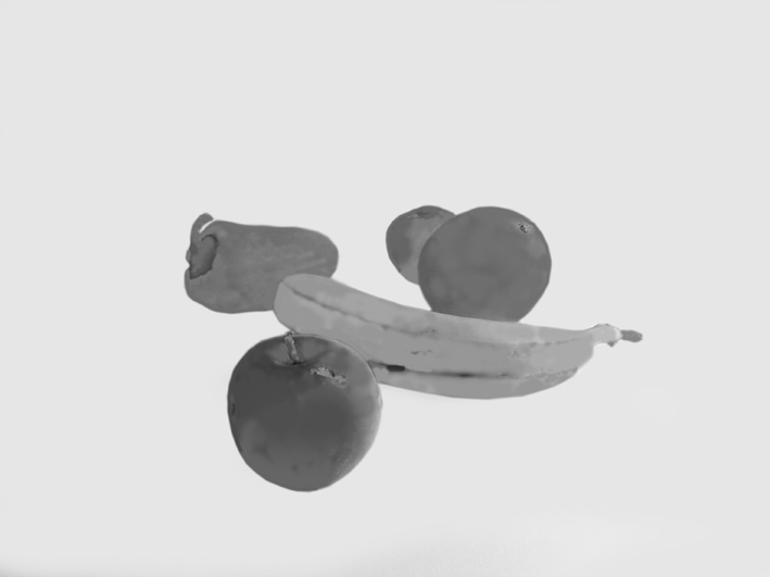
In the final photo, I painted the fruit with gesso so that it was as white as plaster. No local colour. No obfuscation and confusion from local colour. You can clearly see lit areas, shaded areas, and areas re-illuminated by bounced or secondary light sources. In order to clearly see light and shade on form we need to be able to look at our subject and see it as though it is made out of plaster.

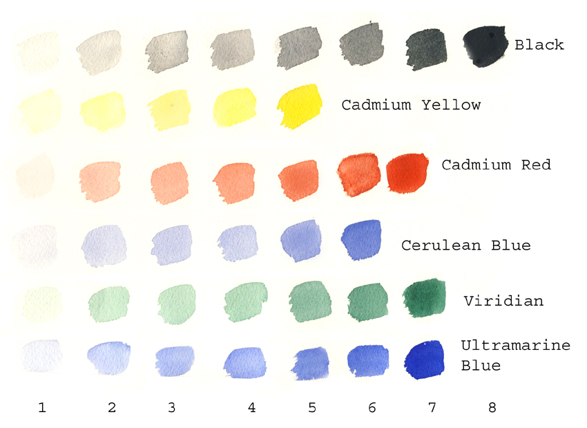
You saw above how much value the orange of the orange had, and the red of the apple. Have a look at these watercolour swatches, translated into black and white, to see how much value colour actually has. Two of the essential qualities that facilitate good painting skils are to 1/ being able to see a subject as though it were made of plaster and 2/ being able to judge the value of a colour. What good painters can do is mix two separate colours with completely different hues and match the value exactly. That's essentially what I was trying to do with the colours below; line them up in order of their value in black and white. Being able to do this with ease would perhaps be the equivalent of having perfect pitch.

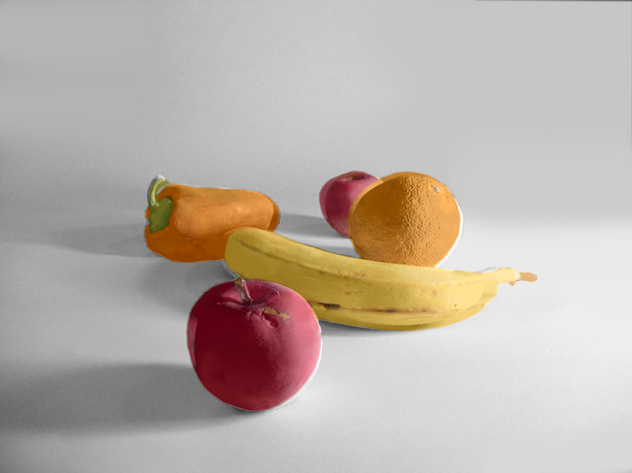
Lets break down our bowl of fruit into light and shade on form and local colour and then reassemble these discrete components. Top left we start with our colour photograph of fruit. We take away the local colour and we have fruit that looks like it is made out of plaster. Top right we see the local colour only. It is as if the fruit were lit by intense soft lighting from all directions. There is no shadow. Colour reads exactly as it is. Darker blotches are where pigment has pooled in the skin of the fruit, or a result of bruising and ripening; not the result of light and shadow.
Bottom left we can turn the local colour to local value by de-saturating the local colour.
Bottom middle is interesting. If we take top right and saturate the colour, make it more vivid and intense (in a digital program) and then make it transparent and then apply it to the photograph of the gessoed fruit we find our discrete light, shade and local colour reassembling themselves to resemble the original photograph of the fruit, repeated bottom right.
This application of transparent local colour on a monochromatic under painting of light and shade on form is exactly what we are going to do with our watercolour painting in this class. When painting, with watercolour or transparent oil, this application of colour to an under painting is called glazing. The process below mimics our process.


As a student, I and many of my colleagues struggled to make the leap from drawing and rendering to painting, the very leap that we are making in this short course. If my instructors provided me with the process I'm describing in this course, I wasn't paying attention. Working with opaque oil simply confused the issue more. Like most of my fellow students, I found myself pushing paint around into meaningless incoherent daubs. I still see this sort of thing happening on canvas. I solved the problem in my last year of school by working in watercolour, in Italy, in the ruins of old villas. I would paint the interiors of these old buildings, and try to describe the way light flooded into them and illuminated their interior surfaces. I would paint a monochromatic under painting and then glaze local colour on top. I can't recall what prompted me to do this. It may well have been being exposed to Renaissance oil painting in which artists, making tempera 'grisaille' under paintings applied glazes of oil upon them to create paintings with luminous tactile qualities.
A few years later, when employed with as an animation background painter, I followed the same method of creating a convincing visual scenario. I would be provided with a line drawing of a scene, usually a complex establishing shot, and I would proceed to paint it monochromatic with gouache washes, paying careful attention to modulating how light and shade would play on surfaces. I would try and use the imposition of light and shade to simplify the image. I would then glaze gouache washes of local colour (usually limited...take a look at how monochromatic a lot of the backgrounds in film, particularly live action, actually are) on top, and then finish up using the gouache opaquely, lightening lights and most significantly darkening darks.
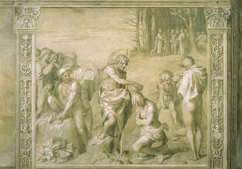
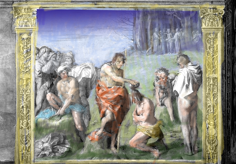
Lets have a look, simplistically, at just how those Renaissance artists worked. Below is a grisaille painting by Andrea Del Sarto of Christ being baptized by John the Baptist. It has been painted without any colour, as if all the images contents are made from plaster. As a result of the revered aesthetic of raw marble used in sculpture, Renaissance artists were often commissioned to do completely monochromatic grisaille paintings. The artist Wendy Artin, whose work we saw above, focuses on these same aesthetic qualities of light and shade on form by eliminating local colour in some of her work. Ironically, Renaissance artists and patrons were under the mistaken impression that ancient Greek and Roman artists also left their sculptures as raw marble. In fact, they painted them; the paint had simply fallen off for the most part. Nevertheless, most of us would admit that there is a lovely quality to a colourless rendering, whether a drawing or a painting. Later on we'll have a quick look at aerial perspective, and with that in mind when looking at this picture, make a note of where the lightest lights and darkest darks are in this painting. In the foreground. The further you recede into the picture plane the darker the lights and the lighter the darks.
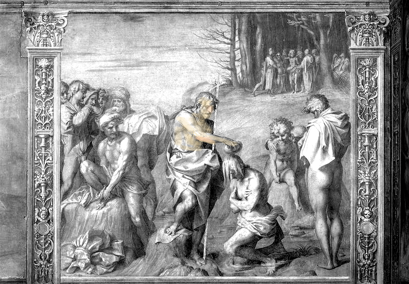
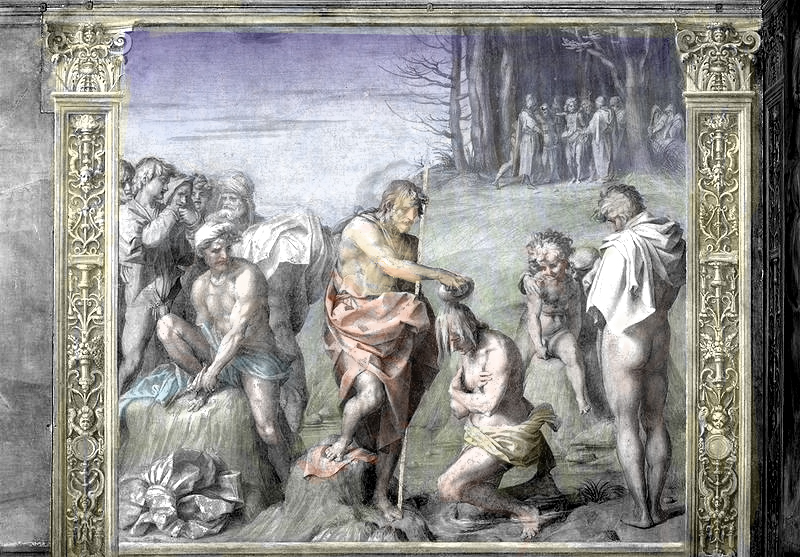
Now lets 'glaze' some local colour onto Del Sarto's grisaille painting. I've pumped up the contrast in the under painting somewhat, and completely de-saturated the image. This was done digitally, by applying transparent local colour; flesh tones for figures, green for grass, blue for sky. You can see that just like in the fruit photographs the discrete effects of light and shade on form and local colour merge to create a fairly convincing and naturalistic imaging of form.
The beauty of learning how to paint, of coming to understand the discrete qualities of light and shade on form and local colour, in watercolour, is that watercolour forces you to consider what is in light because you cannot lighten what you have darkened. Once you have applied colour or tone on a piece of watercolour paper you will have a great deal of trouble lifting it off. In fact, you will never get back to the pure white of the paper. So you can never apply paint darker than required.
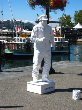
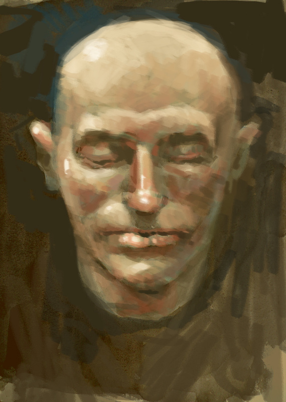
As you put your first washes down, you have to clearly see what is in light and what is in shade. You will have to imagine your subject, like the Plasterman top left, is made out of colourless white plaster. Following plasterman are a few of my own quick wash paintings. These were done as quickly as 20 minutes at life drawing sessions. In the life poses, there was a lot of confusing light in the room, from overhead fluorescent bulbs. But we trained an overhead projector on the model which cast a different quality of light from the rooms ambient lighting, and I was able to separate and use the projectors light to try and establish form with light and shade.
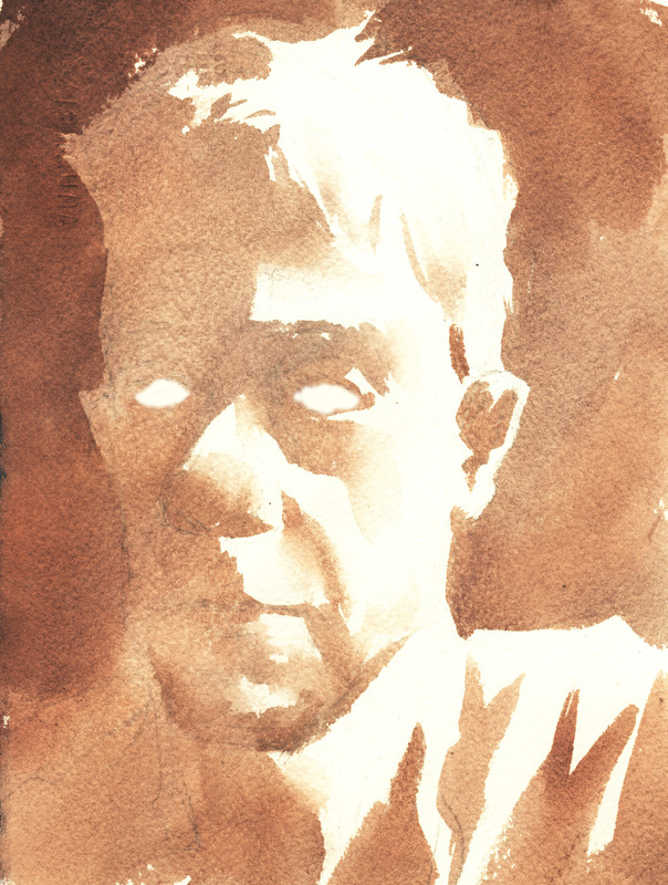
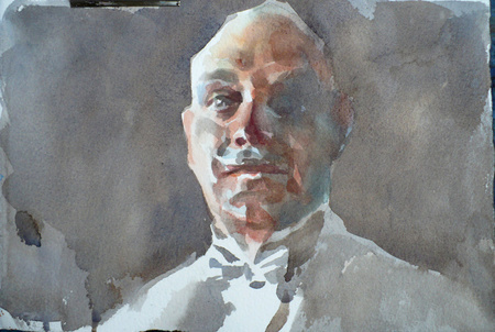
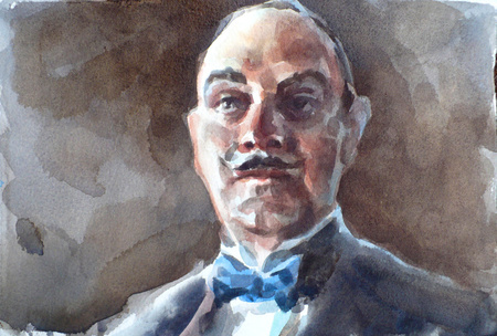
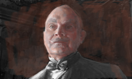
The final two photos below show a face, with a first wash laid down and the beginning of a second darker wash. Notice how in the first version I paid attention to the fact that the balls of the eyes were in complete shade. It is a huge, very amateur looking mistake to presume that the whites of the eyes are in fact lit. Occasionally they are, but generally a light source from above will shade them with the brow and the eyelid. In class we'll take a close look at each other, as well as some paintings, to confirm the fact that the whites of the eyes are rarely white. You can see how amateur and zombie like having white eyes really looks by looking at the last picture.
As you put your first washes down, you have to clearly see what is in light and what is in shade. You will have to imagine your subject, like the Plasterman top left, is made out of colourless white plaster. Following plasterman are a few of my own quick wash paintings. These were done as quickly as 20 minutes at life drawing sessions. In the life poses, there was a lot of confusing light in the room, from overhead fluorescent bulbs. But we trained an overhead projector on the model which cast a different quality of light from the rooms ambient lighting, and I was able to separate and use the projectors light to try and establish form with light and shade.
The final two photos below show a face, with a first wash laid down and the beginning of a second darker wash. Notice how in the first version I paid attention to the fact that the balls of the eyes were in complete shade. It is a huge, very amateur looking mistake to presume that the whites of the eyes are in fact lit. Occasionally they are, but generally a light source from above will shade them with the brow and the eyelid. In class we'll take a close look at each other, as well as some paintings, to confirm the fact that the whites of the eyes are rarely white. You can see how amateur and zombie like having white eyes really looks by looking at the last picture.

Below, have a look at how quickly an initial mid to light tone wash establishes form. This is exactly how I hope you work with watercolour in the class. Put a mid to light tone over everything that you want to be in shade/do not want in direct light. Then you will proceed to darken your darks, watching for bounced light, and finally glazing local colour on top of your under painting. The fact that our models will probably have quite a light complexion will be a help, but frankly, even with darker flesh complexions the principle is the same. The final photo shows a finished watercolour with darker darks and local colour applied.
Here is the process of painting in transparent watercolour and preserving whites roughly applied to a face for a demonstration.

Here is the same process, working transparently, with digital paint that might resemble oil or acrylic.

Once you have got the hang of working with watercolour, if you return to opaque acrylic or oil paint you should find you have a better understanding of light and shade and colour and won't find yourself helplessly pushing paint around as I did. As an aside, we might want to consider how an opaque oil or acrylic painting might develop. When I moved to acrylic painting backgrounds I started to work more or less along the following lines.
Notice the big difference here! I didn't preserve my whites because I'm working more opaquely. I put a mid to light tone over the whole 'canvas' and then began darkening darks both opaquely and with thinner transparent strokes. Because I'm working with a more opaque medium, I am able to lighten my lights as I darken my darks. Finally, I have added local colour, sometimes by painting a translucent stroke on top of the painting and sometimes matching the value in colour of the monochromatic paint below.
Notice the big difference here! I didn't preserve my whites because I'm working more opaquely. I put a mid to light tone over the whole 'canvas' and then began darkening darks both opaquely and with thinner transparent strokes. Because I'm working with a more opaque medium, I am able to lighten my lights as I darken my darks. Finally, I have added local colour, sometimes by painting a translucent stroke on top of the painting and sometimes matching the value in colour of the monochromatic paint below.
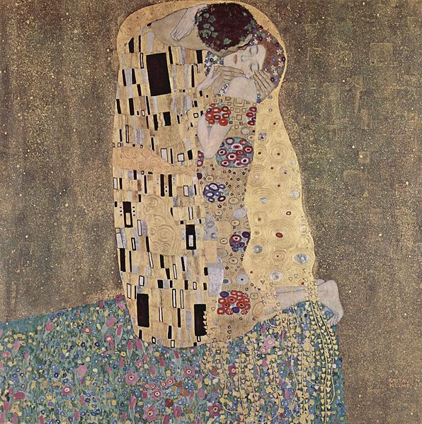
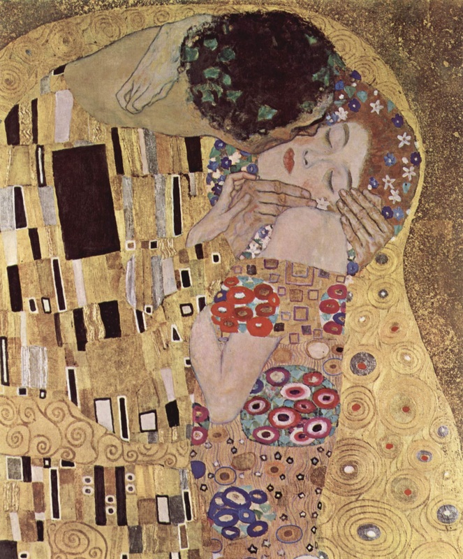
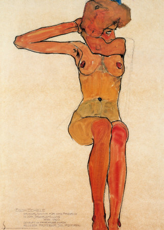
And now for something completely different. Look closely at the images below. There is virtually no sense of light and shade on any of the three images directly below. On the top left we have a painting by Gustav Klimt, followed by a colour reproduction of a watercolour drawing/painting by Egon Schiele. Klimt's painting is flat, graphic and poster-like. Schiele's painting is the same; there is some apparent colour modulation but when we translate the painting into pure value, or black and white, we can see it reads flat. Both these artists studied under a long tradition of painting, the same tradition of 'realism' that emphasised nuanced theatrical lighting effects. These artists were essentially rebelling against that tradition, pushing back at it, lavishing flat graphic poster-like qualities on their paintings that emphasised colour and texture. Schiele's pieces also emphasise the drawn aspects of his image. To render the figure in light and shade would subtract from his drawing prowess. Klimt's paintings, with their decorative graphic poster-like qualities are to this day hot sellers as posters at art galleries and museums. There is a wide spectrum of application between articulated light and shade and flat and graphic in which you as an artist can modulate and choose where to locate an image.
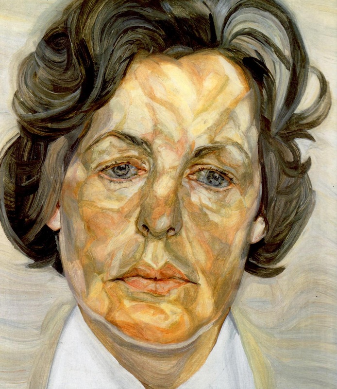
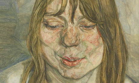
The final two paintings are by Lucien Freud. Freud often lights his subjects directly producing a harsh and disconcerting effect. Since there is little description of form with light and shade he exaggerates the local colour of his subjects. If you were to look closely at the faces and hands on Klimt's figures you would observe the same treatment. Both artists, but most notably Freud, in exaggerating the local colour of pale complexions, make their subjects look bruised, bloodshot, damaged. They look profoundly mortal. Take a look at yourself closely in a mirror under fluorescent ambient light. All those 'sickly' colours are there waiting for exaggeration, especially in paler complexions during the winter months. The lighting treatment is very similar to the flooding, penetrating light of a flash camera. You can almost always tell a portrait painted from a flash photo reference, in the hands of an inexperienced artist it will usually appear very weak. If you are drawing and shading a portrait, think about your lighting when you pose the figure for the drawing or take photo reference. Think about the psychological effects of chiaroscuro and having light rake across your subjects face. Place sideways in a window for effect. If you want to use relief lighting, have them face the window.
The final two paintings are by Lucien Freud. Freud often lights his subjects directly producing a harsh and disconcerting effect. Since there is little description of form with light and shade he exaggerates the local colour of his subjects. If you were to look closely at the faces and hands on Klimt's figures you would observe the same treatment. Both artists, but most notably Freud, in exaggerating the local colour of pale complexions, make their subjects look bruised, bloodshot, damaged. They look profoundly mortal. Take a look at yourself closely in a mirror under fluorescent ambient light. All those 'sickly' colours are there waiting for exaggeration, especially in paler complexions during the winter months. The lighting treatment is very similar to the flooding, penetrating light of a flash camera. You can almost always tell a portrait painted from a flash photo reference, in the hands of an inexperienced artist it will usually appear very weak. If you are drawing and shading a portrait, think about your lighting when you pose the figure for the drawing or take photo reference. Think about the psychological effects of chiaroscuro and having light rake across your subjects face. Place sideways in a window for effect. If you want to use relief lighting, have them face the window.

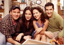
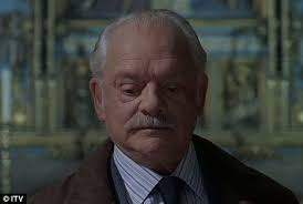
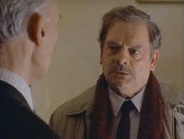
As a final aside, we can also see examples of these flood/flash lighting effects on the screen...television particularly. In film making or television with a reasonable budget, great effort is lavished on the lighting, which usually (but not always) models forms by having light and shade describe form in a way very similar to the 'traditional' painting model. This involves a lot of work. When television began filming (video) television sitcoms regularly there simply wasn't the time to establish complex lighting schemes. The solution was to 'flatten out' the lighting and carefully design the backgrounds and character colours (or values, as this was initially done in black and white) consistently throughout an episode. No effort for lighting was required from shot/scene to scene and the shows could be cranked out quickly. They discovered that without moody dark shadows the flatter lighting actually added to the levity of the production. Today, filmmakers might actually choose to use flat lighting to create levity, versus using dark moody lighting as in Bladerunner and other 'noir' films that use chiaroscuro and light and shadow extensively.
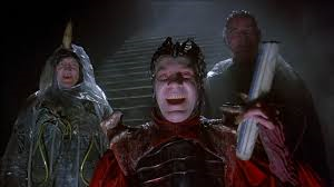
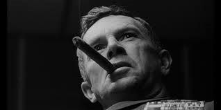
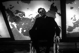
Below you can see, top row, examples of stills from comedy sitcoms and second row a detective series each employing 'appropriate' lighting schemes. Of course, you will always find exceptions to this generalization. It's also worth noting that satire, and other darkly humorous productions, will often use very dramatic, theatrical, 'classical' lighting schemes as in the stills from the movie Dr. Strangelove on the third row.
Below you can see, top row, examples of stills from comedy sitcoms and second row a detective series each employing 'appropriate' lighting schemes. Of course, you will always find exceptions to this generalization. It's also worth noting that satire, and other darkly humorous productions, will often use very dramatic, theatrical, 'classical' lighting schemes as in the stills from the movie Dr. Strangelove on the third row.


Aerial Perspective and the use of Light and Shadow in Landscape
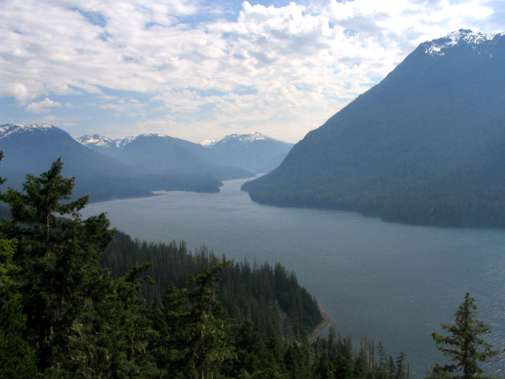
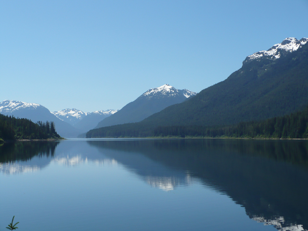
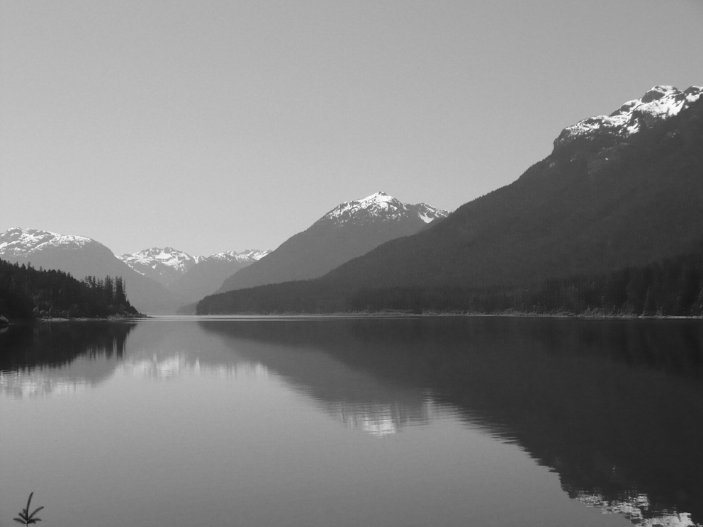
In this class we are concentrating our study of light, shadow and local colour by using the human form; human topography. But what our studies reveal can easily be applied to any other subject, including inanimate objects and landscape. By taking a short aside and studying landscape we can take a moment to appreciate how light can play on the surface of the earth, and also study the phenomenon of aerial perspective. Aerial perspective is readily observable when we look at receding hills across a vast landscape. Before we learn how we can apply aerial perspective to the figure, lets find out how it works. Take look at the three photos below. Two are colour and the final is a black and white version of the middle photo. In all three you can see how, as the mountains recede toward the horizon, the darks become lighter and the lights become darker. Eventually, if there is enough atmospheric particulate matter and haze, any sense of relief, modelling, light and shade on form in the mountains will be reduced to a silhouette. You can often observe this happening when you look across to the mainland mountains from Vancouver Island. The final photo shows how, even when we replace local colour with local value, and de-saturate the image the phenomenon becomes more obvious. If you look at the snow on the near mountains it is subtly lighter than the snow on the far mountains. The darks are markedly darker in the foreground, and create more contrast with the lighter lights, pulling the foreground objects forward.
Lets do a breakdown on an imaginary landscape to see how we can create aerial perspective. Below is an image of a mountain. There is very little if any aerial perspective. You can see the dark green of the conifer trees, the dark shadows in the rock, and the lit areas of the rock.

Below, I've taken the image above and installed some aerial perspective by applying a thin transluscent gradation of atmospheric colour, blue like the sky in this case. This layer is most opaque in the lower part of the picture, where the atmosphere would be most dense and also full of more water vapour (hence the blue colour) and more particulate matter that refracts, or scatters, light from the sun away from the ground and to our eye. This refraction creates the obscuring effect of aerial perspective. You can clearly see that contrast between lights and dark have been reduced in the topography of the lower mountainside.

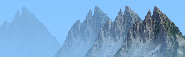
I've copied and pasted the mountain further back into the picture plane in the image below. The closer mountain overlaps the further one, which helps with a feeling of depth, but there is no linear perspective; both mountains are the same size. The reduction of contrast as a result of applying a transluscent layer of tone over the mountain that simulates the obscuring refraction of light, is what is causing the greatest feeling of distance for the further peak. Look closely. Lights have become darker in value, and darks have become lighter. There is a slight flattening effect and reduction of contrast compared to the foreground mountainside.

As we add more distant mountains and pull down more veils of compounding obscuring atmosphere, contrast is reduced until the distant mountain becomes a silhouette. No sense of relief or topography whatsoever.


Light and Shade in Landscape
This is not a landscape course, as mentioned, we are using the topography of the human figure to study the effect of light and shade on form. However, what we learn is so transmissible that we really should take a look at a few examples of light and shade being used to describe landscape.
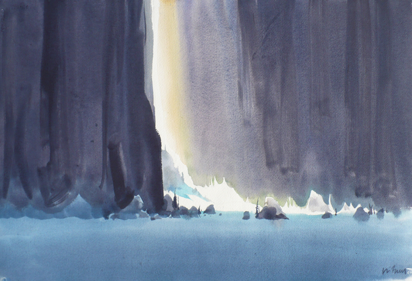
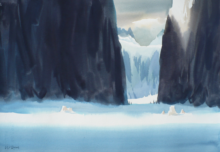
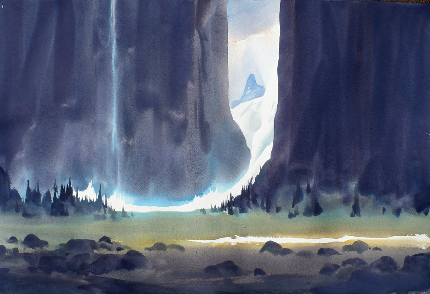
Row one: I've taken the liberty of using some of my own landscapes to demonstrate an attempt to design with light and shade in a very particular landscape. This is deep valley under the Comox Glacier, so I wanted to create the feeling of a landscape as an 'interior' of sorts, as in the sense of being in it's bowels, as in 'man eating landscape', which was the exhibition title for my show containing these pieces. It should be noted that I don't think out why I'm doing things consciously while I'm doing them. I don't necessarily decide 'I'm going to use light' to do this that or the other. I've done enough painting to just do it.
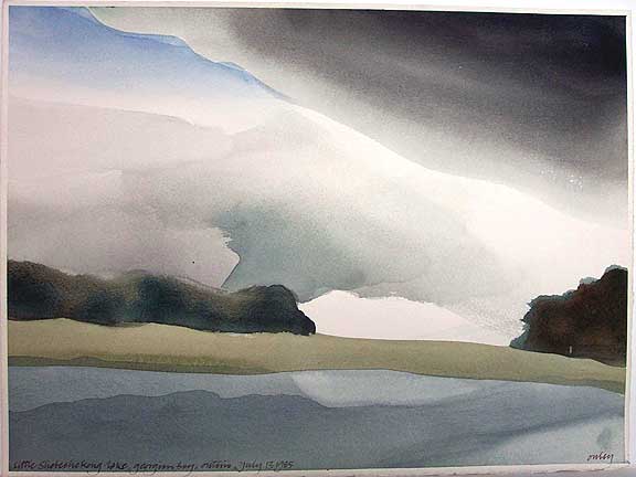
Row two: A favourite watercolourist of mine has always been Toney Onley. It almost certainly shows in my work. I've read quotes of Onley saying how much he admired 19th century watercolourists and landscapists, as I do, so my love of Onley's painting is quite logical. Notice how he carefully modulates shade/light/shade/light/shade... receding into the background. His alignment of light against shade is impeccable for such spontaneous work; look at shaded boulder catching a bit of light just where it's form intrudes into a space occupied by shaded dark valued trees.
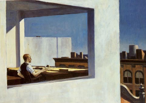
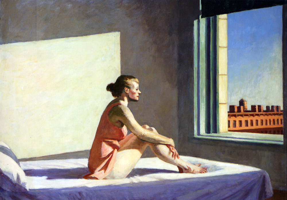
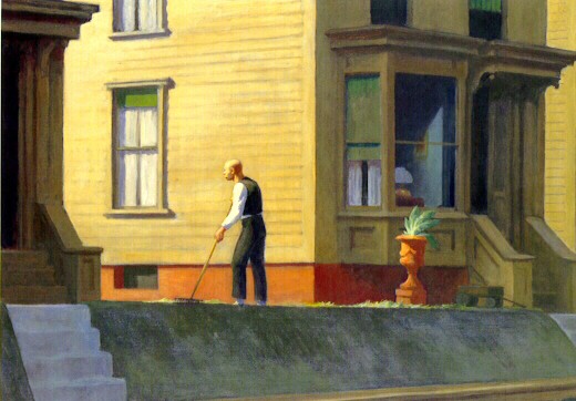
Row three: Not landscape as such, but Edward Hopper often put dramatic lighting effects to good use. My own landscapes in the top row almost seem to have referred to some of his lighting effects.
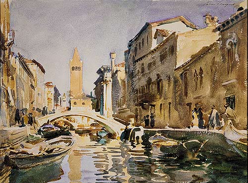
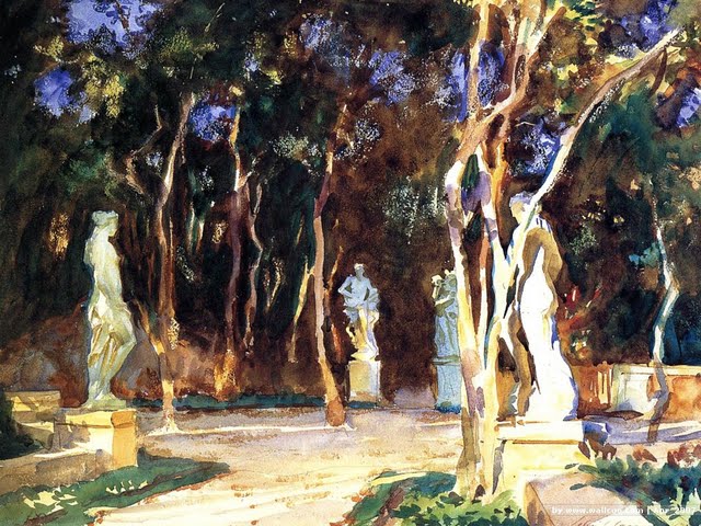
Row four: John Singer Sargent watercolours; Sargent often employed dramatic luminous lighting schemes. And sometimes not at all, sometimes his watercolours used a very flat lighting. These are dramatic and simple however.
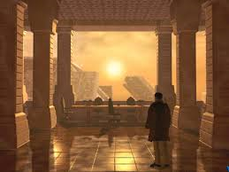
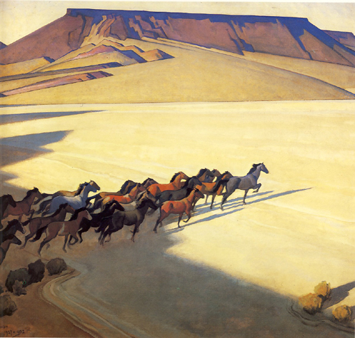
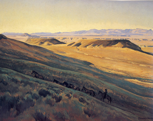
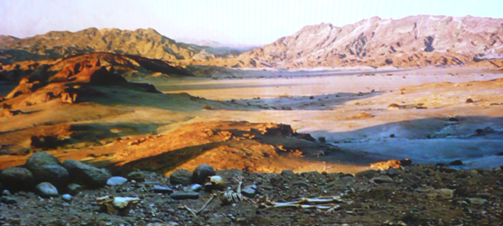
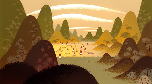
Row five: Two Maynard Dixon landscapes, and at the end of the row a still from the Dawn of Time opening of 2001: A Space Odyssey. It is not inconceivable that Stanley Kubrick, who was deeply involved in creating the sets and including painting matte paintings, was aware of Dixon's work.
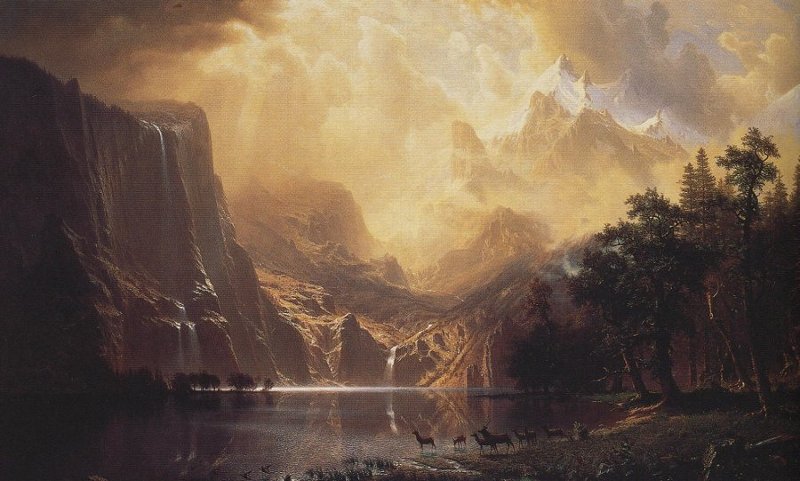
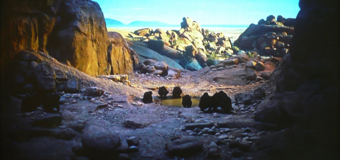
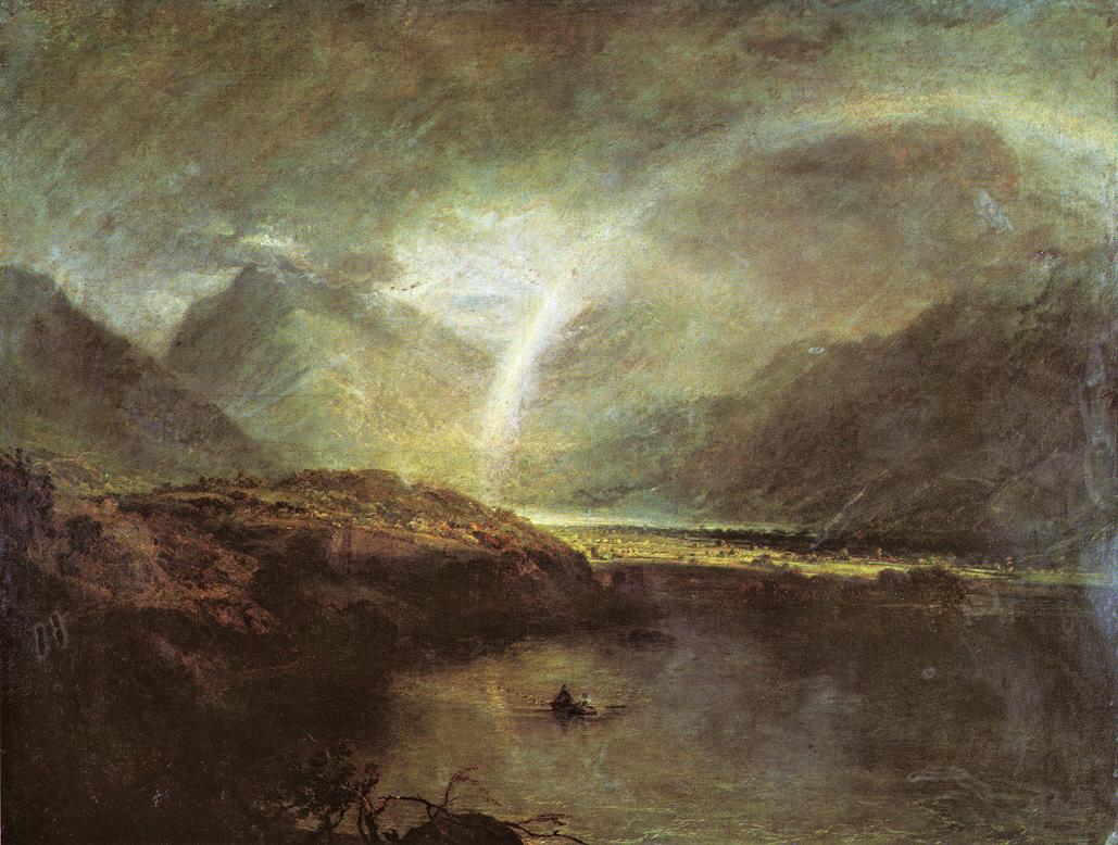
Row six: A couple of classic 19th century landscapes with divisions of light and shade on the land as well as aerial perspective. At the end of the row is another still from the beginning of 2001. There is the definite feel of a romantic landscape in the set; the aerial perspective, rock forms, and otherworldly pool of secondary lighting near the water hole.


Aerial Perspective in Figurative Art and in Film
Aerial perspective is a very real effect. Often, in clear weather conditions, it's effect might be less obvious. By understanding how it works, and observing it in nature, art and film you might decide to fabricate it's effect in your own landscape painting when it is less observable, and also consider using it in still life, non representational and figurative drawing and painting to push and pull objects in and out of the picture plane. Don't feel obliged to just paint what you see.
You can also use it arbitrarily in still life or landscape, or even non representational painting. If, when working on a figure, you find yourself wanting to push a hind limb further into the background on your figure you can create atmosphere, or aerial perspective to push that limb further into the picture plane by reducing contrast. Likewise, if you have two figures, one in front of the other, you can keep the more distant figure further back using in the picture plane by using subtle aerial perspective...reducing the contrast.
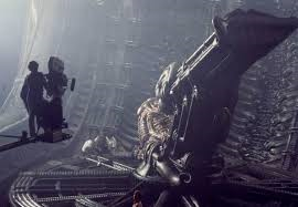
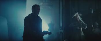
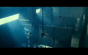
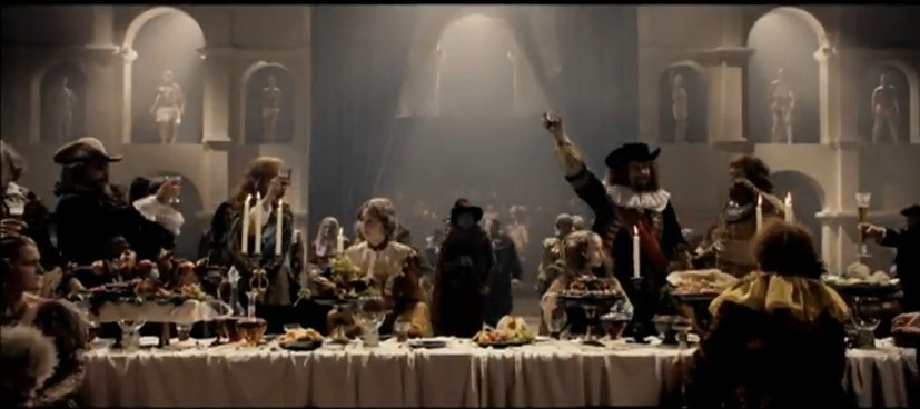
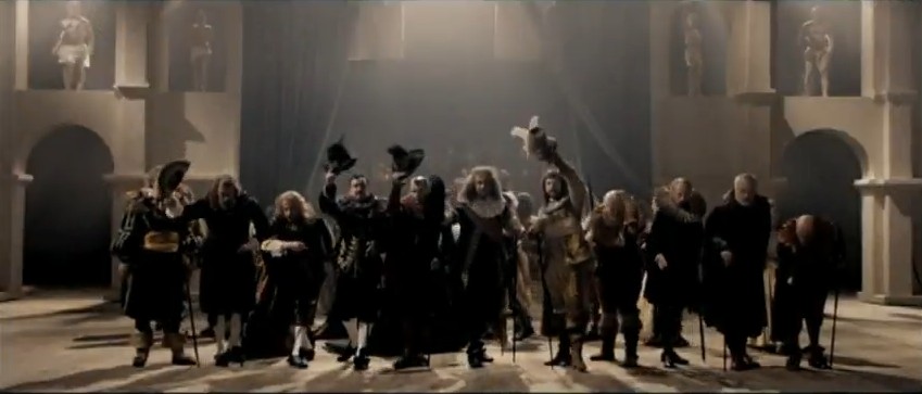
In the classical oil painting tradition and film making aerial perspective is employed relentlessly, as well as the dramatic effect of light and shade. Stages or locations, even interiors, will have smoke blown into them and be lit with warmer and cooler lighting to gain dramatic advantage and prevent background elements from interfering with figures and their interactions. As well as ambient lighting, you will also see the atmospheric smoke/haze itself illuminated, creating gradations, shafts and simple flat graphic design elements in the background. Look at how flattened out and simple the background becomes in close up shots allowing the viewer to concentrate on the character!
The images below are taken from a variety of film stills and demonstrate powerful and creative uses of aerial perspective within the confines of a room/film set; when watching films and television make a note of when and how aerial perspective is employed and try learn from it.