Visual Examples of the Principles of Design
Balance; Movement/rhythm; Similarity/Contrast; Dominance/Emphasis; Scale/Proportion; Unity/Harmony
Balance; Movement/rhythm; Similarity/Contrast; Dominance/Emphasis; Scale/Proportion; Unity/Harmony
Unity/Harmony
What constitutes harmony for one person might be different for another. Design theory is profoundly subjective. However, being familiar with the words and the concepts that hang on them might allow us to be more thoughtful when creating or reviewing work, individually, but most especially in a group. Harmony might be considered an umbrella concept for all of the design principles. Harmony in a design means that all of the art elements and principles of design relate to and compliment each other. Achieving harmony is considered to be a primary goal of design. No individual part is more important than the design of the whole. For example, there might be a pleasing aesthetic balance between unity and variety. Always consider that the principles of design can be twisted or ignored for the purposes of communication. For example, in film, a scene might be deliberately made to be aesthetically displeasing or downright disturbing in order to unnerve us.
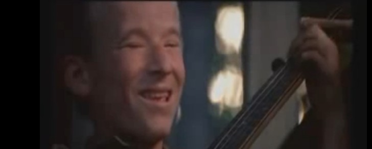
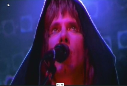
In music harmony is the sound of two or more discrete notes that sound pleasant together, that 'harmonize', as with a duet of voices. Or a guitar and banjo. For a spectacular deployment of the concept of harmony take a look at this film clip from the movie Deliverance, a story about some well-to-do middle class city businessmen taking a canoe trip down a river about to be dammed that will damn the landscape that dirt poor rustic hillbillies supplement their meagre existence from. There is no harmony between these urban and rural peoples. They represent two classes in society at profound dis-ease; the city boys represent those who are destroying the country boys and their way of life, and in the movie, which is a classic thriller, the country boys threaten to kill the city boys. There is an undercurrent of profound hostility in the idea of the guitar and banjo duelling; the film will in fact be a battle of wits between the canoeists and the people on the land. But in the short musical sequence, a harmony between the two people and the two instruments is established briefly. And then lost. I think just watching it explains a lot about what harmony can do both in music, art and design. Click the link here: https://www.youtube.com/watch?v=1tqxzWdKKu8
What constitutes harmony for one person might be different for another. Design theory is profoundly subjective. However, being familiar with the words and the concepts that hang on them might allow us to be more thoughtful when creating or reviewing work, individually, but most especially in a group. Harmony might be considered an umbrella concept for all of the design principles. Harmony in a design means that all of the art elements and principles of design relate to and compliment each other. Achieving harmony is considered to be a primary goal of design. No individual part is more important than the design of the whole. For example, there might be a pleasing aesthetic balance between unity and variety. Always consider that the principles of design can be twisted or ignored for the purposes of communication. For example, in film, a scene might be deliberately made to be aesthetically displeasing or downright disturbing in order to unnerve us.
In music harmony is the sound of two or more discrete notes that sound pleasant together, that 'harmonize', as with a duet of voices. Or a guitar and banjo. For a spectacular deployment of the concept of harmony take a look at this film clip from the movie Deliverance, a story about some well-to-do middle class city businessmen taking a canoe trip down a river about to be dammed that will damn the landscape that dirt poor rustic hillbillies supplement their meagre existence from. There is no harmony between these urban and rural peoples. They represent two classes in society at profound dis-ease; the city boys represent those who are destroying the country boys and their way of life, and in the movie, which is a classic thriller, the country boys threaten to kill the city boys. There is an undercurrent of profound hostility in the idea of the guitar and banjo duelling; the film will in fact be a battle of wits between the canoeists and the people on the land. But in the short musical sequence, a harmony between the two people and the two instruments is established briefly. And then lost. I think just watching it explains a lot about what harmony can do both in music, art and design. Click the link here: https://www.youtube.com/watch?v=1tqxzWdKKu8
Before leaving the idea of harmony expressed in music and sound, here's another thing to consider. Many bird lovers consider the thrush family to be the some of the most beautiful sound makers. Their song consists of flute like trilling and singing. The American Robin is an example. Here on the west coast we have the Varied Thrush, which emits just a simple series of trills. There is also the Veery and Wood Thrush. When I was child in the UK it was the Blackbird, closely related to our Robin, which was the most conspicuous and beautiful songbird. Search any of these birds on YouTube if you want to see them and hear their sound. Even the simple ones have an extraordinary resonance. This is apparently caused in birds by a different vocal mechanism than humans and mammals called a syrinx. It allows at least two sounds to be emitted and, in a sense, harmonize with each other creating rich satisfying voice. Interestingly, pan pipes were created by the Greek god Pan, after the chaste goddess Syrinx asked river nymphs for help. They turned her into reeds which Pan then made pan pipes out of. The first set of pipes were called Syrinx and the sexually frustrated Pan would play them for their haunting...haunted actually...sound.
It has been a struggle for me to find a few images to represent harmony, so if you look at the images below and think, 'I don't see the harmony in these' you might be quite justified. I have picked the examples and then tried to say why I think they might be harmonious. It is all very subjective. You might like to browse art images yourself, find ones you like, copy and paste them to a file and think about why the images you selected might suggest harmony of art elements and design principles. You can click on an image below for a larger view with correct image proportions and composition. The image might look more harmonious as a result...
The following images attempt in the gallery below attempt to illustrate examples of harmony/unity. You can click on each image to enlarge and see it in it's proper dimensions.
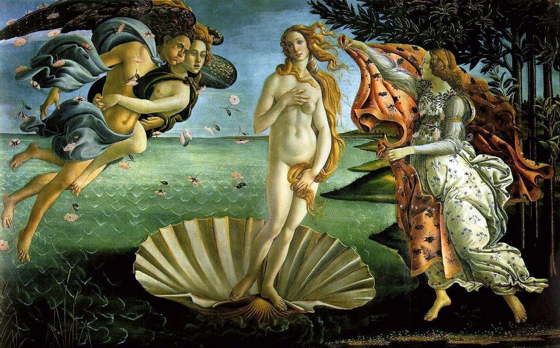
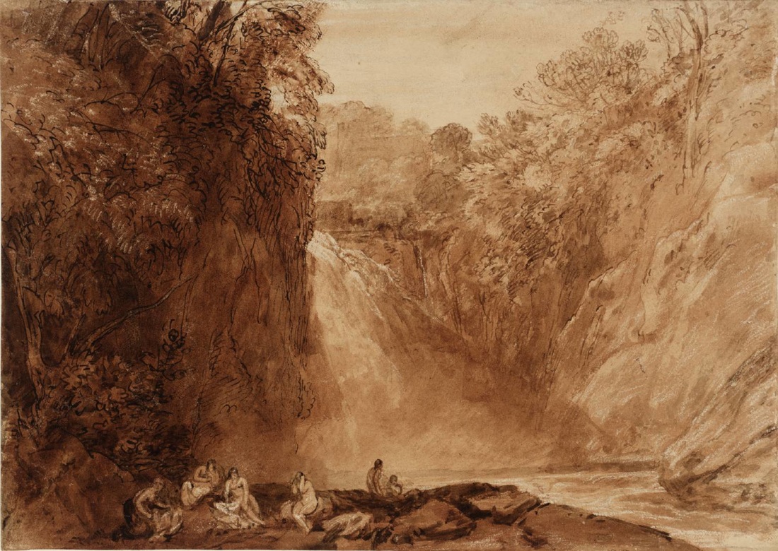
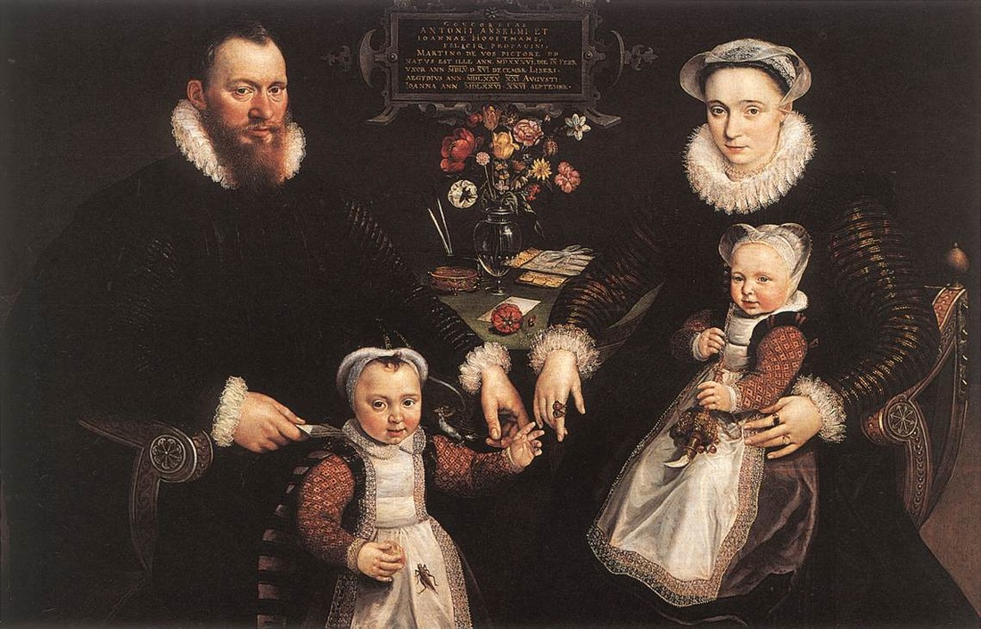
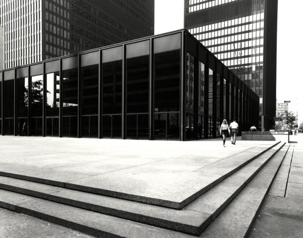
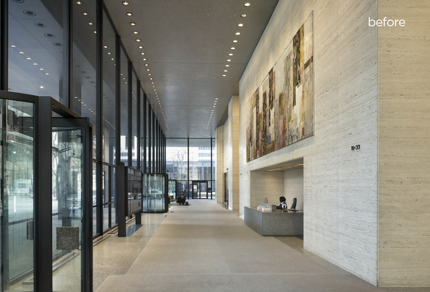
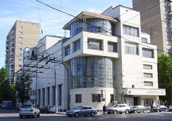
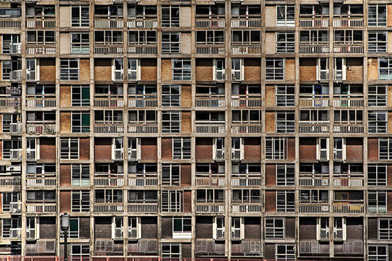
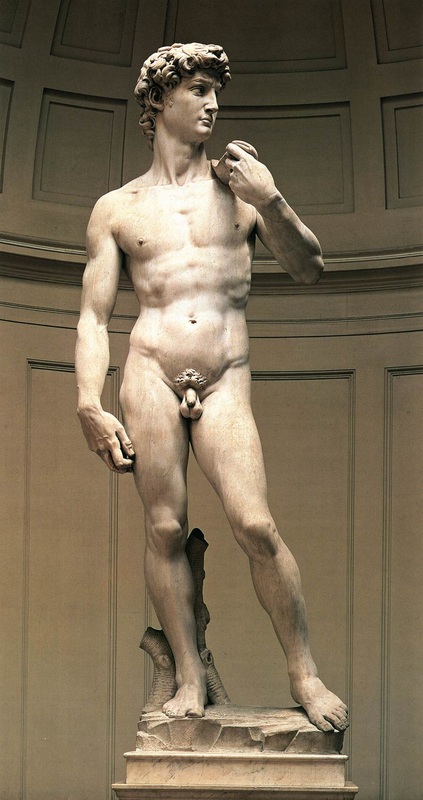
1 A lot of people find Botticelli's Birth of Venus beautiful and harmonious. This might result from the colour scheme, or the near symmetry of the design with Venus front and centre and the figures almost rotating around her in a vortex. Much of your feeling of pleasure from the aesthetic and design could come from a familiarity with Renaissance art and it's conventions of beauty. 2 Michelangelo's statue of David might be more persuasive in the case for harmony, in the engineering of the stance. This is a simple depiction of a male body. The figure is standing contrapposto, an iconic stable but alert position for the human figure. Weight is on one leg, and the other is poised to move either forward or back. The David figure is a cliché in sculpture, but if we take the time to really look at it closely with fresh eyes we might discover it to be a profound representation of the human form as a result of it's finely tuned balance between passive and dynamic elements; harmony of discrete and even opposite forces. If you at the figure of Venus in the Botticelli she almost looks ungainly by comparison. 3 Sepia drawings of scenes often seem to me to evoke a kind of harmony. The warm monochromatic treatment of this landscape has a unifying effect and the artist has choreographed the composition of areas and tones beautifully. A large dark area on the left is balanced by a larger lighter area on right, and the two are bridged by the sliver of land on which the figures sit. There is a completeness to the scene. I look at it and I'm not worried about what might be outside of the frame of reference. 4 This sombre family portrait seems to emit a series of harmonizing low pitched drones like a small chorus of insects. Like the Botticelli the almost disembodied heads seem to orbit around the cluster of hands, flowers and table top in a subdued but pleasing way. 5-7 Some examples of architecture. I once worked in a studio in one of the towers at the Toronto Dominion Centre in Toronto designed by Ludwig Mies van der Rohe. I found it an very pleasing and harmonious place to be. The effect of harmony in a design is completely unconscious, and it is a struggle to put into words why something is so aesthetically pleasing. But this is a design course and we are taking the time to consider this sort of thing. I think it was the unity of forms and design elements throughout the complex. Walking on the granite walkways with carefully placed trees and shrubs was like walking across a table top with a simple tasteful still life on it. As imposing as the towers were, they made you feel shielded, and the space below felt open and safe. There was no visual clutter; you could breath easy and move easily through the space. It was quite magic. 8 I'm not sure I could feel the same way about the architecture in this image.
It has been a struggle for me to find a few images to represent harmony, so if you look at the images below and think, 'I don't see the harmony in these' you might be quite justified. I have picked the examples and then tried to say why I think they might be harmonious. It is all very subjective. You might like to browse art images yourself, find ones you like, copy and paste them to a file and think about why the images you selected might suggest harmony of art elements and design principles. You can click on an image below for a larger view with correct image proportions and composition. The image might look more harmonious as a result...
The following images attempt in the gallery below attempt to illustrate examples of harmony/unity. You can click on each image to enlarge and see it in it's proper dimensions.
1 A lot of people find Botticelli's Birth of Venus beautiful and harmonious. This might result from the colour scheme, or the near symmetry of the design with Venus front and centre and the figures almost rotating around her in a vortex. Much of your feeling of pleasure from the aesthetic and design could come from a familiarity with Renaissance art and it's conventions of beauty. 2 Michelangelo's statue of David might be more persuasive in the case for harmony, in the engineering of the stance. This is a simple depiction of a male body. The figure is standing contrapposto, an iconic stable but alert position for the human figure. Weight is on one leg, and the other is poised to move either forward or back. The David figure is a cliché in sculpture, but if we take the time to really look at it closely with fresh eyes we might discover it to be a profound representation of the human form as a result of it's finely tuned balance between passive and dynamic elements; harmony of discrete and even opposite forces. If you at the figure of Venus in the Botticelli she almost looks ungainly by comparison. 3 Sepia drawings of scenes often seem to me to evoke a kind of harmony. The warm monochromatic treatment of this landscape has a unifying effect and the artist has choreographed the composition of areas and tones beautifully. A large dark area on the left is balanced by a larger lighter area on right, and the two are bridged by the sliver of land on which the figures sit. There is a completeness to the scene. I look at it and I'm not worried about what might be outside of the frame of reference. 4 This sombre family portrait seems to emit a series of harmonizing low pitched drones like a small chorus of insects. Like the Botticelli the almost disembodied heads seem to orbit around the cluster of hands, flowers and table top in a subdued but pleasing way. 5-7 Some examples of architecture. I once worked in a studio in one of the towers at the Toronto Dominion Centre in Toronto designed by Ludwig Mies van der Rohe. I found it an very pleasing and harmonious place to be. The effect of harmony in a design is completely unconscious, and it is a struggle to put into words why something is so aesthetically pleasing. But this is a design course and we are taking the time to consider this sort of thing. I think it was the unity of forms and design elements throughout the complex. Walking on the granite walkways with carefully placed trees and shrubs was like walking across a table top with a simple tasteful still life on it. As imposing as the towers were, they made you feel shielded, and the space below felt open and safe. There was no visual clutter; you could breath easy and move easily through the space. It was quite magic. 8 I'm not sure I could feel the same way about the architecture in this image.


Harmony/Unity continued...
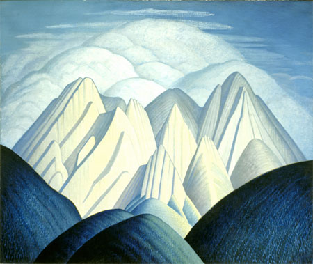
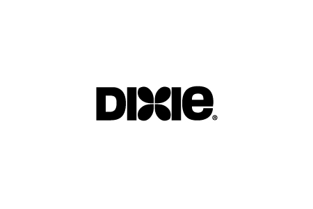
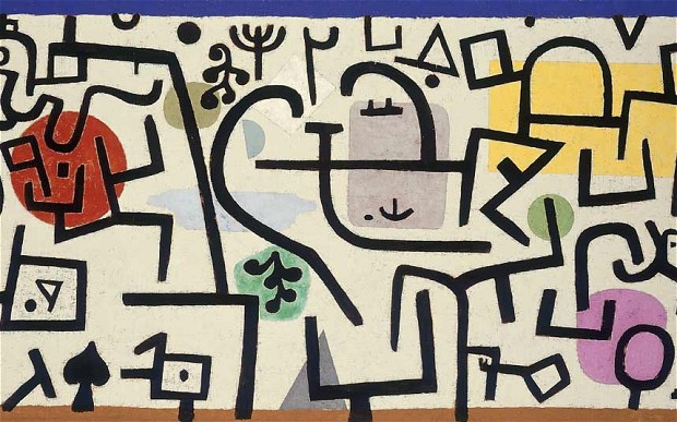
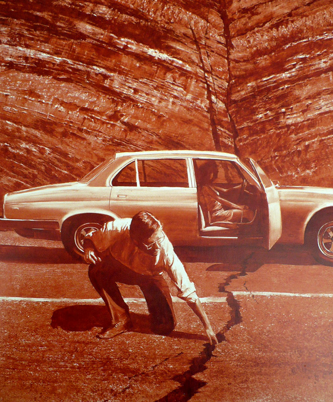
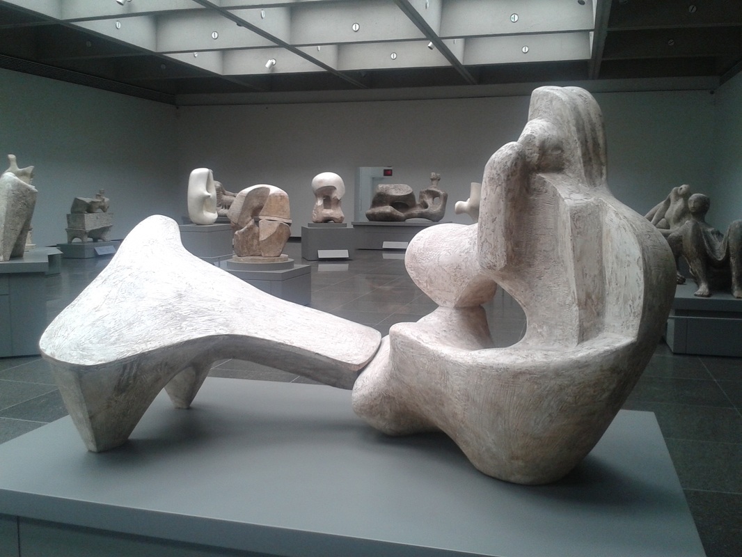
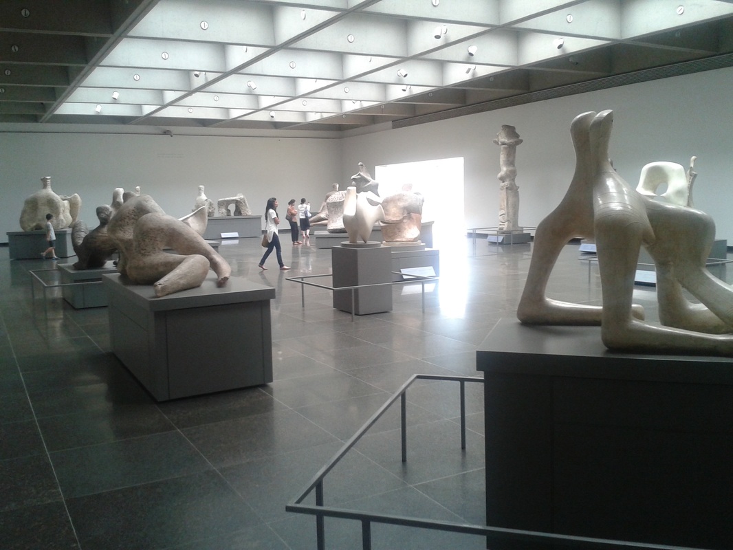
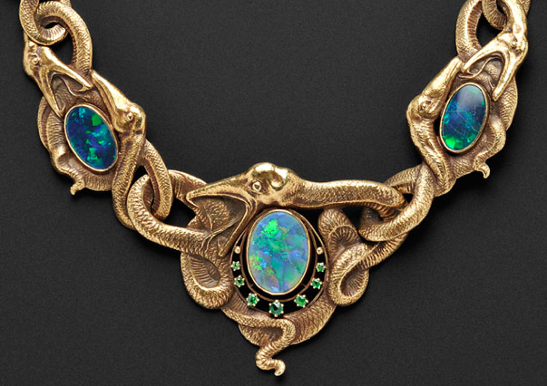
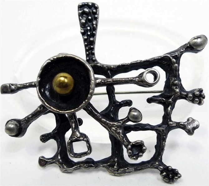
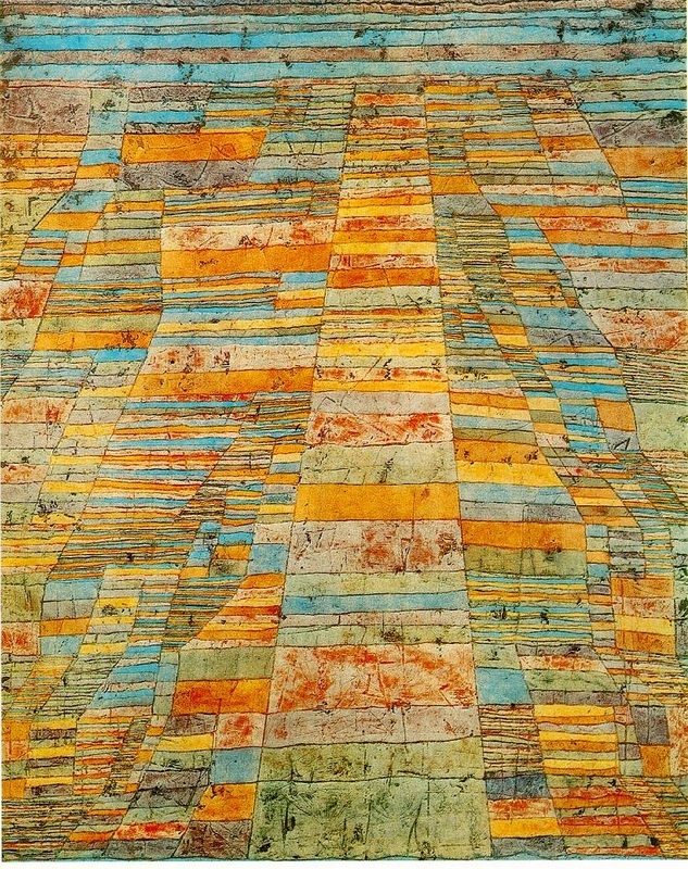
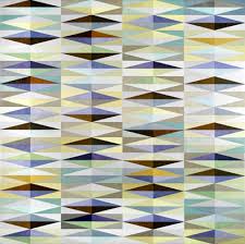
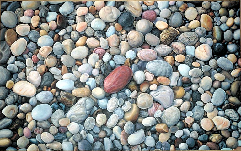
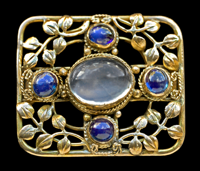
1 In this Lauren Harris painting there is arguably a kind of stylistic harmony in the technique and treatment throughout. Look also to the stacked clouds and mountains. Despite an organic curvaceous treatment of the clouds and a crystalline geometric treatment of the mountains, the two seem to mirror each other, harmonize, in a similar way to the duelling banjos song. 2 Simple text by Saul Bass for Dixie Cups. Does this seem to have harmony? I think so, and it's down to the slightly soft and organic choice of font that works with the floral organic 'x' design in the centre. 3 A simple graphic painting by Klee. If there is harmony it is again supplied by consistency of style and treatment as well as a careful compositional arrangement of the visual motifs. 4 A painting by Mark Tansey. The monochromatic colour treatment as well as the very meat and potatoes treatment of the paint unifies the whole. But it's worth bearing in mind Tansey's work is conceptual in nature, it is about a very simple idea much like a New Yorker cartoon, and his colour deprived paintings help draw attention to the simple idea behind the work. A car on a road split in two by sublime forces of nature and a man sticking his finger in the wound in the tarmac in the same way as doubting Thomas allegedly thrust his fingers in the chest wound of the resurrected Christ. Get it? Next... 5-6 Henry Moore Sculpture room at the Art Gallery of Ontario. Moore was involved in the design of this large space to exhibit his plaster casts of sculpture and it is a remarkably harmonious place to view the work. There is harmony, of course, between the sculptural material and it's organic forms and these are accentuated by the square room and ceiling architecture. 7-8 Harmony in jewellery designs. Writhing organic scrolling forms hold the design on left together. The piece on the right is in the 'Brutalist' style, which isn't to suggest it's brutal...the nomenclature comes from architecture and a French word for a design movement that used concrete. However, there is an apparently blunt and coarse treatment of the material which nevertheless unifies the whole. I quite like the style. Even if I didn't, I would still have to admit the design has harmony. 9-12 Three paintings and a photo. All arguably have a sense of unity. But when does unity become boring? A case can be made that these images simply become repetitive patterns and tedious. Of course, this can provoke a meditative quality; again, there is a huge amount of subjectivity in assessing design principles.
1 In this Lauren Harris painting there is arguably a kind of stylistic harmony in the technique and treatment throughout. Look also to the stacked clouds and mountains. Despite an organic curvaceous treatment of the clouds and a crystalline geometric treatment of the mountains, the two seem to mirror each other, harmonize, in a similar way to the duelling banjos song. 2 Simple text by Saul Bass for Dixie Cups. Does this seem to have harmony? I think so, and it's down to the slightly soft and organic choice of font that works with the floral organic 'x' design in the centre. 3 A simple graphic painting by Klee. If there is harmony it is again supplied by consistency of style and treatment as well as a careful compositional arrangement of the visual motifs. 4 A painting by Mark Tansey. The monochromatic colour treatment as well as the very meat and potatoes treatment of the paint unifies the whole. But it's worth bearing in mind Tansey's work is conceptual in nature, it is about a very simple idea much like a New Yorker cartoon, and his colour deprived paintings help draw attention to the simple idea behind the work. A car on a road split in two by sublime forces of nature and a man sticking his finger in the wound in the tarmac in the same way as doubting Thomas allegedly thrust his fingers in the chest wound of the resurrected Christ. Get it? Next... 5-6 Henry Moore Sculpture room at the Art Gallery of Ontario. Moore was involved in the design of this large space to exhibit his plaster casts of sculpture and it is a remarkably harmonious place to view the work. There is harmony, of course, between the sculptural material and it's organic forms and these are accentuated by the square room and ceiling architecture. 7-8 Harmony in jewellery designs. Writhing organic scrolling forms hold the design on left together. The piece on the right is in the 'Brutalist' style, which isn't to suggest it's brutal...the nomenclature comes from architecture and a French word for a design movement that used concrete. However, there is an apparently blunt and coarse treatment of the material which nevertheless unifies the whole. I quite like the style. Even if I didn't, I would still have to admit the design has harmony. 9-12 Three paintings and a photo. All arguably have a sense of unity. But when does unity become boring? A case can be made that these images simply become repetitive patterns and tedious. Of course, this can provoke a meditative quality; again, there is a huge amount of subjectivity in assessing design principles.
Balance
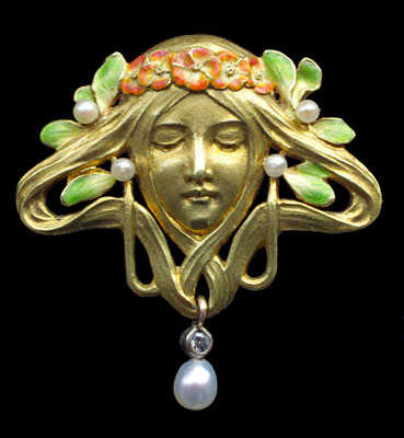
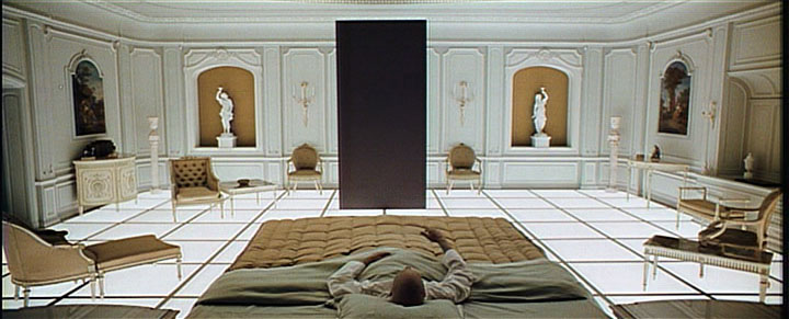
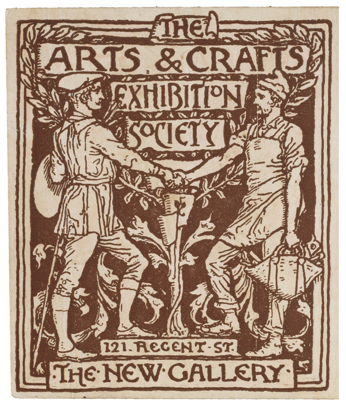
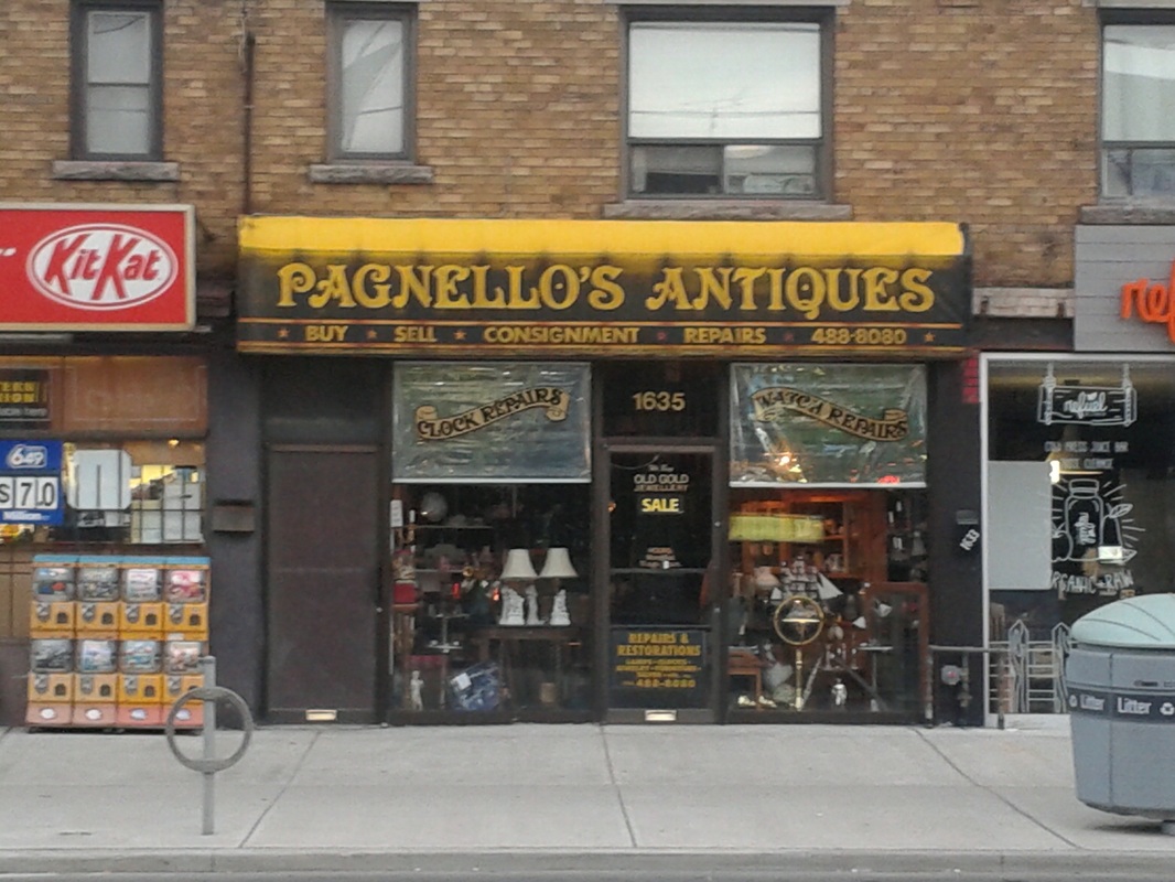
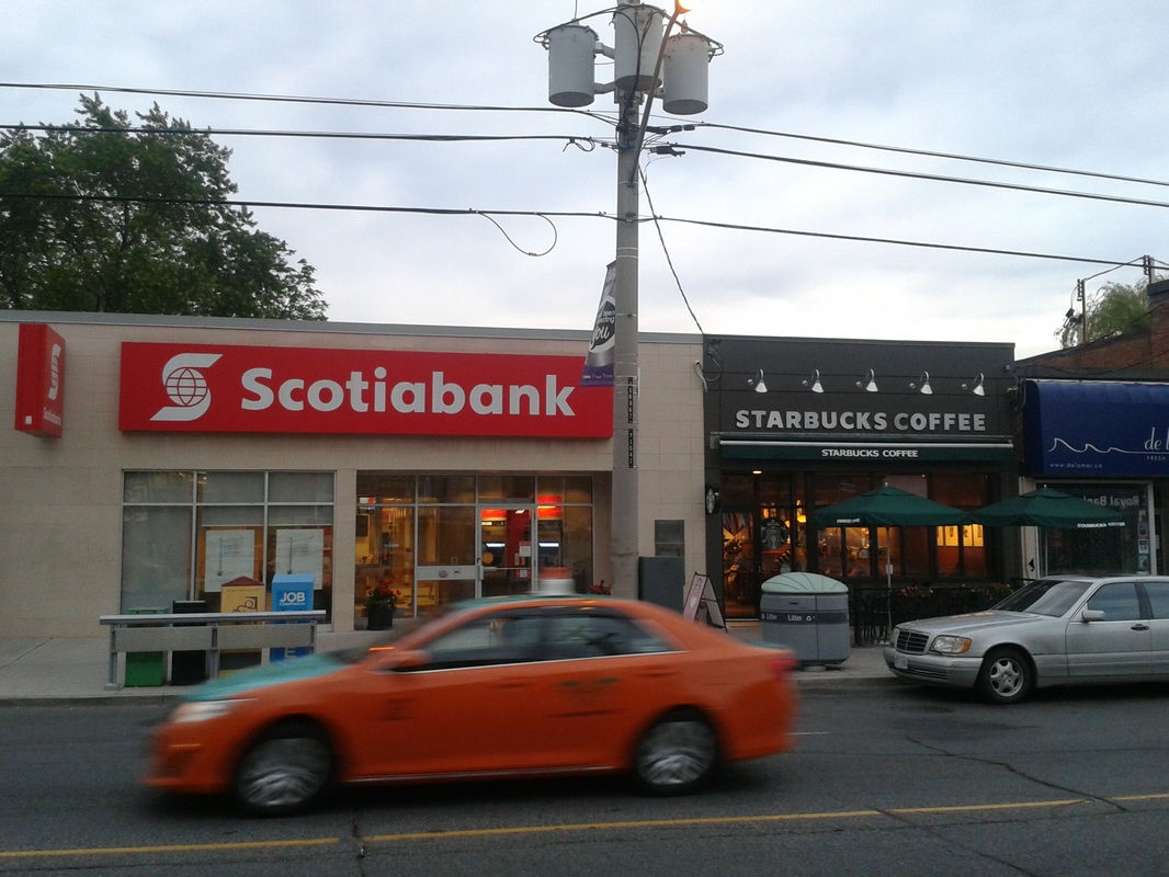
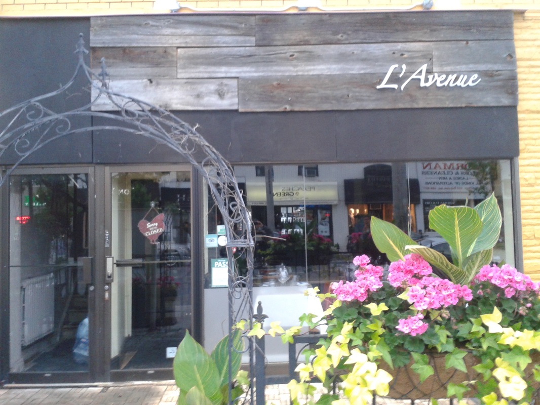
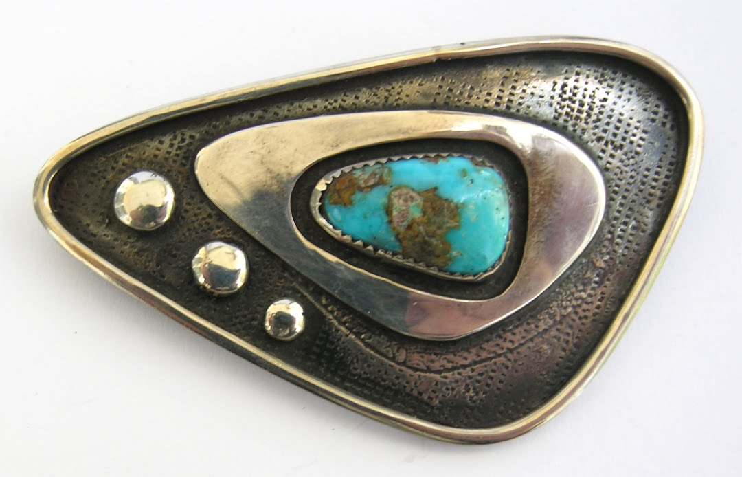
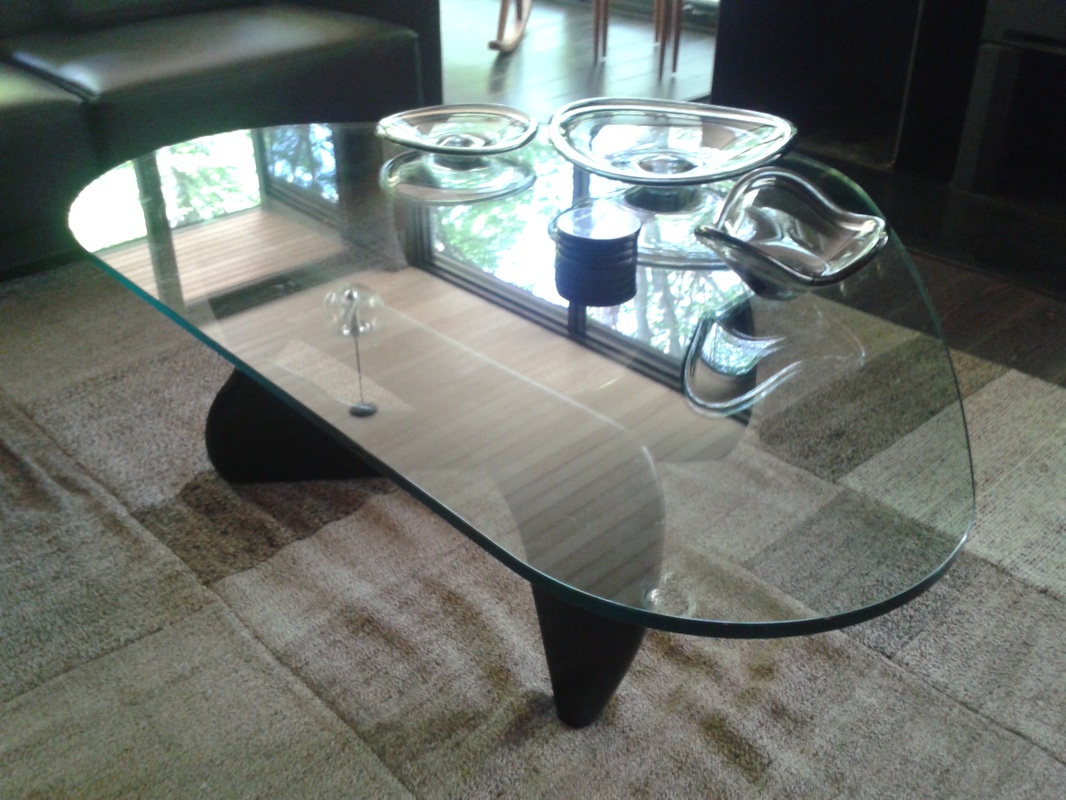
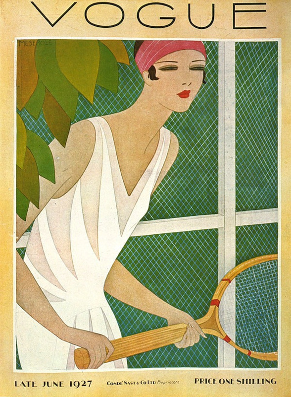
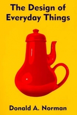
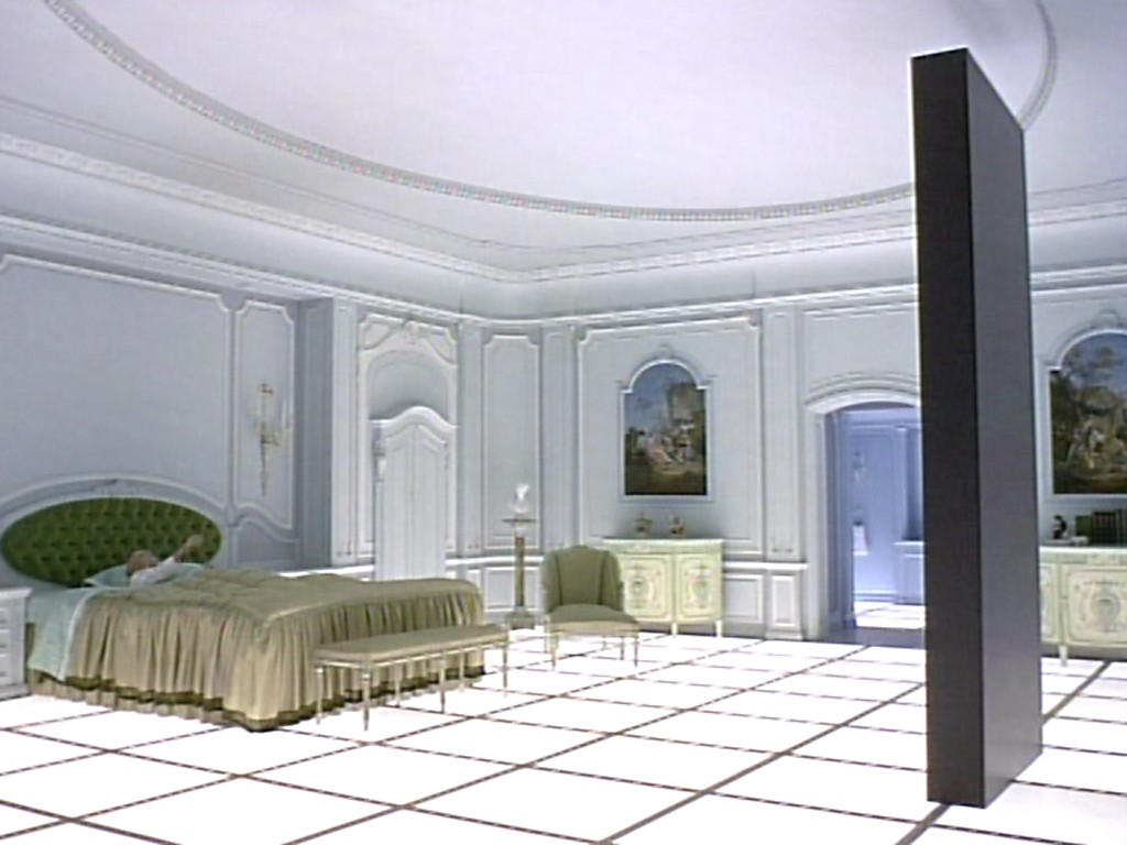
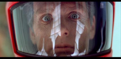
Balance is equalized tension and equilibrium between some or all of the elements of art and design. Symmetry is an obvious example of balance. Asymmetrical balance produces an informal dynamic balance that attracts attention. It's easiest to illustrate and discuss balance in terms composition, but as mentioned above, all the elements of design can be balanced in more subtle ways. Click on the image to see full size and check the composition. 1-2 Almost perfectly symmetrical pieces of jewellery. 3 A mostly symmetrical screen grab from 2001: A space Odyssey. Most film shots are balanced asymmetrically using the Golden Rectangle, but at regular intervals, during profound moments or scenes, film makers like Kubrick employ single point perspective and an almost fearful symmetry. 4 A beautiful classic Arts and Crafts design employed on an almost symmetrical design on a poster. 5-6 Straightforward and almost symmetrical design on store fronts in Toronto. The Scotiabank sign is slightly thrown off by the weight of the logo on the left. 7-8 Asymmetrical balance on two store fronts in Toronto. The weight of the text in both cases balance by the large empty space. Works for me. Does it work for you? If it does, isn't it strange that nothing can balance something? 9 Michelangelo's David. We've looked at this above because harmony is achieved by the wonderful feeling of balance as a result of the contrapposto stance. 10 Henry Moore sculpture. One piece in two parts, two parts which seem to balance each other out despite their differences. 11 A piece of jewellery with a wonderful sense of balance in my opinion. The slightly offset regressive cam-like shapes balance each other out in the way a flywheel smooth's and regulates the operation of an internal combustion engine. 12 The lovely organic modernist shapes of the glass table and the objects on it are balanced by placing the objects on the small narrow side and allowing the wide open empty side to act as a counter balance. 13 A lovely Art Deco poster. The figure is stylized and graphic but this is balanced by a wonderful naturalism that comes to the artist from countless hours drawing and studying the human form. On the compositional front, the weight of the racquet balances the figure beautifully. 14 Careful observation of this apparent clutter of Constructivist forms reveals a wonderful balance of discrete parts in placement, weight and colour. 15 A random point and shoot photograph taken while belaying a climber. 'Good' photographs generally rely on random variable selection. Many photographs might be taken impulsively and are edited down to a small number after. Obviously digital photography has enhanced this aspect of taking photographs. Previously, using film, when photographers took and edited large numbers of photos, to minimize the expense of printing, they would produce 'contact sheets' of many tiny images, which they would scrutinize through a magnifying 'Lupe'. In this photo the figure is balanced by the kayak, which almost seems to be orbiting the mass and density of the figure and rock face the way a moon is almost perfectly balanced despite being elliptical. 16 The Masochist's teapot, and experiment in perversion in the realm of product design, is not only irrational but insanely unbalanced looking.
Balance is equalized tension and equilibrium between some or all of the elements of art and design. Symmetry is an obvious example of balance. Asymmetrical balance produces an informal dynamic balance that attracts attention. It's easiest to illustrate and discuss balance in terms composition, but as mentioned above, all the elements of design can be balanced in more subtle ways. Click on the image to see full size and check the composition. 1-2 Almost perfectly symmetrical pieces of jewellery. 3 A mostly symmetrical screen grab from 2001: A space Odyssey. Most film shots are balanced asymmetrically using the Golden Rectangle, but at regular intervals, during profound moments or scenes, film makers like Kubrick employ single point perspective and an almost fearful symmetry. 4 A beautiful classic Arts and Crafts design employed on an almost symmetrical design on a poster. 5-6 Straightforward and almost symmetrical design on store fronts in Toronto. The Scotiabank sign is slightly thrown off by the weight of the logo on the left. 7-8 Asymmetrical balance on two store fronts in Toronto. The weight of the text in both cases balance by the large empty space. Works for me. Does it work for you? If it does, isn't it strange that nothing can balance something? 9 Michelangelo's David. We've looked at this above because harmony is achieved by the wonderful feeling of balance as a result of the contrapposto stance. 10 Henry Moore sculpture. One piece in two parts, two parts which seem to balance each other out despite their differences. 11 A piece of jewellery with a wonderful sense of balance in my opinion. The slightly offset regressive cam-like shapes balance each other out in the way a flywheel smooth's and regulates the operation of an internal combustion engine. 12 The lovely organic modernist shapes of the glass table and the objects on it are balanced by placing the objects on the small narrow side and allowing the wide open empty side to act as a counter balance. 13 A lovely Art Deco poster. The figure is stylized and graphic but this is balanced by a wonderful naturalism that comes to the artist from countless hours drawing and studying the human form. On the compositional front, the weight of the racquet balances the figure beautifully. 14 Careful observation of this apparent clutter of Constructivist forms reveals a wonderful balance of discrete parts in placement, weight and colour. 15 A random point and shoot photograph taken while belaying a climber. 'Good' photographs generally rely on random variable selection. Many photographs might be taken impulsively and are edited down to a small number after. Obviously digital photography has enhanced this aspect of taking photographs. Previously, using film, when photographers took and edited large numbers of photos, to minimize the expense of printing, they would produce 'contact sheets' of many tiny images, which they would scrutinize through a magnifying 'Lupe'. In this photo the figure is balanced by the kayak, which almost seems to be orbiting the mass and density of the figure and rock face the way a moon is almost perfectly balanced despite being elliptical. 16 The Masochist's teapot, and experiment in perversion in the realm of product design, is not only irrational but insanely unbalanced looking.


Hierarchy
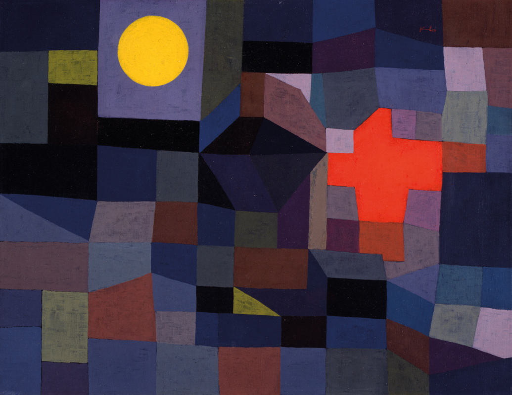
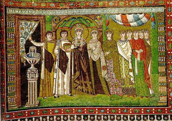
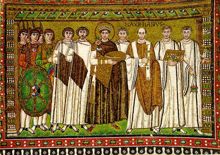
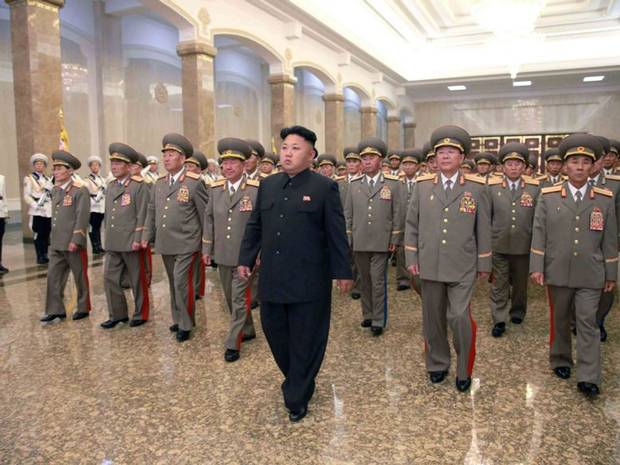
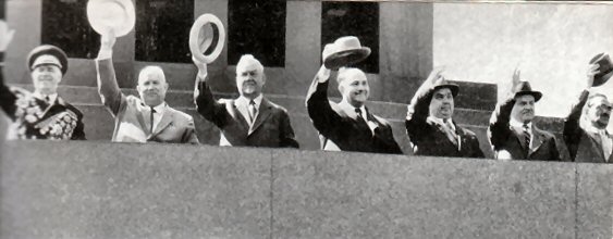
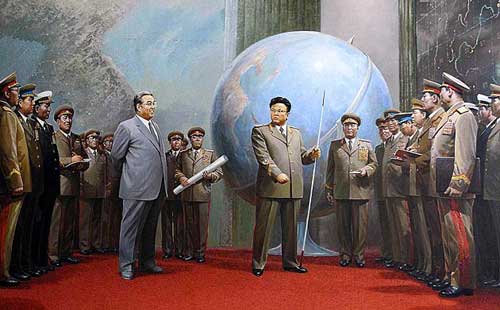
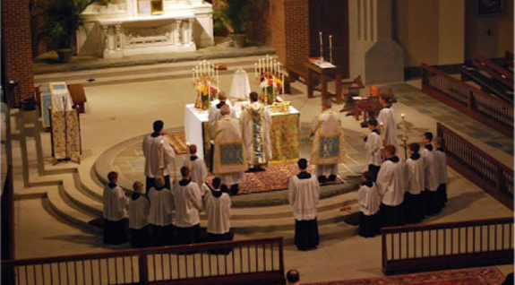
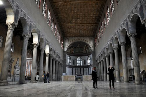
In good design there is generally an order of significance to the various elements. A careful deployment of the principle of hierarchy will ensure the user is aware of an appropriate order (one, two, three, four, etc.). 1 Hierarchy can be as simple placement and choice of colour in abstract shapes, as in this painting. The most important element is probably the yellow circle with red cross a close second. In order to establish the meaning of hierarchy in a raw and easy to understand, here are a series of images that show raw power manifested in hierarchy. 2-3 The Emperor (Eastern or Byzantine Emperor) Justinian and Empress Theodora in mosaics at San Vitale in Ravenna. Justinian and Theodora both have halos and carry objects of significance and power. There can be no doubt as to their place in the hierarchy of beings in each frieze. In both cases, but especially the image with Justinian (3) you can see a hierarchy amongst the figures. The closer individuals are to the ultimate power the more important they are, administrators, church representatives, the more 'real' and portrait like their appearance is. The bishop of Ravenna, Maximus, is actually named. On the far left, members of the army appear almost clone like in appearance with no individually distinguishing features. As well as Hierarchy there is also balance; Justinian the Emperor and his government occupies a central position between forces of the Church and forces of the army. Politics is often described aptly as Byzantine. 4 Note the similarities and differences in the arrangement in this photo of Dear Leader Kim Jong-un of North Korea. No church or other sources of power to balance the military here. The senior military men abreast behind their leader are, to the western viewer at least, as anonymous as the soldiers in the court of Justinian. 5 However, observers of power might note how individuals get shuffled like cabinets in and out of favour. The hierarchy of individuals at May Day parades in Soviet Russia could learn a lot about who's who in the Politburo by noting how officials were arranged relative to the President. 6 The same can be said for North Korean painting. That sure looks like Kim Jong-Il's dad, looking on approvingly on the left side of the painting. 7 The liturgy of most Christian churches is a direct descendant of the hierarchical political structures characteristic of Byzantine Mediaeval government. The administration of the churches, particularly the more traditional and orthodox are reminiscent of ancient state structures. At the front of a mass you have the same orderly placement, hierarchy of individuals and objects who mete out power from God. Incredibly, many modern states employ the God delusion to shore up their power, claiming that it comes from an alleged deity. 8 A photograph of a basilica. The basilica was the official public court building in the later Roman period. It was official government architecture. Not surprisingly the design was adopted by the Church as an official building for spiritual governance. So much about modern churches is deeply rooted in mediaeval governmental design and practice. The repetition of the colonnades can be considered to be hierarchical in nature, leading to the apse, the most significant place in the design of the whole. High in the apse, in a church, would usually be a mosaic or fresco of Christ enthroned. Linear and aerial perspective both establish a hierarchy amongst objects in a picture plane from foreground to background.
In good design there is generally an order of significance to the various elements. A careful deployment of the principle of hierarchy will ensure the user is aware of an appropriate order (one, two, three, four, etc.). 1 Hierarchy can be as simple placement and choice of colour in abstract shapes, as in this painting. The most important element is probably the yellow circle with red cross a close second. In order to establish the meaning of hierarchy in a raw and easy to understand, here are a series of images that show raw power manifested in hierarchy. 2-3 The Emperor (Eastern or Byzantine Emperor) Justinian and Empress Theodora in mosaics at San Vitale in Ravenna. Justinian and Theodora both have halos and carry objects of significance and power. There can be no doubt as to their place in the hierarchy of beings in each frieze. In both cases, but especially the image with Justinian (3) you can see a hierarchy amongst the figures. The closer individuals are to the ultimate power the more important they are, administrators, church representatives, the more 'real' and portrait like their appearance is. The bishop of Ravenna, Maximus, is actually named. On the far left, members of the army appear almost clone like in appearance with no individually distinguishing features. As well as Hierarchy there is also balance; Justinian the Emperor and his government occupies a central position between forces of the Church and forces of the army. Politics is often described aptly as Byzantine. 4 Note the similarities and differences in the arrangement in this photo of Dear Leader Kim Jong-un of North Korea. No church or other sources of power to balance the military here. The senior military men abreast behind their leader are, to the western viewer at least, as anonymous as the soldiers in the court of Justinian. 5 However, observers of power might note how individuals get shuffled like cabinets in and out of favour. The hierarchy of individuals at May Day parades in Soviet Russia could learn a lot about who's who in the Politburo by noting how officials were arranged relative to the President. 6 The same can be said for North Korean painting. That sure looks like Kim Jong-Il's dad, looking on approvingly on the left side of the painting. 7 The liturgy of most Christian churches is a direct descendant of the hierarchical political structures characteristic of Byzantine Mediaeval government. The administration of the churches, particularly the more traditional and orthodox are reminiscent of ancient state structures. At the front of a mass you have the same orderly placement, hierarchy of individuals and objects who mete out power from God. Incredibly, many modern states employ the God delusion to shore up their power, claiming that it comes from an alleged deity. 8 A photograph of a basilica. The basilica was the official public court building in the later Roman period. It was official government architecture. Not surprisingly the design was adopted by the Church as an official building for spiritual governance. So much about modern churches is deeply rooted in mediaeval governmental design and practice. The repetition of the colonnades can be considered to be hierarchical in nature, leading to the apse, the most significant place in the design of the whole. High in the apse, in a church, would usually be a mosaic or fresco of Christ enthroned. Linear and aerial perspective both establish a hierarchy amongst objects in a picture plane from foreground to background.
Hierarchy continued...
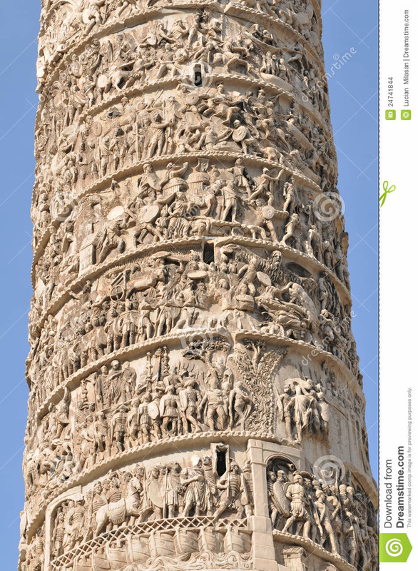
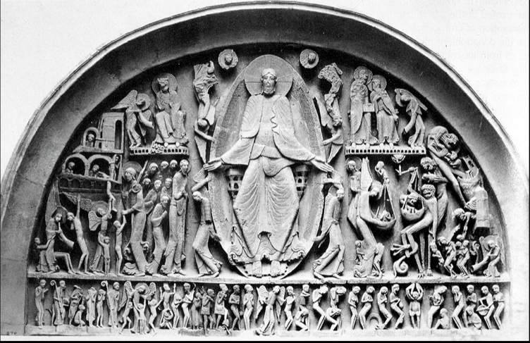
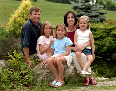
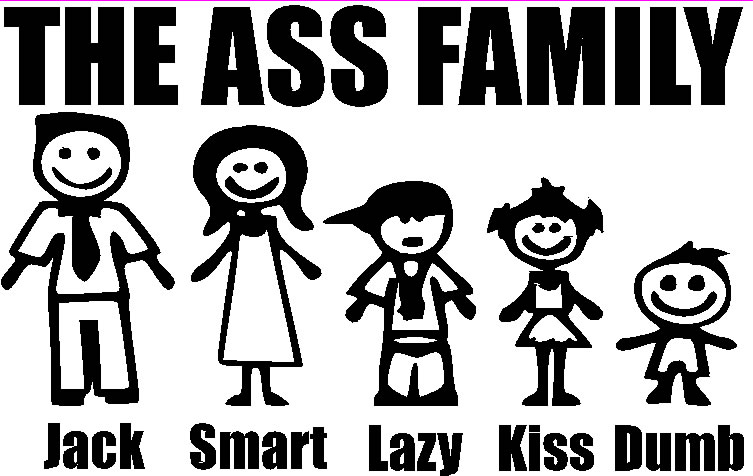
1 Trajan's Column, erected at the beginning of the second century AD in Rome, has a scrolling bass relief circulating around it's girth. It is essentially a visual narrative documenting wars between the Romans and Dacians. Narrative can be thought of as a hierarchy of sorts, and orderly structure of events or plot. The visually tiered appearance of the column foreshadows the extremely tiered and hierarchic design of later Romanesque and Mediaeval design. 2 Christ and judgement day from a Romanesque church portal. Deeply hierarchic. 3 Judgement day on Michelangelo's Sistine Chapel; divinely perceived hierarchy still reigns supreme, much like the perception of god. 4 Size matters. In Mediaeval art hierarchies are often established by the size of a paintings occupants. There can be no doubt who the big man is here. 5 Family portraiture is an interesting study in hierarchy. The arrangement of power in modern families is distributed subtly and often creatively. 6 In the Ass Family the hierarchy is more obvious. 7 This is a photo from a company that sells faceless family figures that purchasers can arrange in their own groupings. Like children's drawings of their families, a lot might be inferred from any hierarchies noticed. 8 Portraits of The Holy Family often have interesting twist to the established hierarchy as we shall see in the class slide show. Notice the virgin and child indoors in this etching by Rembrandt. If you look in the window you can see Joseph, cuckolded by God, staring in at 'his' family from outside...
1 Trajan's Column, erected at the beginning of the second century AD in Rome, has a scrolling bass relief circulating around it's girth. It is essentially a visual narrative documenting wars between the Romans and Dacians. Narrative can be thought of as a hierarchy of sorts, and orderly structure of events or plot. The visually tiered appearance of the column foreshadows the extremely tiered and hierarchic design of later Romanesque and Mediaeval design. 2 Christ and judgement day from a Romanesque church portal. Deeply hierarchic. 3 Judgement day on Michelangelo's Sistine Chapel; divinely perceived hierarchy still reigns supreme, much like the perception of god. 4 Size matters. In Mediaeval art hierarchies are often established by the size of a paintings occupants. There can be no doubt who the big man is here. 5 Family portraiture is an interesting study in hierarchy. The arrangement of power in modern families is distributed subtly and often creatively. 6 In the Ass Family the hierarchy is more obvious. 7 This is a photo from a company that sells faceless family figures that purchasers can arrange in their own groupings. Like children's drawings of their families, a lot might be inferred from any hierarchies noticed. 8 Portraits of The Holy Family often have interesting twist to the established hierarchy as we shall see in the class slide show. Notice the virgin and child indoors in this etching by Rembrandt. If you look in the window you can see Joseph, cuckolded by God, staring in at 'his' family from outside...


Scale/proportion
Size matters. Some art objects and images require large format for appreciation. Others require a small format. All objects and images have a distance, or proximity at which they 'read' best. For a humorous glimpse of scale out of proportion you might like to watch this clip from the 'mocumentary' Spinal Tap, about an ill fated comeback tour by a glam/prog rock band. Prior to the clip, the dimensions of a piece of scenic art loosely based on Stonehenge are scribbled down incorrectly on a napkin and made precisely to the wrong specifications by a sculptor/model maker. At the beginning of the clip the error is discovered by the bands manager and steps are taken to solve the problem. Hilarity ensues... click here: https://vimeo.com/94459739
Size matters. Some art objects and images require large format for appreciation. Others require a small format. All objects and images have a distance, or proximity at which they 'read' best. For a humorous glimpse of scale out of proportion you might like to watch this clip from the 'mocumentary' Spinal Tap, about an ill fated comeback tour by a glam/prog rock band. Prior to the clip, the dimensions of a piece of scenic art loosely based on Stonehenge are scribbled down incorrectly on a napkin and made precisely to the wrong specifications by a sculptor/model maker. At the beginning of the clip the error is discovered by the bands manager and steps are taken to solve the problem. Hilarity ensues... click here: https://vimeo.com/94459739
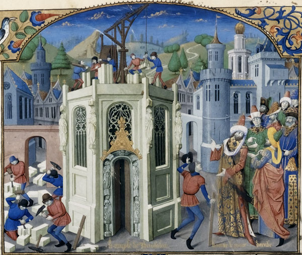
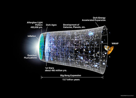
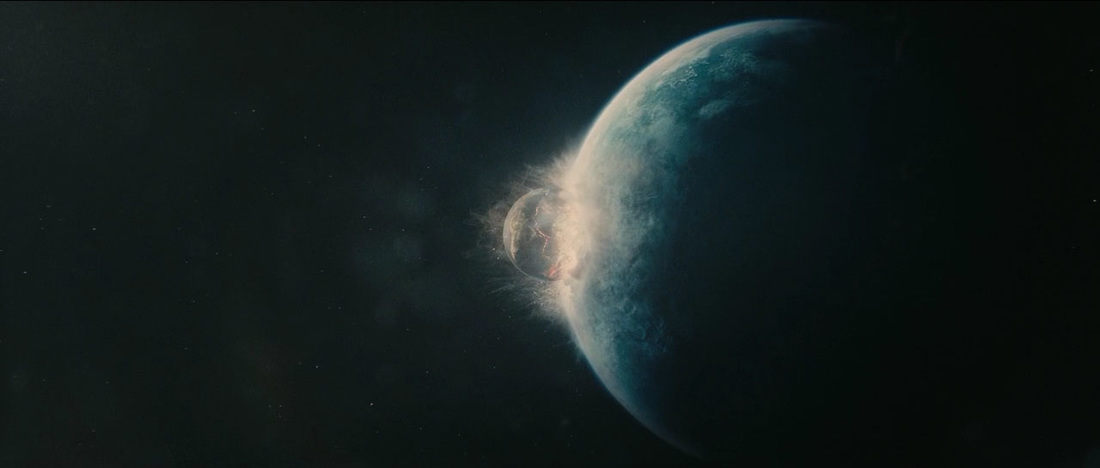
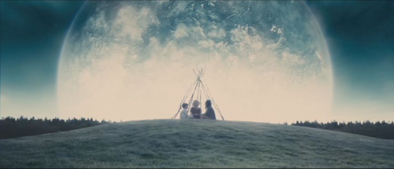
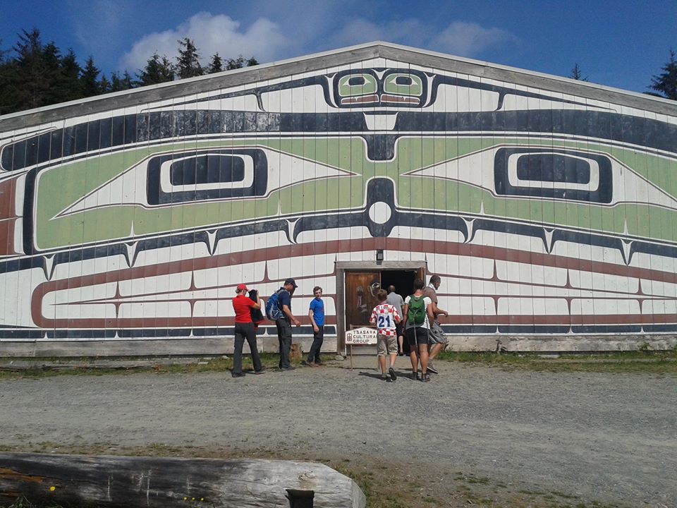
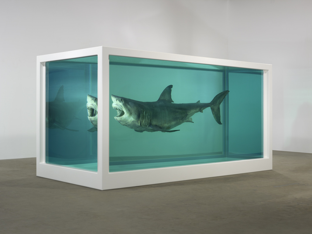
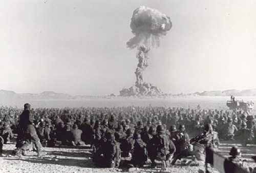
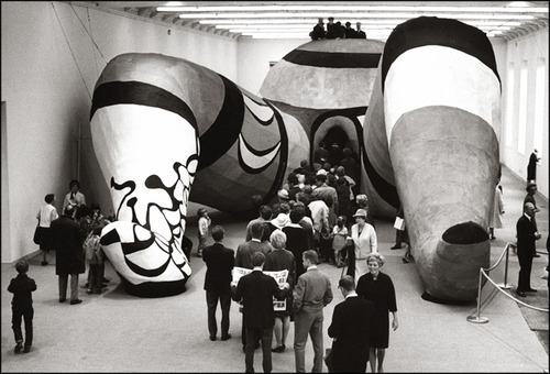
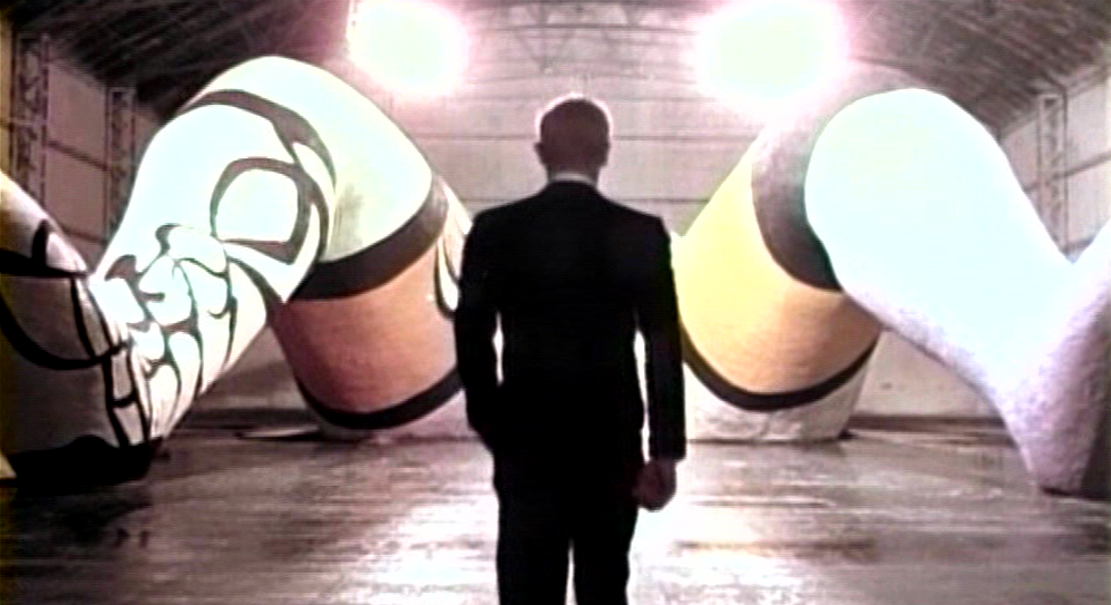
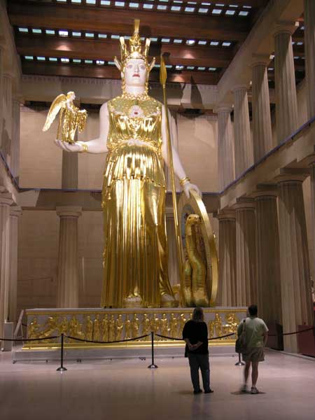
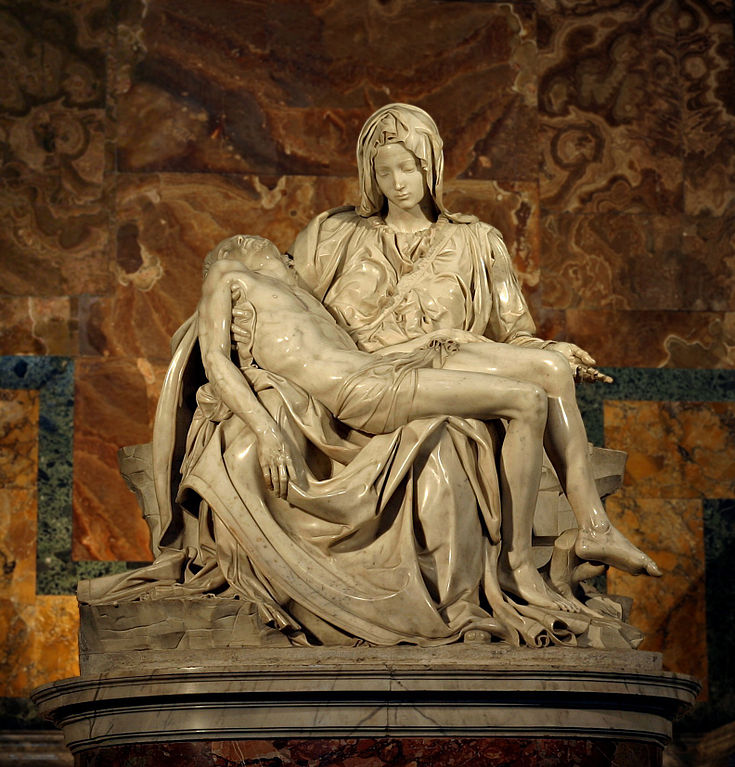
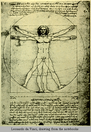
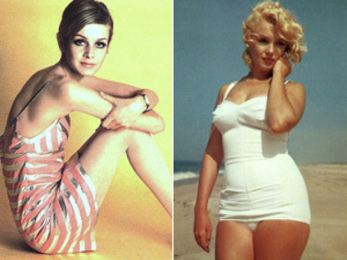
The design principle of scale/proportion can apply to the various components of a design, but also to the choice of scale. Scale can make a thought or an object manageable or incomprehensible. 1 A diagram possibly illustrating the observable universe that we see looking backwards in time down a cone that ends with the Big Bang. The enormity of the universe is incomprehensive to us. 2-3 CGI generated screen grab of footage of the Earth colliding with a renegade 'Super Earth' exo-planet that enters the solar system in the movie Melancholia by Lars von Trier. The idea of a huge earth swallowing our earth is a profound exercise in the idea and application of scale and proportion. 4-5 Size matters in cultural matters. The marvelous Big House at Alert Bay off Vancouver Island. The experience of entering and being in the hall and witnessing cultural activities within the vast space is magic. Just outside is the 'largest totem pole' in the world. Advocates of other poles dispute the claim, as this one is made of two discrete pieces of wood, but it is nevertheless an imposing artifact. 6 A lot of modern architecture is designed to intimidate the human individual and make them subservient to government and cultural institutions. Churches come to mind. 7 Works of visual art range from miniature to monstrous in scale. They are often designed to be 'read' at a particular distance. A mural is read at a different proximity than a print advert. 8 The idea of a large shark in a large tank is more impressive than a small shark in a small tank. 9 Large events like nuclear bomb tests are not meant to be witnessed in close proximity. You need to stand back and close your eyes to appreciate them. 10 Jean Tinguely and Niki de saint Phalle's Hons, or Woman, is a remarkable art object in terms of scale. The large size rather than life size allows spectators to literally walk back into the womb. 11 The artists recreated the object as a prop in the disturbing Italian film La Femina Ridens. 12 An artists recreation of the fabled Athena Parthenos, originally housed in the Parthenon. If the statue were an item on a mantelpiece it might be less fabled. 13 Dismembered parts of the Colossus of Constantine which occupied the Basilica of Maxentius in Rome. Size matters for politicians as much as deities. 14 Michelangelo's Pieta, in which the Virgin holds her dead adult son, would allegedly tower over her progeny should they stand back to back. 15 Proportion and scale are notable on the human scale. Renaissance artists like Durer, and Leonardo who made this drawing, made efforts to establish ideal human proportions. 16 The proportions of human desire change over time, from the 'Rubenesque' to the anorexic. Here we can see how the female proportional ideal changed from Marilyn to Twiggy in about a decade.


Dominance/Emphasis
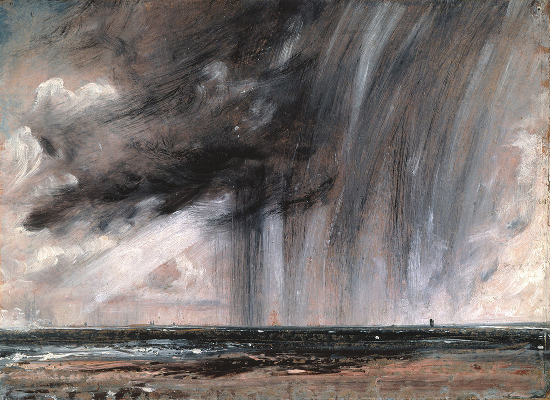
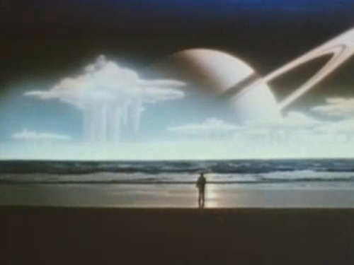
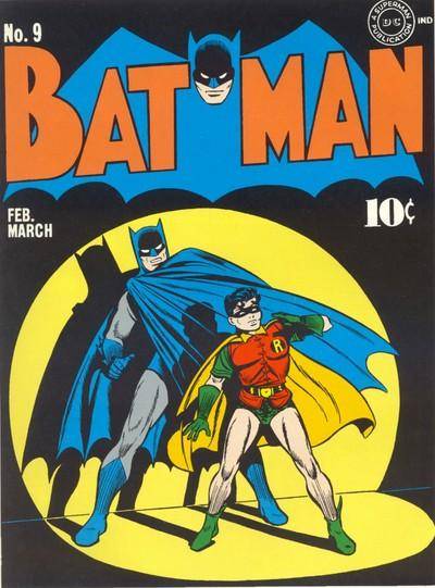
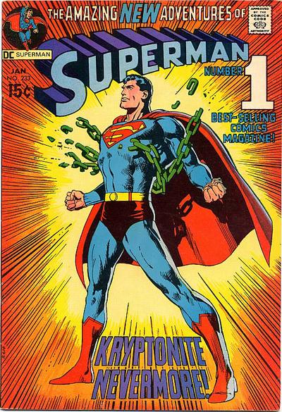
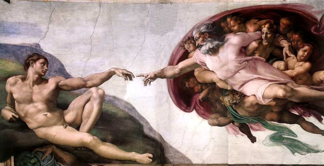
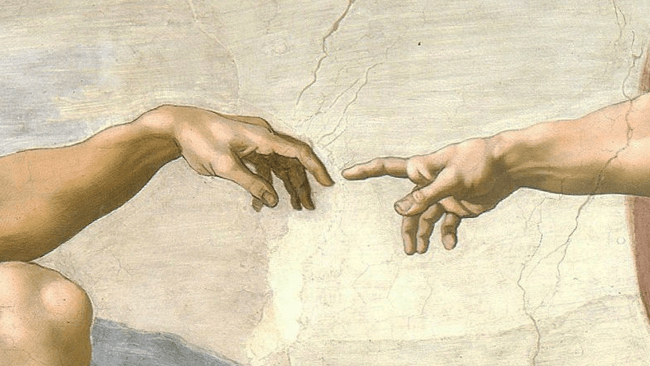
This principle is achieved by emphasizing and singling out design components by contrasting size, position, style or shape. An ideal design might do this without disrupting the unity of the whole. 1 There can be no doubt the sky utterly dominates the land in this sketch by Constable, but the rich tone of the ocean holds it together. 2 What a wonderfully sublime subject the vast restless ocean makes, especially when an alien planet rises over the horizon. Screen grab of the final scene in the NZ sci-fi movie The Quiet Earth. The sky dominates in a similar way to the Constable. 3 The black Monolith dominates the white room in 2001. 4 Bat man and Robin are emphasized by the use of a graphic spotlight in the comic cover. 5 Superman is emphasized by placement, a dynamic pose, and converging graphic action lines. As Batman once said in a crowd on the TV program 'Excuse my shoulders'. 6 Comic book style emphasis works effectively in this sign of the Klimbs. 7-8 A marvelous zen-like emphatic (lack of) touch known to almost everyone. The fact that Adam and God's fingers are not touching add all the more power and emphasis to what is meant to be a life-giving touch.
This principle is achieved by emphasizing and singling out design components by contrasting size, position, style or shape. An ideal design might do this without disrupting the unity of the whole. 1 There can be no doubt the sky utterly dominates the land in this sketch by Constable, but the rich tone of the ocean holds it together. 2 What a wonderfully sublime subject the vast restless ocean makes, especially when an alien planet rises over the horizon. Screen grab of the final scene in the NZ sci-fi movie The Quiet Earth. The sky dominates in a similar way to the Constable. 3 The black Monolith dominates the white room in 2001. 4 Bat man and Robin are emphasized by the use of a graphic spotlight in the comic cover. 5 Superman is emphasized by placement, a dynamic pose, and converging graphic action lines. As Batman once said in a crowd on the TV program 'Excuse my shoulders'. 6 Comic book style emphasis works effectively in this sign of the Klimbs. 7-8 A marvelous zen-like emphatic (lack of) touch known to almost everyone. The fact that Adam and God's fingers are not touching add all the more power and emphasis to what is meant to be a life-giving touch.

Similarity/Contrast
The key to creating something generally regarded as good design is to find a balance (unity again) between opposites such as similarity and contrast. Too much similarity might be boring. Too much contrast might be irritating. Subjectivity will again be part of our assessing whether the principle of similarity/contrast works in a design.
Similarity can be created using internal unifying structures such as a compositional device. Shapes can be made to relate to each other, for example, by consistently using organic or geometric shapes throughout. Continuity in text formats from page to page in terms of font, spacing, headers, borders, and themes will establish an overall perception of harmony. If you illustrate your text a consistent stylistic treatment to the illustrations will help to tie various pages together. If you are working on a project that involves a number of relate pieces, develop a style manual and try to adhere to it.
Contrast might be itemized along the following lines:
Space: filled/empty; near/far; 2D/3D
Position: left/right; top/bottom; isolated/grouped; centred/off centre
Form: simple/complex; beautiful/ugly; whole/broken
Direction: stability/movement
Structure: organized/chaotic; mechanical/freehand
Size: small/large; deep/shallow; thick/thin
Colour and value: grey scale and black and white/colour; light/dark
Texture: fine/ coarse; rough/smooth; dull/sharp
Density: transparent/opaque; thick/thin; liquid/solid
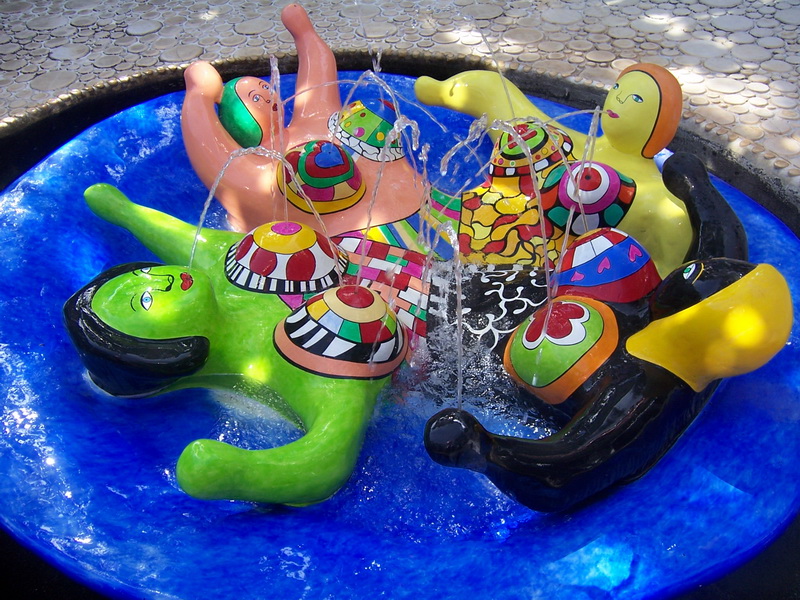
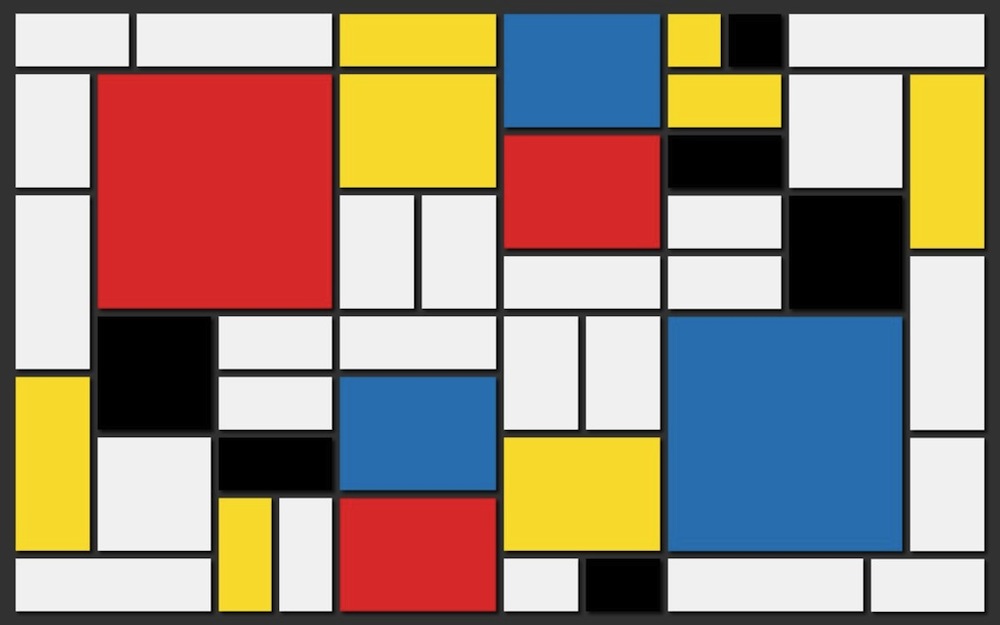
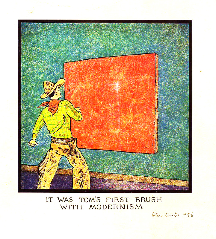
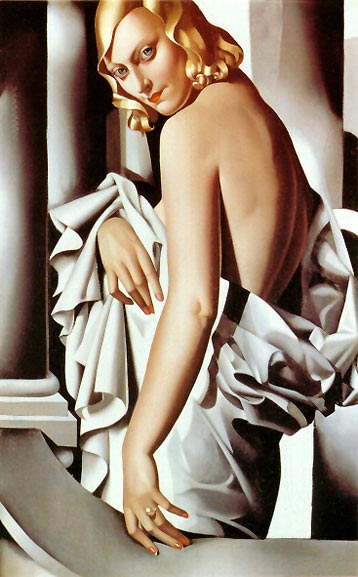
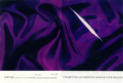
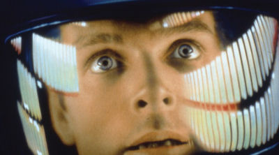
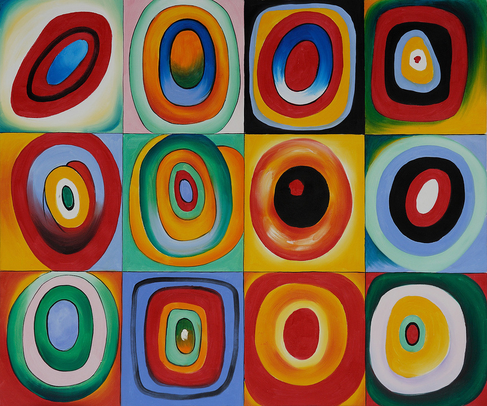
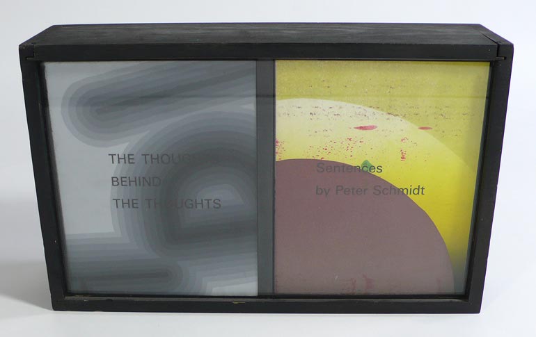
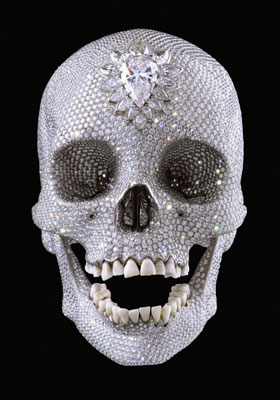
1 Sculpture by Niki de Saint Phalle. Her work is garish with bright complimentary and contrasting colours. But this is applied with such consistency...similarity, that the over all effect is effervescent but also harmonious. 2 The same could be said of Mondrian's painting. Vibrant pure primary hues and black and white are arranged on a unifying compositional scaffold of various shaped squares and rectangles. 3 A cartoon showing the contrast between modernism in art and a rural cowboy by Glen Baxter 4 A painting by Tamara Lempicka. The drenching bright white light and dark shadows create a high contrast painting technique which, by the consistency of treatment, creates a unifying effect. 5 An advert for Silk Cut Cigarettes by Paul Arden of Saatchi and Saatchi from the 1980's. Government regulation restricted the showing of tobacco products so Arden designed a surreal and conceptual campaign that lasted about a decade and brought the underperforming women's cigarette to the top seller in the UK. The contrast of the smooth silk and the ragged cut was eye catching and the simple message was 'Cut Silk=Silk Cut'. But there was more. Silk Cut sounds very close to Silk Cunt, and the wound like vaginal shaped slit in the fabric was intentionally designed by Arden to suggest this. For many years all the subsequent ads used cut silk, often in bizarre, confusing, irrational, and surreal ways. 6-8 Astronaut Dave Bowman from 2001 before, during and after the Stargate Sequence toward the end of the movie. Dave starts his sublime and disturbing journey an adult male, but at the end of it he is changed man as a result of the experience. Most notably he ages decades. The contrast between the young Bowman and the older Bowman is significant in the movie. 9 High contrast but similarly treated organic forms by Hundervasser. 10-11 Some examples of the Thoughts Behind Thoughts by artist Peter Schmidt. Schmidt ripped up old drawings and prints creating impulsive compositions, then printed, with letter press, random passages on them. As you look at each of his small 'images' absurd and irrational arrangements surprisingly are given meaning as we take them in. Schmidt later collaborated with musician Brian Eno to make a set of printed word cards called Oblique Strategies. These absurd and irrational texts were meant to be used as an aid to circumvent creative blocks by preventing obsessive or concrete thinking. Apparently Eno used them effectively while working on the LP Low with David Bowie. These irrational methods of design are intriguing in and of themselves, and valuable as a resort when creativity dries up. 16 One of the classic Memento Mori images/objects of all time, Damien Hirst's diamond embellished skull. Classic Memento Mori (Latin; Remember you must die) usually uses contrasting symbolic objects to implicate death as a part of life. Hirst has brilliantly taking a chilling motif of death, a human skull, and studded it with symbols of worldliness. The contrast is bizarre and sobering.
The key to creating something generally regarded as good design is to find a balance (unity again) between opposites such as similarity and contrast. Too much similarity might be boring. Too much contrast might be irritating. Subjectivity will again be part of our assessing whether the principle of similarity/contrast works in a design.
Similarity can be created using internal unifying structures such as a compositional device. Shapes can be made to relate to each other, for example, by consistently using organic or geometric shapes throughout. Continuity in text formats from page to page in terms of font, spacing, headers, borders, and themes will establish an overall perception of harmony. If you illustrate your text a consistent stylistic treatment to the illustrations will help to tie various pages together. If you are working on a project that involves a number of relate pieces, develop a style manual and try to adhere to it.
Contrast might be itemized along the following lines:
Space: filled/empty; near/far; 2D/3D
Position: left/right; top/bottom; isolated/grouped; centred/off centre
Form: simple/complex; beautiful/ugly; whole/broken
Direction: stability/movement
Structure: organized/chaotic; mechanical/freehand
Size: small/large; deep/shallow; thick/thin
Colour and value: grey scale and black and white/colour; light/dark
Texture: fine/ coarse; rough/smooth; dull/sharp
Density: transparent/opaque; thick/thin; liquid/solid
1 Sculpture by Niki de Saint Phalle. Her work is garish with bright complimentary and contrasting colours. But this is applied with such consistency...similarity, that the over all effect is effervescent but also harmonious. 2 The same could be said of Mondrian's painting. Vibrant pure primary hues and black and white are arranged on a unifying compositional scaffold of various shaped squares and rectangles. 3 A cartoon showing the contrast between modernism in art and a rural cowboy by Glen Baxter 4 A painting by Tamara Lempicka. The drenching bright white light and dark shadows create a high contrast painting technique which, by the consistency of treatment, creates a unifying effect. 5 An advert for Silk Cut Cigarettes by Paul Arden of Saatchi and Saatchi from the 1980's. Government regulation restricted the showing of tobacco products so Arden designed a surreal and conceptual campaign that lasted about a decade and brought the underperforming women's cigarette to the top seller in the UK. The contrast of the smooth silk and the ragged cut was eye catching and the simple message was 'Cut Silk=Silk Cut'. But there was more. Silk Cut sounds very close to Silk Cunt, and the wound like vaginal shaped slit in the fabric was intentionally designed by Arden to suggest this. For many years all the subsequent ads used cut silk, often in bizarre, confusing, irrational, and surreal ways. 6-8 Astronaut Dave Bowman from 2001 before, during and after the Stargate Sequence toward the end of the movie. Dave starts his sublime and disturbing journey an adult male, but at the end of it he is changed man as a result of the experience. Most notably he ages decades. The contrast between the young Bowman and the older Bowman is significant in the movie. 9 High contrast but similarly treated organic forms by Hundervasser. 10-11 Some examples of the Thoughts Behind Thoughts by artist Peter Schmidt. Schmidt ripped up old drawings and prints creating impulsive compositions, then printed, with letter press, random passages on them. As you look at each of his small 'images' absurd and irrational arrangements surprisingly are given meaning as we take them in. Schmidt later collaborated with musician Brian Eno to make a set of printed word cards called Oblique Strategies. These absurd and irrational texts were meant to be used as an aid to circumvent creative blocks by preventing obsessive or concrete thinking. Apparently Eno used them effectively while working on the LP Low with David Bowie. These irrational methods of design are intriguing in and of themselves, and valuable as a resort when creativity dries up. 16 One of the classic Memento Mori images/objects of all time, Damien Hirst's diamond embellished skull. Classic Memento Mori (Latin; Remember you must die) usually uses contrasting symbolic objects to implicate death as a part of life. Hirst has brilliantly taking a chilling motif of death, a human skull, and studded it with symbols of worldliness. The contrast is bizarre and sobering.
Movement/Rhythm
Movement in static objects allude to the path the eye makes as it scans an object or image. (Recall our observations and discussion of eye saccades which are quite literally drawings done by the eye). These eye paths can be manipulated or directed by a compositional element, such as a spiral or a colour or value transition. The eye can be led along lines, colours, edges, shapes and colour.
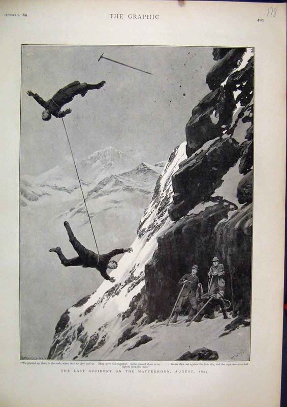
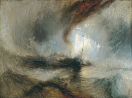
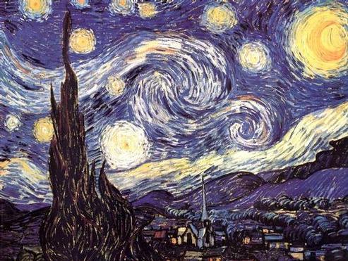
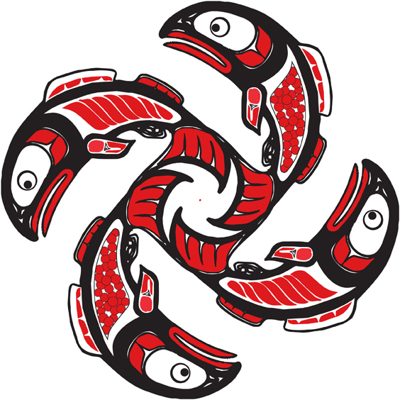
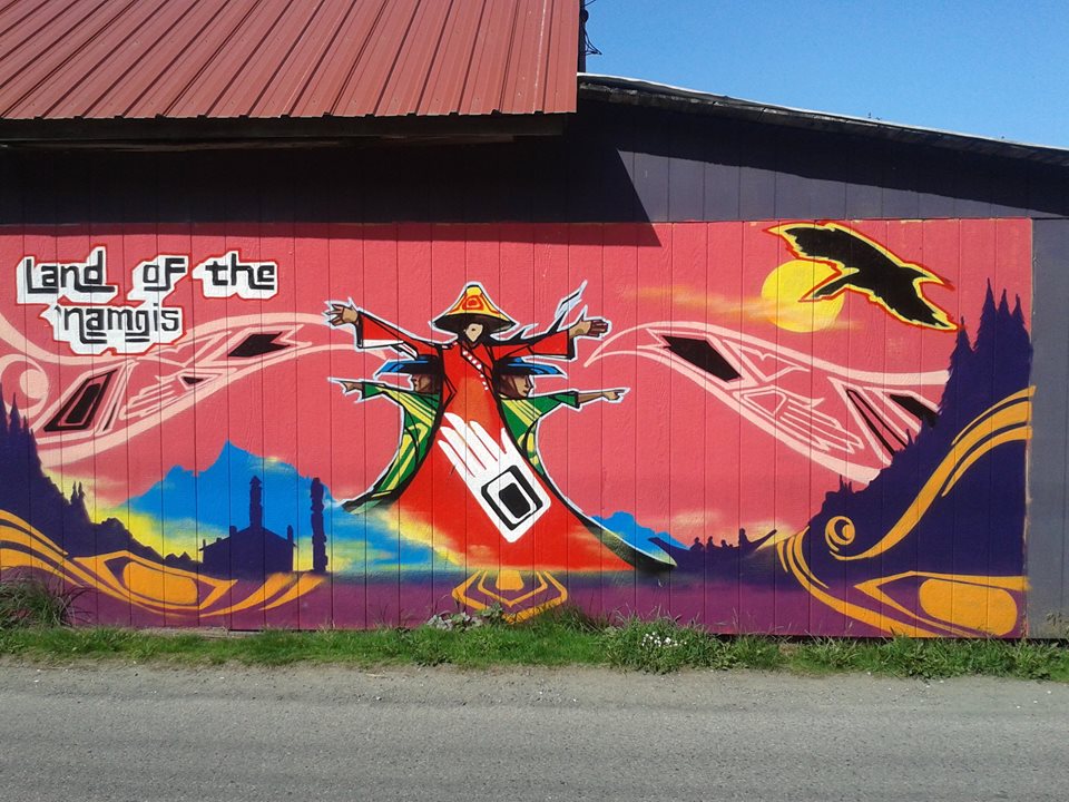
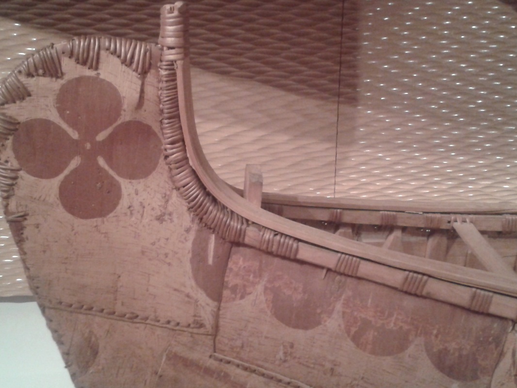
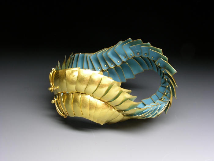
1 In the long Stargate Sequence in 2001 there is a great deal of abstract movement of lights, forms and shapes, often racing with great speed from a vanishing point in a single point perspective. 2 I'd like to say this engraving is by Gustave Dore, but I'm not certain now and can't find the image again to document it. It is a horrifyingly marvelous rendering of two roped climbers falling to their death and the artist has created a sense of spinning centrifugal force created by them being connected. 3 J.W.M. Turner's giddy rendering of a steam boat in the English Channel in a show storm. Turner allegedly tied himself to the ships mast to witness the event and then attempt to communicate the experience. This is probably not true but a clever promotional ploy nevertheless. The ship is at the centre of a swirling vortex. 4 Van Gogh envisions stars in the sky creating eddies in spacetime. 5 Foliated eddies create pleasing patterns in classic Arts and Crafts printmaking. 6 Another swirling vortex, this time of salmon, found in native West Coast art. 7 Contemporary 'Namgis (Kwakwaka'wakw) mural in Alert Bay shows a vigorous sense of movement, rhythm and design. 8 A beautiful canoe at the Royal Ontario Museum build by native Attikamek César Newashish.. Cesar is the subject of a fantastic NFB film by Bernard Gosslin called Cesar Builds a Canoe . In the film, with no narration and very little dialogue, we see Cesar access traditional materials and use traditional technology to build a traditional conveyance of such exceptional design, quality and beauty one can hardly believe ones eyes. Note the rhythmic wave-like detailing on the canoe in the photo. This motif is repeated down the whole side of the canoe creating an exquisite sense of rhythm that mimics the rippling of water. This is a wonderful example of design at its very best, both practical and aesthetically pleasing. 9 Another classic example of a simple but effective design that shows movement; the logo of CN designed by Allen Fleming. What better way to suggest transit across the surface of a country? 10-12 The turbines on jet aircraft and the nesting of feathers on a bird are similar in appearance and both suggest movement. Look at the sense of movement created by this piece of jewellery and compare it to the two logo designs.
Movement in static objects allude to the path the eye makes as it scans an object or image. (Recall our observations and discussion of eye saccades which are quite literally drawings done by the eye). These eye paths can be manipulated or directed by a compositional element, such as a spiral or a colour or value transition. The eye can be led along lines, colours, edges, shapes and colour.
1 In the long Stargate Sequence in 2001 there is a great deal of abstract movement of lights, forms and shapes, often racing with great speed from a vanishing point in a single point perspective. 2 I'd like to say this engraving is by Gustave Dore, but I'm not certain now and can't find the image again to document it. It is a horrifyingly marvelous rendering of two roped climbers falling to their death and the artist has created a sense of spinning centrifugal force created by them being connected. 3 J.W.M. Turner's giddy rendering of a steam boat in the English Channel in a show storm. Turner allegedly tied himself to the ships mast to witness the event and then attempt to communicate the experience. This is probably not true but a clever promotional ploy nevertheless. The ship is at the centre of a swirling vortex. 4 Van Gogh envisions stars in the sky creating eddies in spacetime. 5 Foliated eddies create pleasing patterns in classic Arts and Crafts printmaking. 6 Another swirling vortex, this time of salmon, found in native West Coast art. 7 Contemporary 'Namgis (Kwakwaka'wakw) mural in Alert Bay shows a vigorous sense of movement, rhythm and design. 8 A beautiful canoe at the Royal Ontario Museum build by native Attikamek César Newashish.. Cesar is the subject of a fantastic NFB film by Bernard Gosslin called Cesar Builds a Canoe . In the film, with no narration and very little dialogue, we see Cesar access traditional materials and use traditional technology to build a traditional conveyance of such exceptional design, quality and beauty one can hardly believe ones eyes. Note the rhythmic wave-like detailing on the canoe in the photo. This motif is repeated down the whole side of the canoe creating an exquisite sense of rhythm that mimics the rippling of water. This is a wonderful example of design at its very best, both practical and aesthetically pleasing. 9 Another classic example of a simple but effective design that shows movement; the logo of CN designed by Allen Fleming. What better way to suggest transit across the surface of a country? 10-12 The turbines on jet aircraft and the nesting of feathers on a bird are similar in appearance and both suggest movement. Look at the sense of movement created by this piece of jewellery and compare it to the two logo designs.